VASILII KHROMOV
Brand designer and art-director
hi, i work with a brand identities. the match of strategy, meanings and fresh shapes is the aim
BRANDING
IDENTITY
DIGITAL
to develop wordmark that will reflect clearly the brand positioning and the same time most important points in service mechanic. the woodmark have to have potencial for building accomplished identity around it
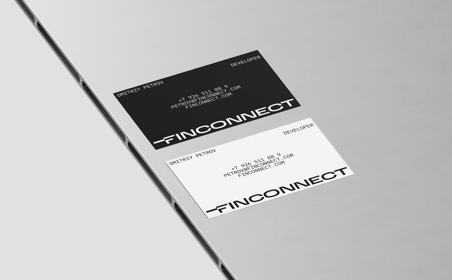
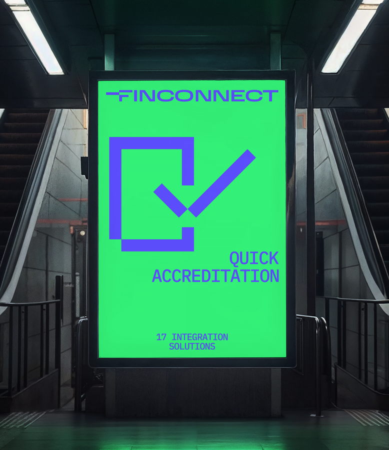
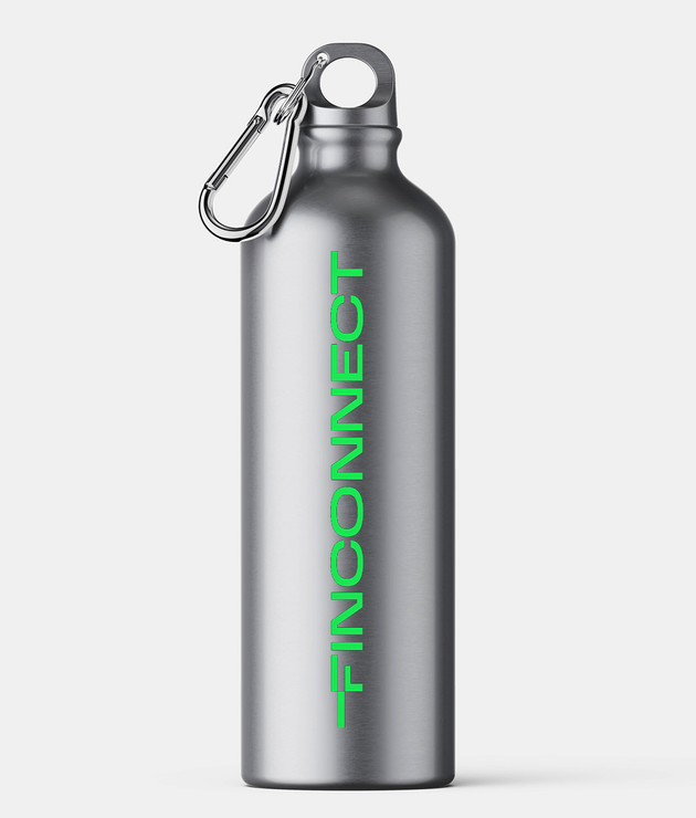
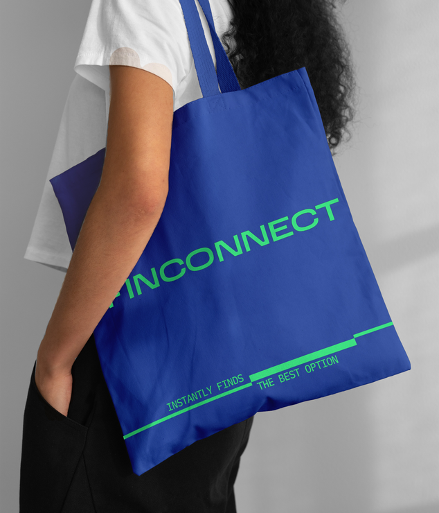
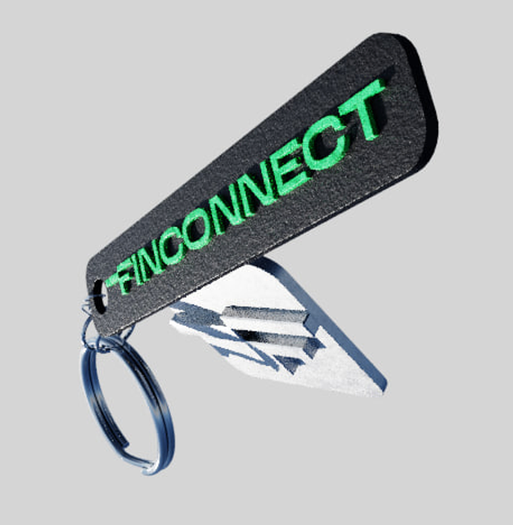
the striking logo represents several important points: assement of options, sharp connection, speed of service, cutting edge technologics. tailor made letter F transfers all this meanings and all the other support it
TARGET
solution
fintech
/
/
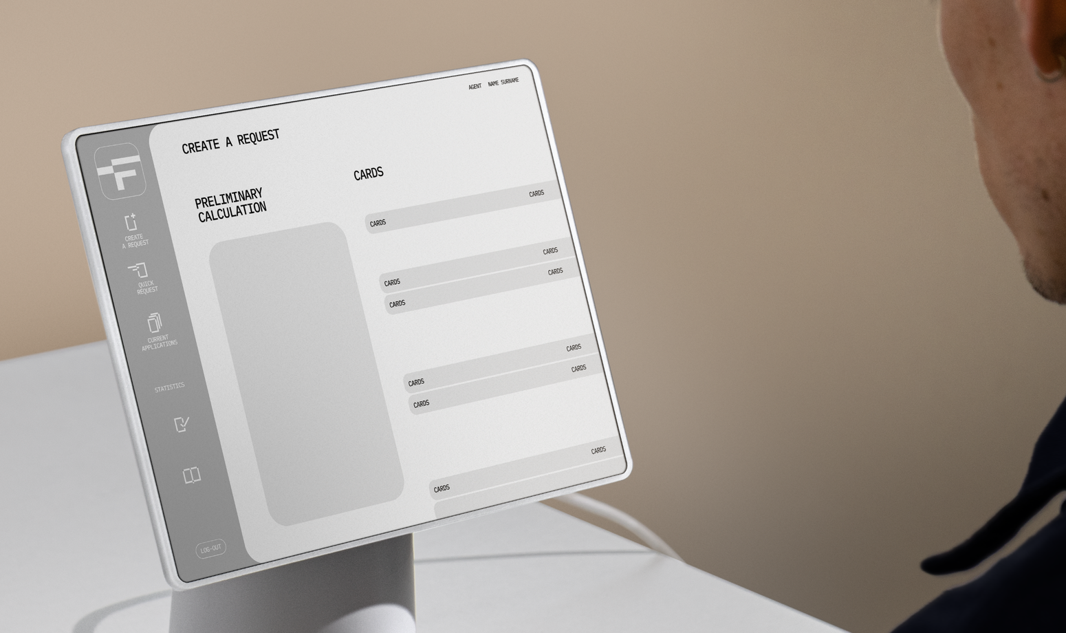
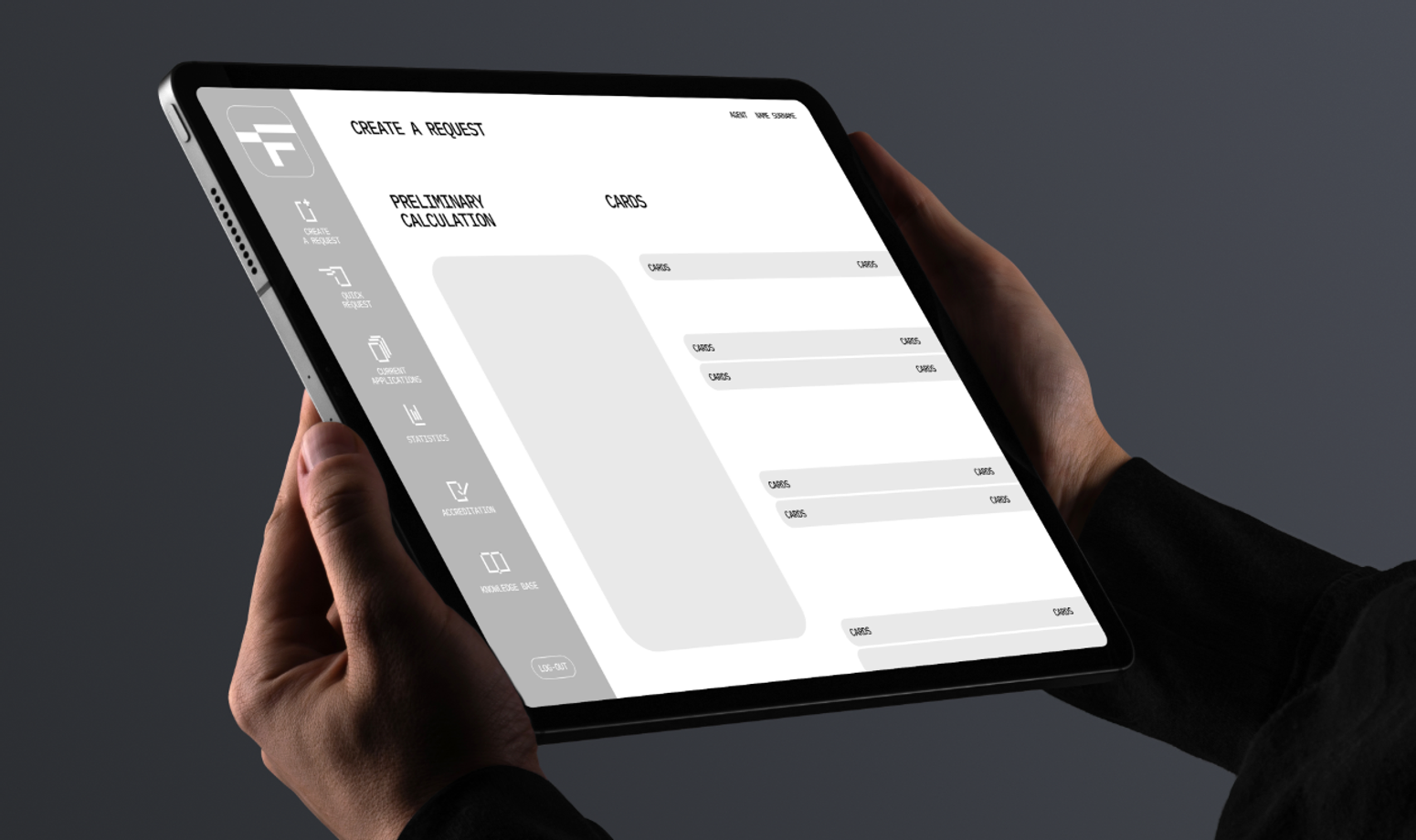
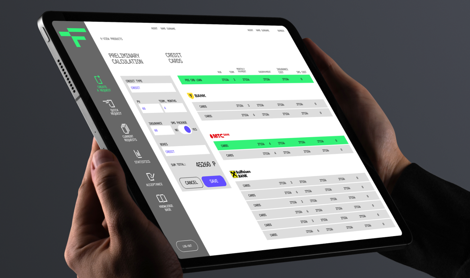
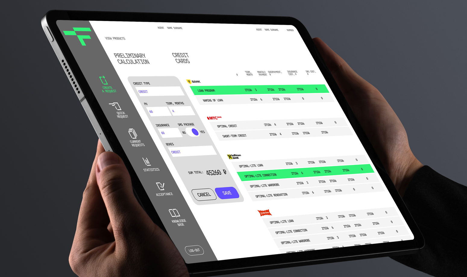
the characteristic letter F becomes the branded application icon
2023, 2025
FINCONNECT
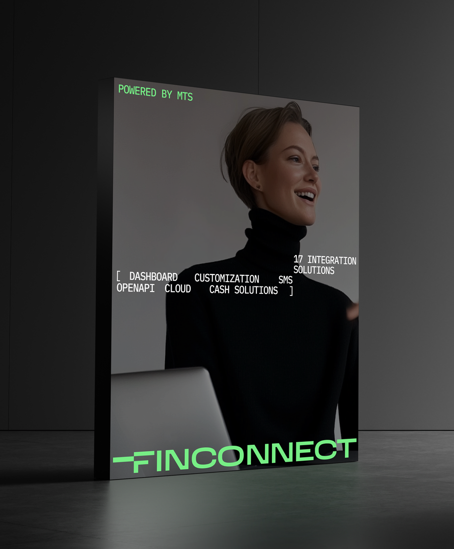
TECHNOLOGICAL PLATFORM FOR RETAIL THAT QUICKLY picks up LOANS
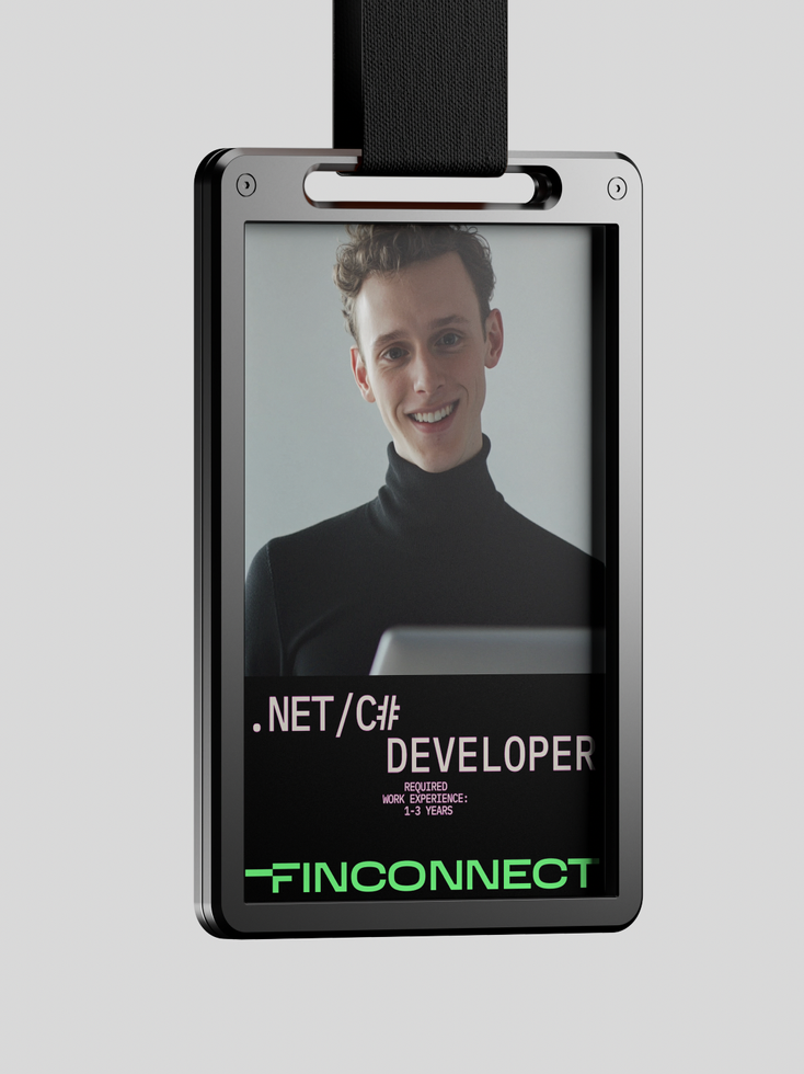
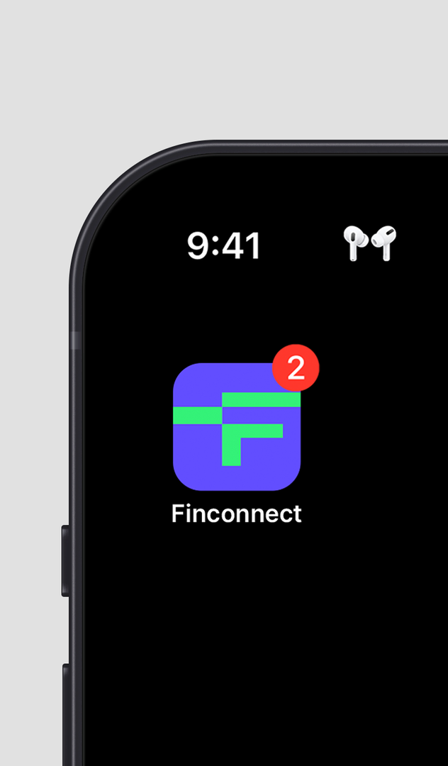
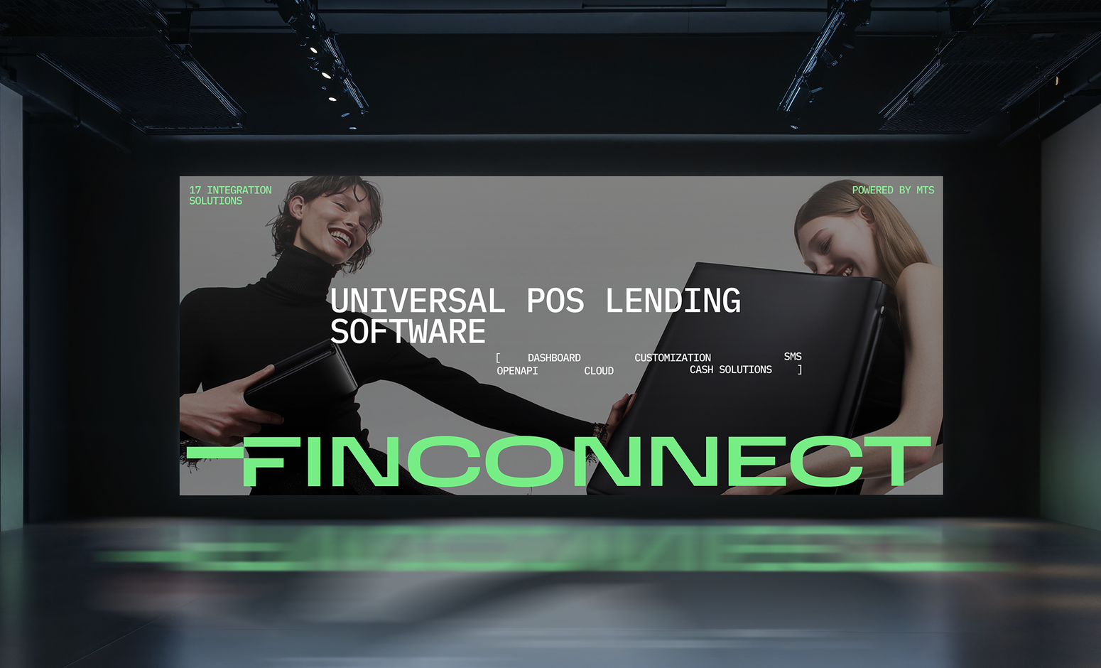
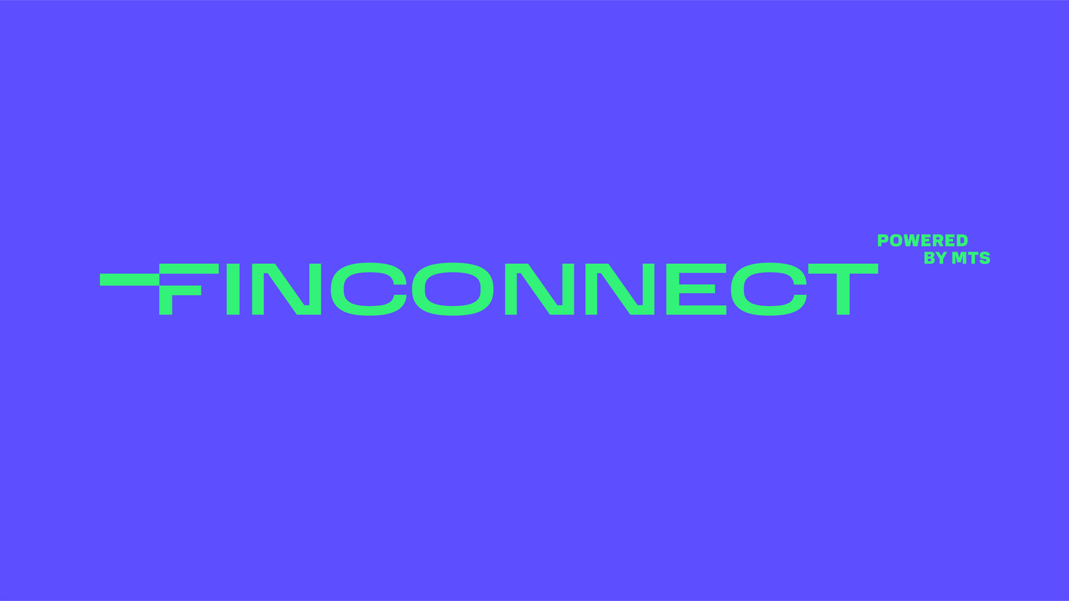
the characteristic letter F becomes the branded application icon
bbdo moscow
agency
ONO is a large fintech company, that provides support in the fueling, transportations and logistics. The company facilitates the partners growth through developing and streamlining their processes. It was important to showcase the flexibility of the service, seamlessness, optimality and top-notch technologies
THE ESSENCE OF THE CONCEPT IS THE IDEA THAT NATURE INSPIRED STRUCTURES AND SHAPES REFLECT THE FLEXIBILITY, GROWTH, SEAMLESS AND OPTIMAL APPROACH OF THE SERVICES.
THE CHARACTERISTIC TRAIT OF THE DESIGN IS COMBINATION OF ORGANIC INSPIRED GRADIENT SHAPES AND ALL THE OVER ELEMENTS THAT located along THE MODULAR GRID
TARGET
solution
fintech
/
/
The feeling of collaboration of elements and structure is essential
2023
ONO
b2b fintech operator providing services optimising businesses
bbdo moscow
agency
VASILII KHROMOV
Brand designer and art-director
hi, i work with a brand identities. the match of strategy, meanings and fresh shapes is the aim
BRANDING
IDENTITY
DIGITAL


experience:
awards and publications:
Red Dot Design Award. inDrive brand identity
Sreda festival. Silver (Supervised student project)
Sreda festival. Bronze (Supervised student project)
G8 festival. Silver (Supervised student project) World Brand Design Society Award, Identity. shortlisted, Ra’men G8 festival. Best logotype. Ra’men Festival Sreda. shortlisted. Using graphics in identity. Ra’men Logolounge 12. Publication in the international collection of logos Ninja Burger. Samowar bar. Fakestival. shortlisted. Nikola-Lenivets "Golden Flea 2020". Publication in the collection of logos. Samowar bar. Studio 168.
2026
2025
2025
2025
2021 2019
2019 2019 2018 2020
Adobe Photoshop, Adobe Illustrator, Indesign Adobe After Effects Figma
Cinema 4d
Blender 3d
Education:
skillset:
Lead designer / art director, BBDO Branding
Brand designer / art director, LINII Brand designer, DDVB
Digital designer, Mosaic
Creative designer, OZON.ru Designer, Design Band Freelance web designer
2021-now
2018-2019
2016-2018
2015-2016
2013-2015
2012-2013
2009-2012
BHSaD MHPI MISiS
2015-2017 2009-2015 2004-2009
additional education:
C4D42 Bang bang education Zerno school
2015-2017 2009-2015 2004-2009
Art direction Framing and solving creative problems and development processes
Team leadership and development Project management Time management
Interest in life around
interests and achievements:
I like to find new information about culture and historical trends, like to trace back interconnections between different parts of culture, policy and history. So that i like to absorb new information about all this stuff literally anywhere, f.e. speaking with somebody, watching youtube or reading books.
Have a tutor experience: curated university student’s degree works.
Have experience of developing the part of the online video course about the branding at Bang Bang Education Platform. My chapter was dedicated to the theme of merging and mutual enrichment between branding and digital design.
My first degree was the engineer of automatisation in metallurgy. That made me better in analytics and made my mindset more structural.
Clients
Yandex, MTS, inDrive, Haval, Huawei, Mars Petcare, Beeline, LADA, NLMK, NLMK Strasbourg, Sibur, OZON.RU, re:store, Буквоед, Bonduelle
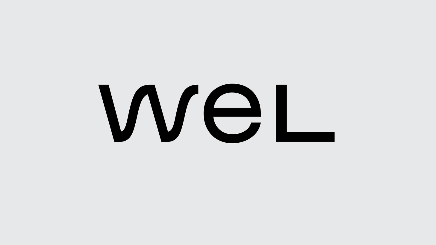
wel
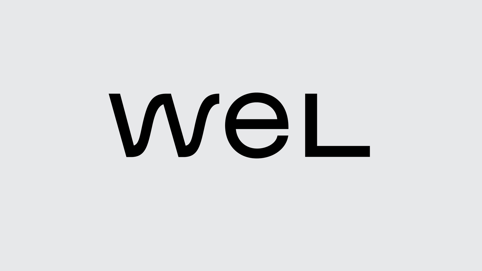
wel is a large fintech operator of business services, providing support in the fuel, transport and logistics industries. The service leverages business growth it's partners by supporting and optimising their processes. it was important to reflect the flexibility of the service, seamlessness, ease of interaction and the high level
of technology.
in the core of brand identity located image of flow, as a metaphor of flexible and intellectual force that brings business in motion helping it with a precize improvements. this idea determines the shape of the logotype and the shape of the brand graphic element “wave”. the “wave” conveys the image of smart, modern intellectual service that builds the precise seamless optimal connections between parts of client’s businesses the same way as a graphic element connects layout elements.
TARGET
solution
b2b fintech operator providing services optimising businesses
fintech
/
2023
bbdo moscow
agency
indrive
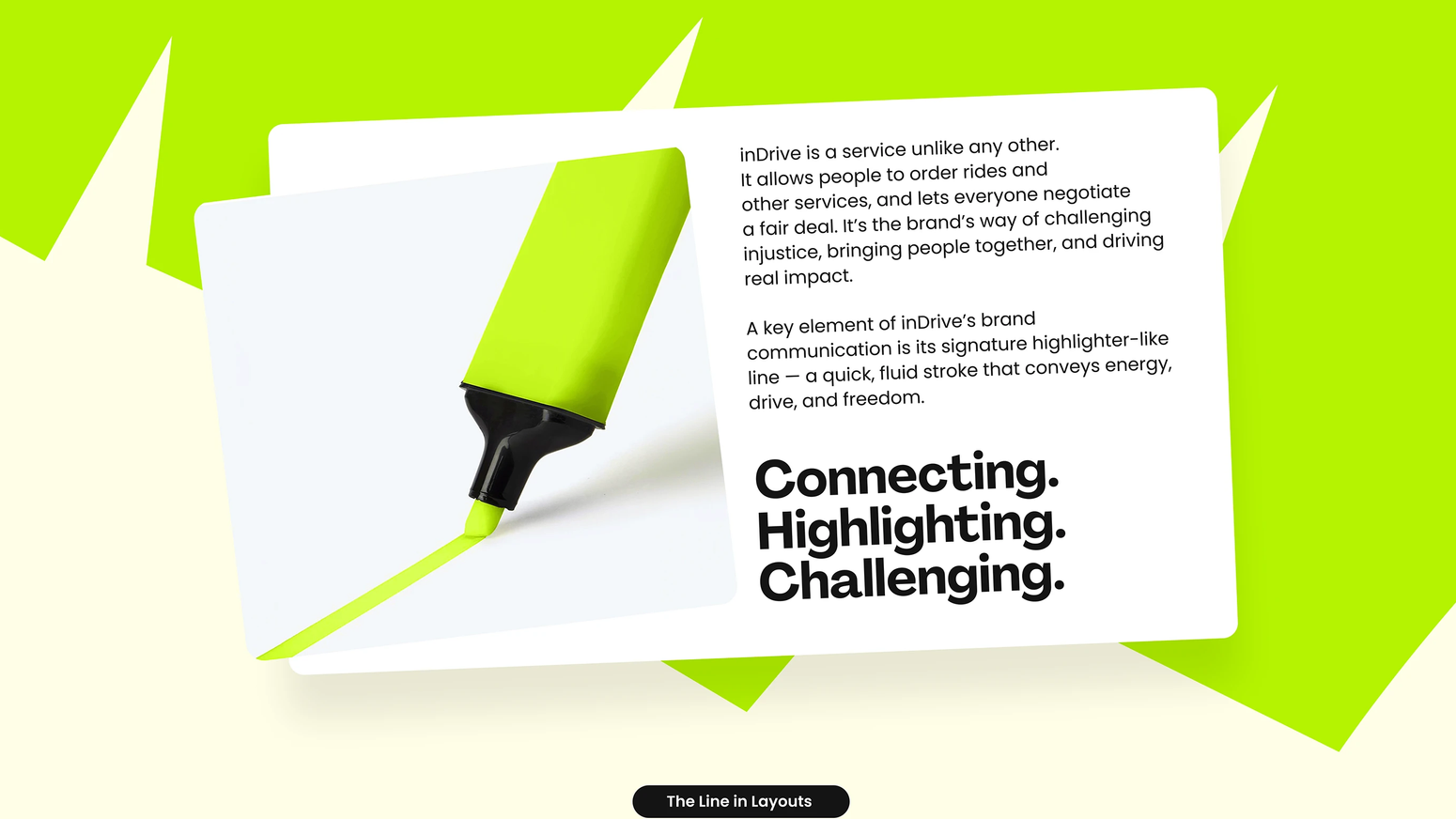
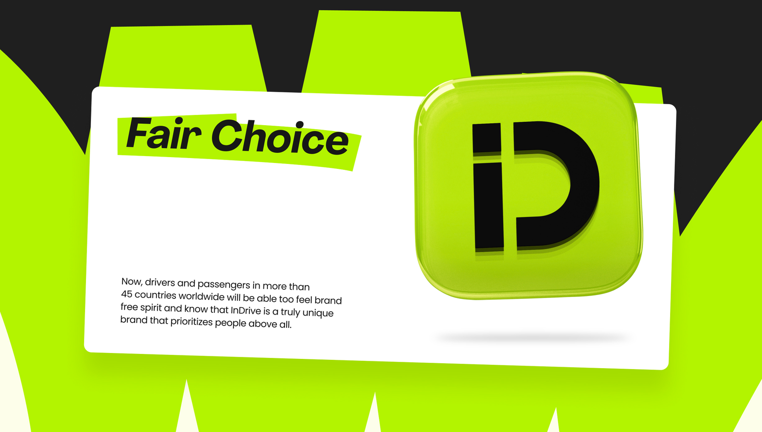
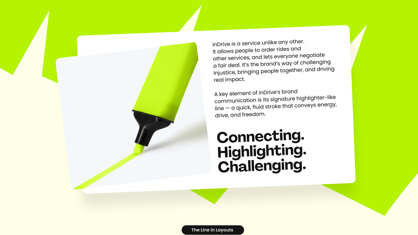
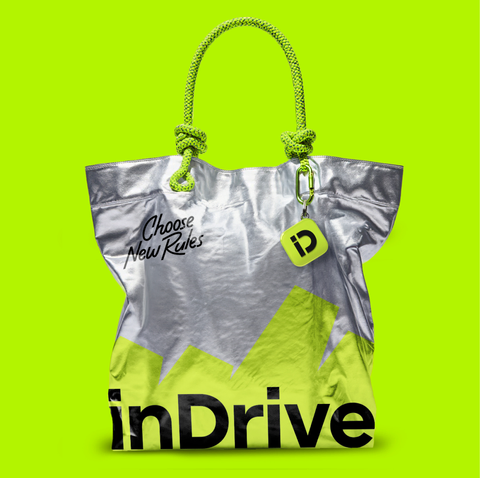
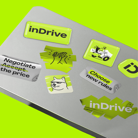
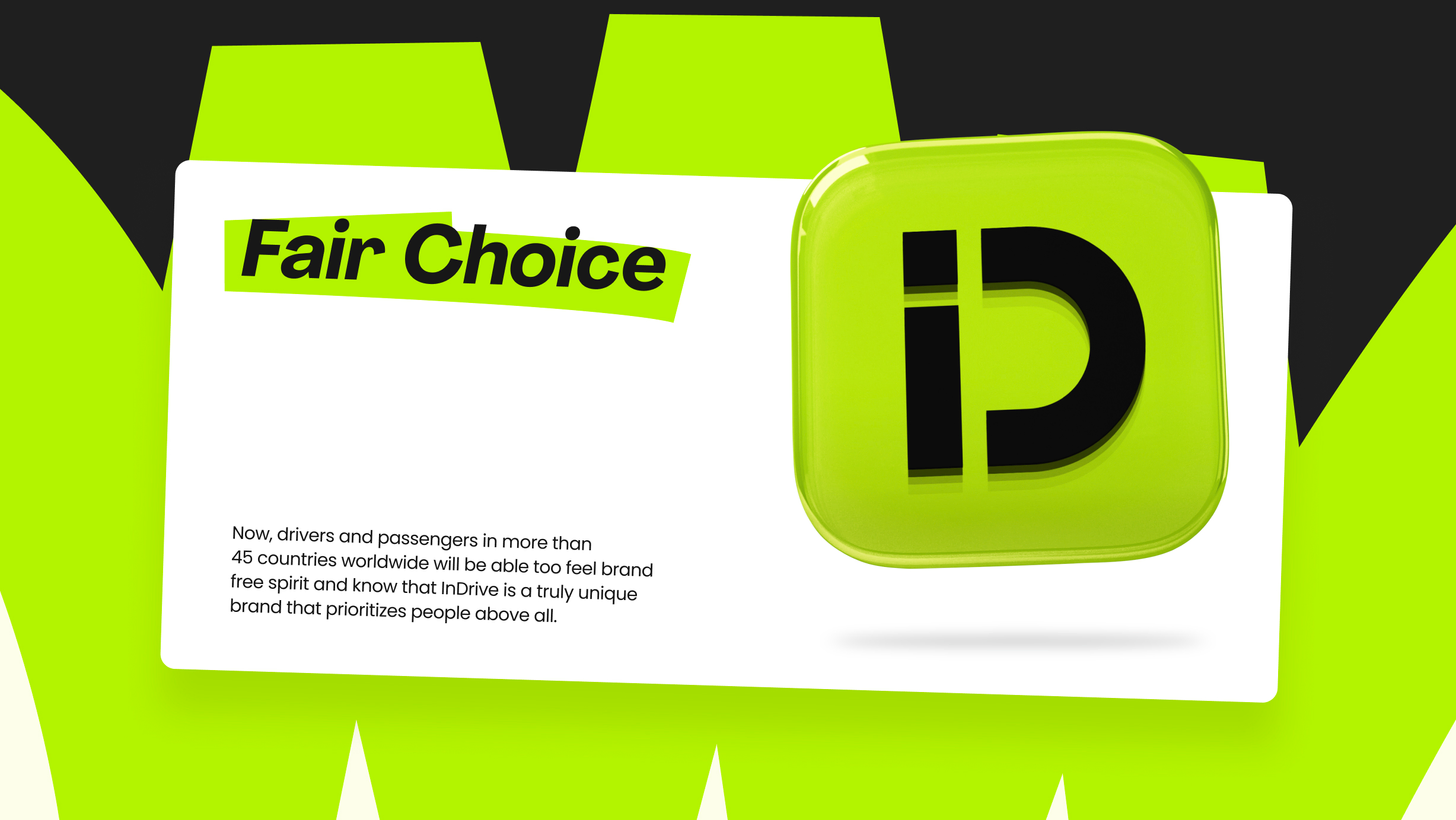
inDrive is a service unlike any other. It allows people to order rides and other services, and lets everyone negotiate a fair deal. It’s the brand’s way of challenging injustice, bringing people together, and driving real impact inDrive's core mission is to challenge injustice through fair choices and affordable mobility
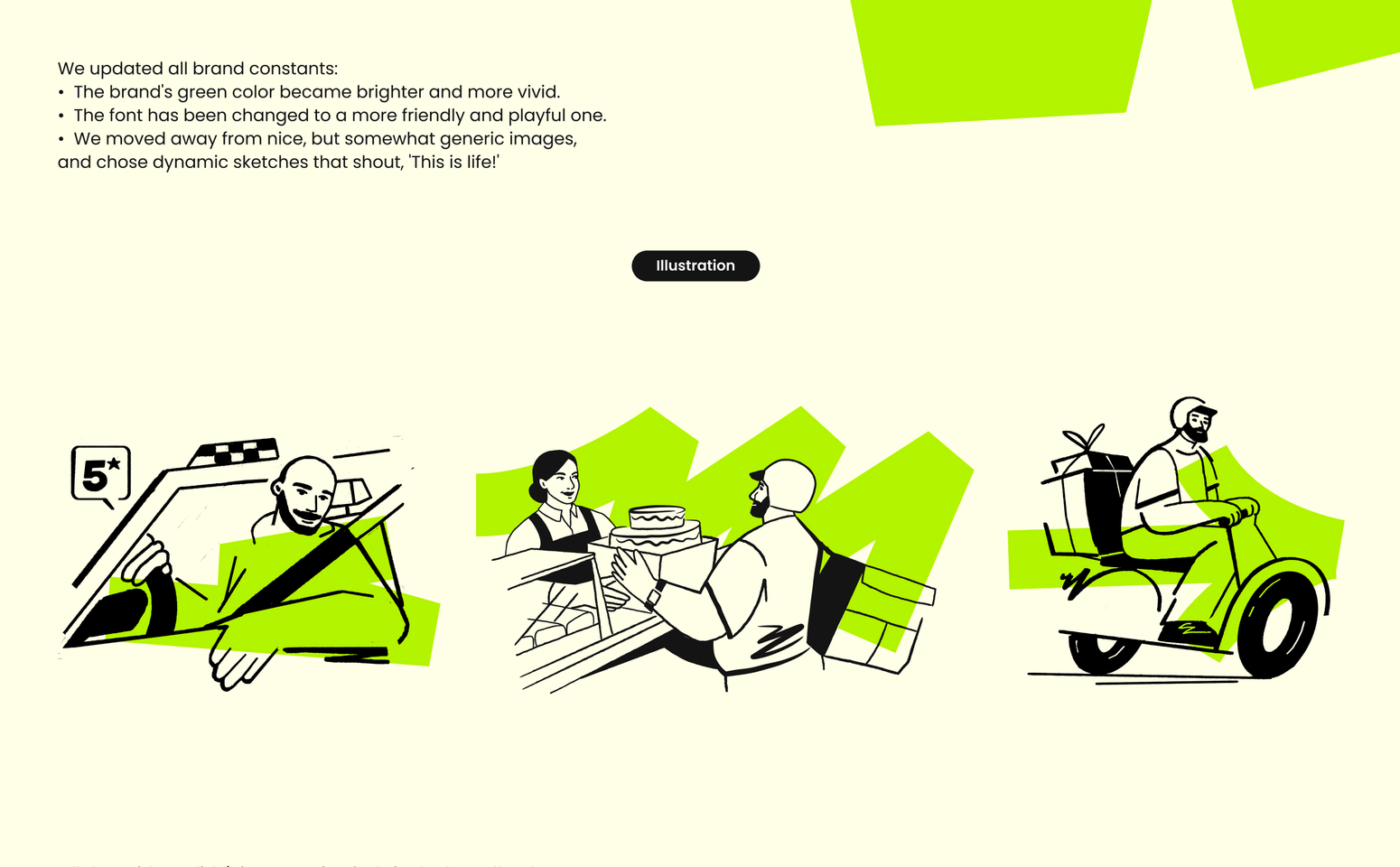
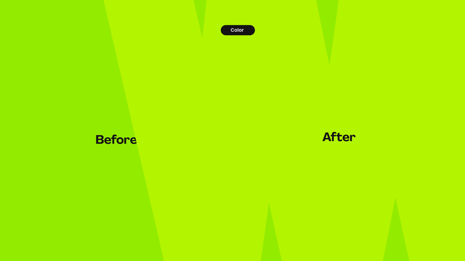
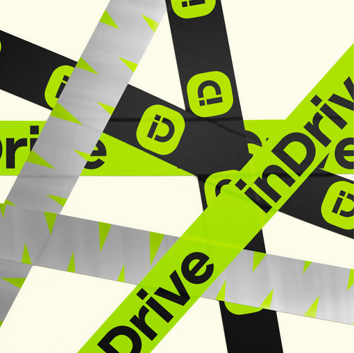
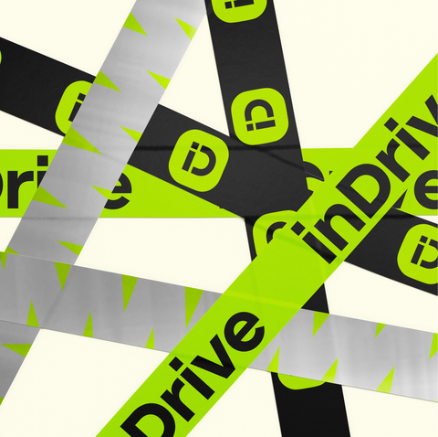
A key element of inDrive’s brand communication is its signature highlighter-like line — a quick, fluid stroke that conveys energy, drive, and freedom.
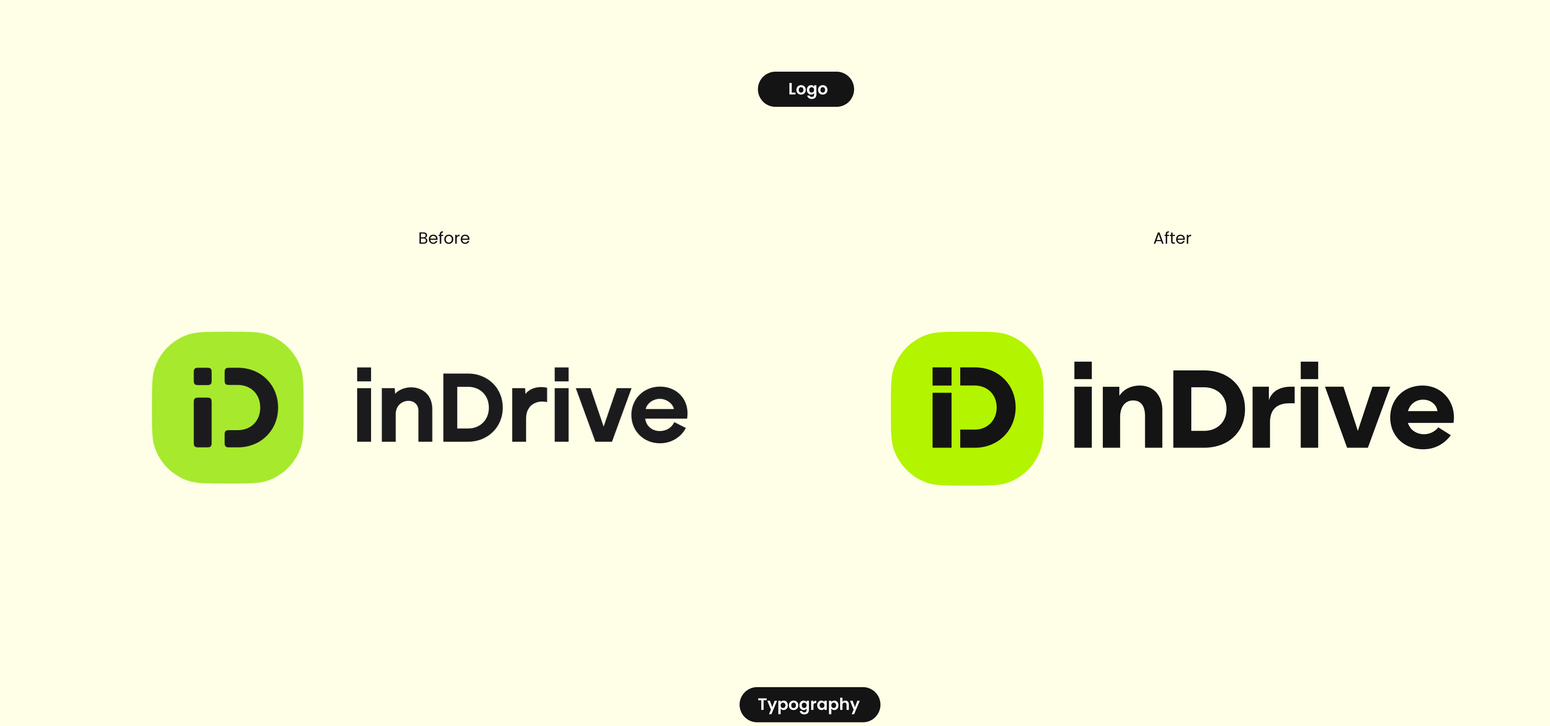
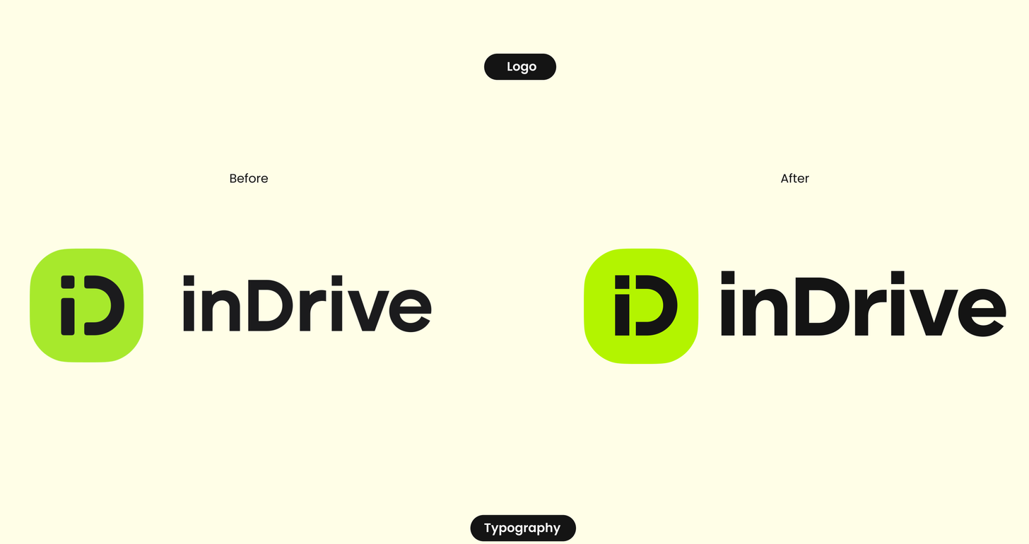
more than a new brand identity — a living ecosystem were designed to challenge the rules and put people first.
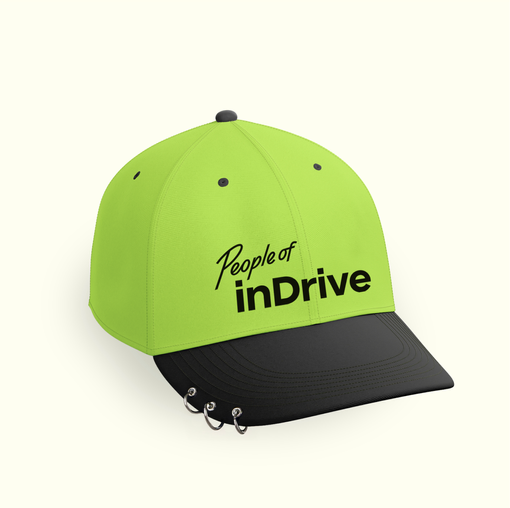
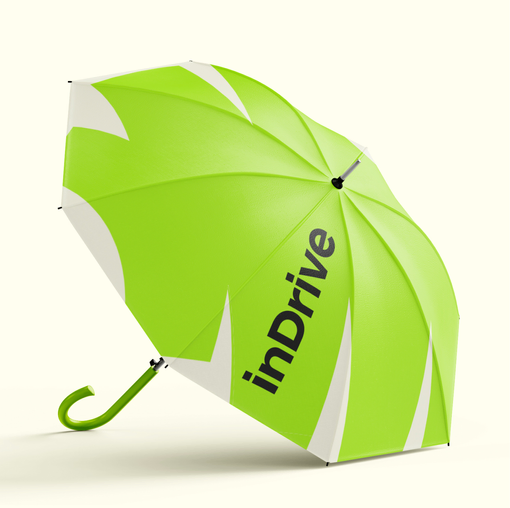
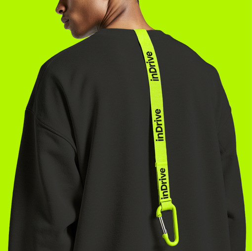
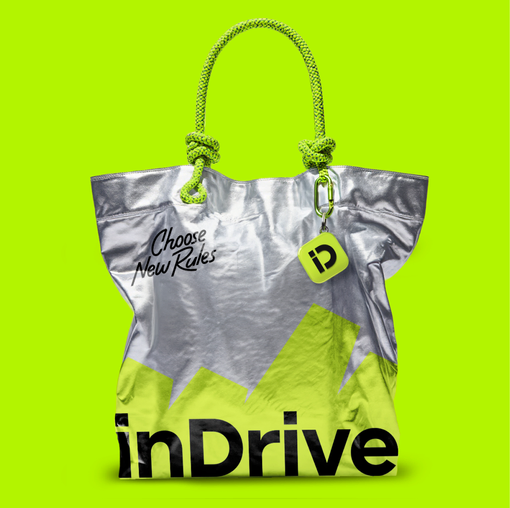
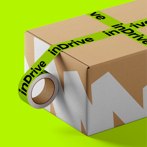
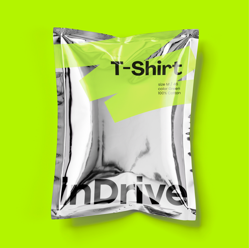
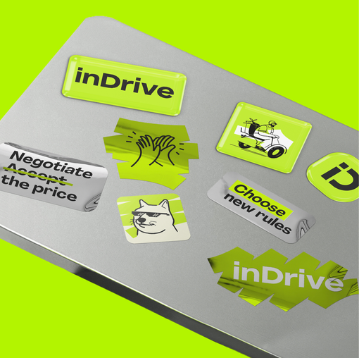
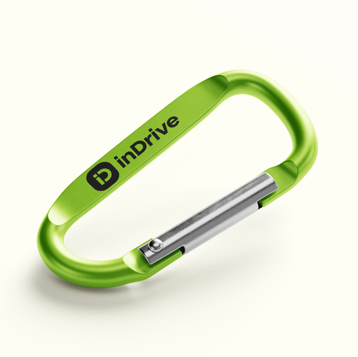
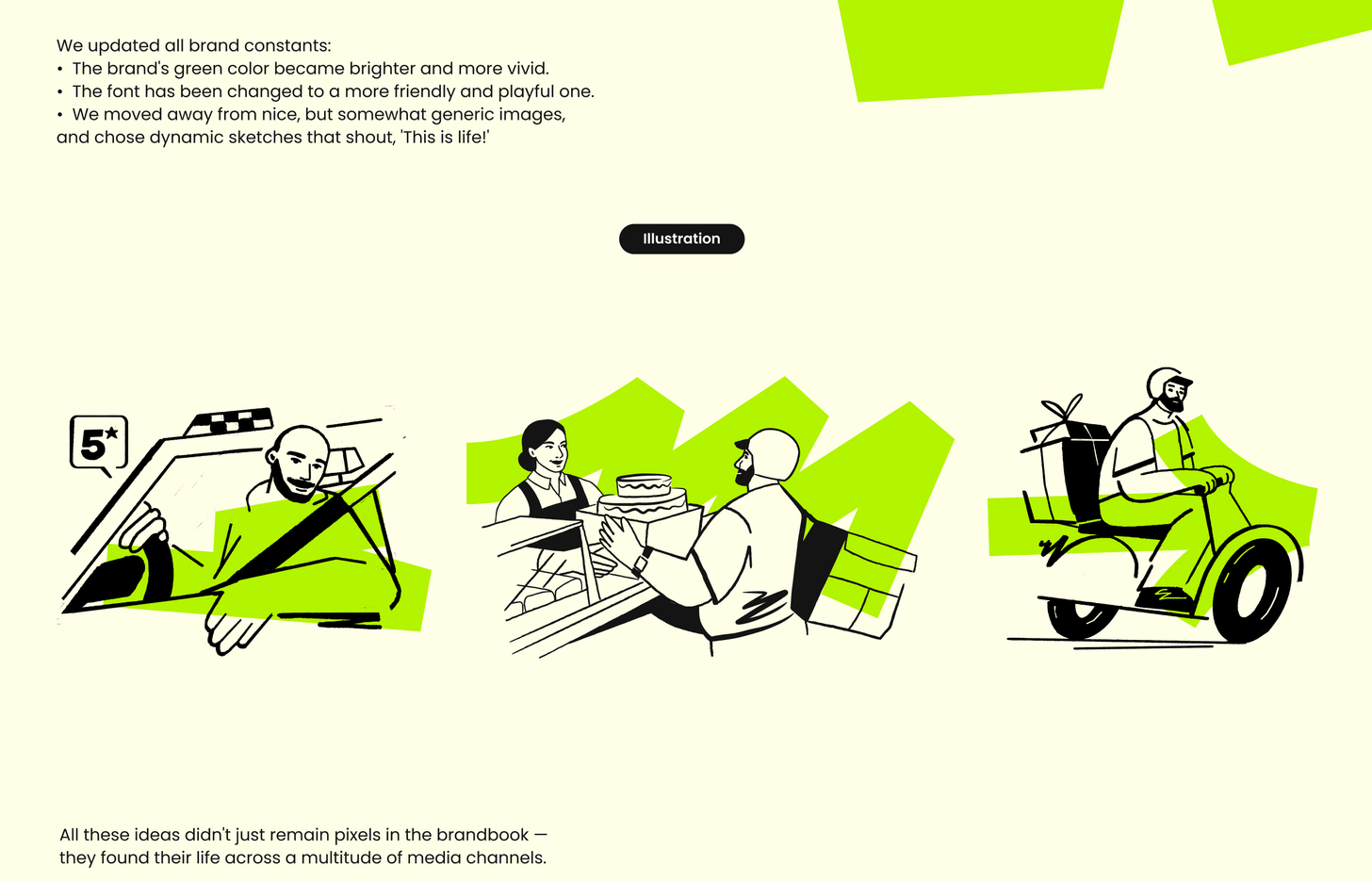
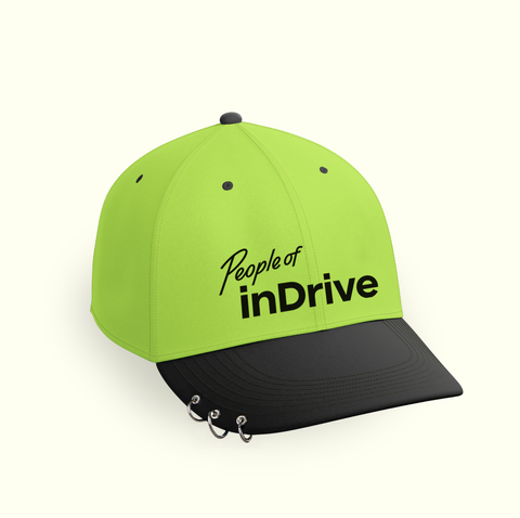
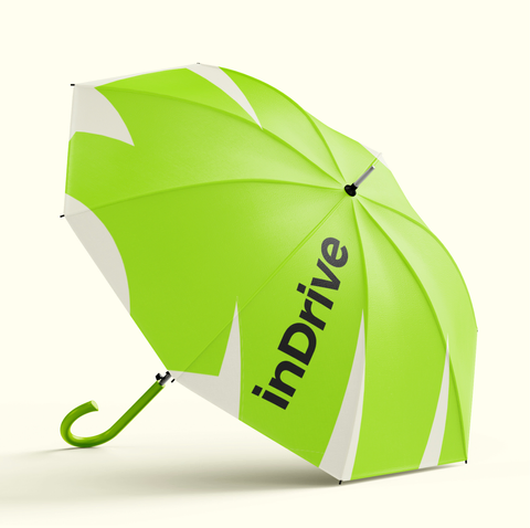
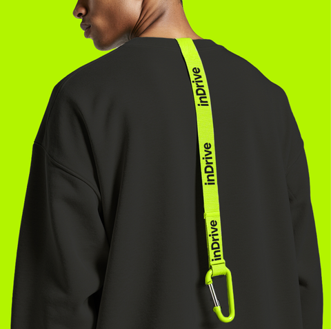
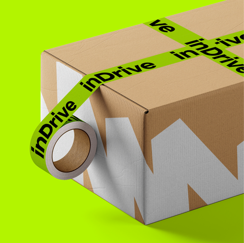
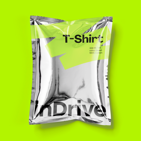
The new design system of @indrive was implemented across a wide range of touchpoints — from car branding and outdoor advertising to cool merchandise and courier uniforms. This entire scale is packed into a 614-page, constantly growing, brandbook.
TARGET
solution
Rebranding
A Global Mobility Service
Ride-hailing
/
2026
border:ZERO
agency
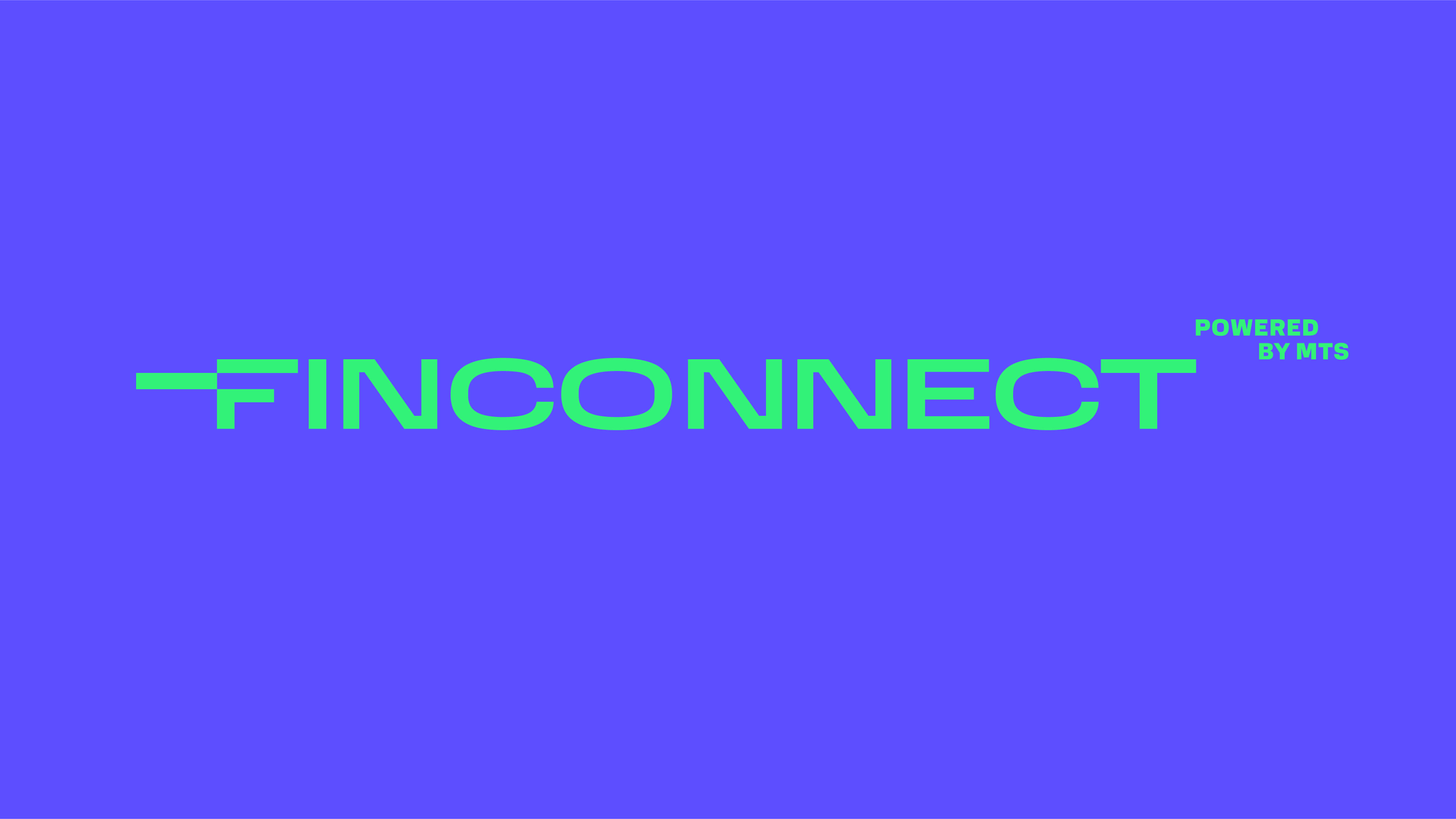
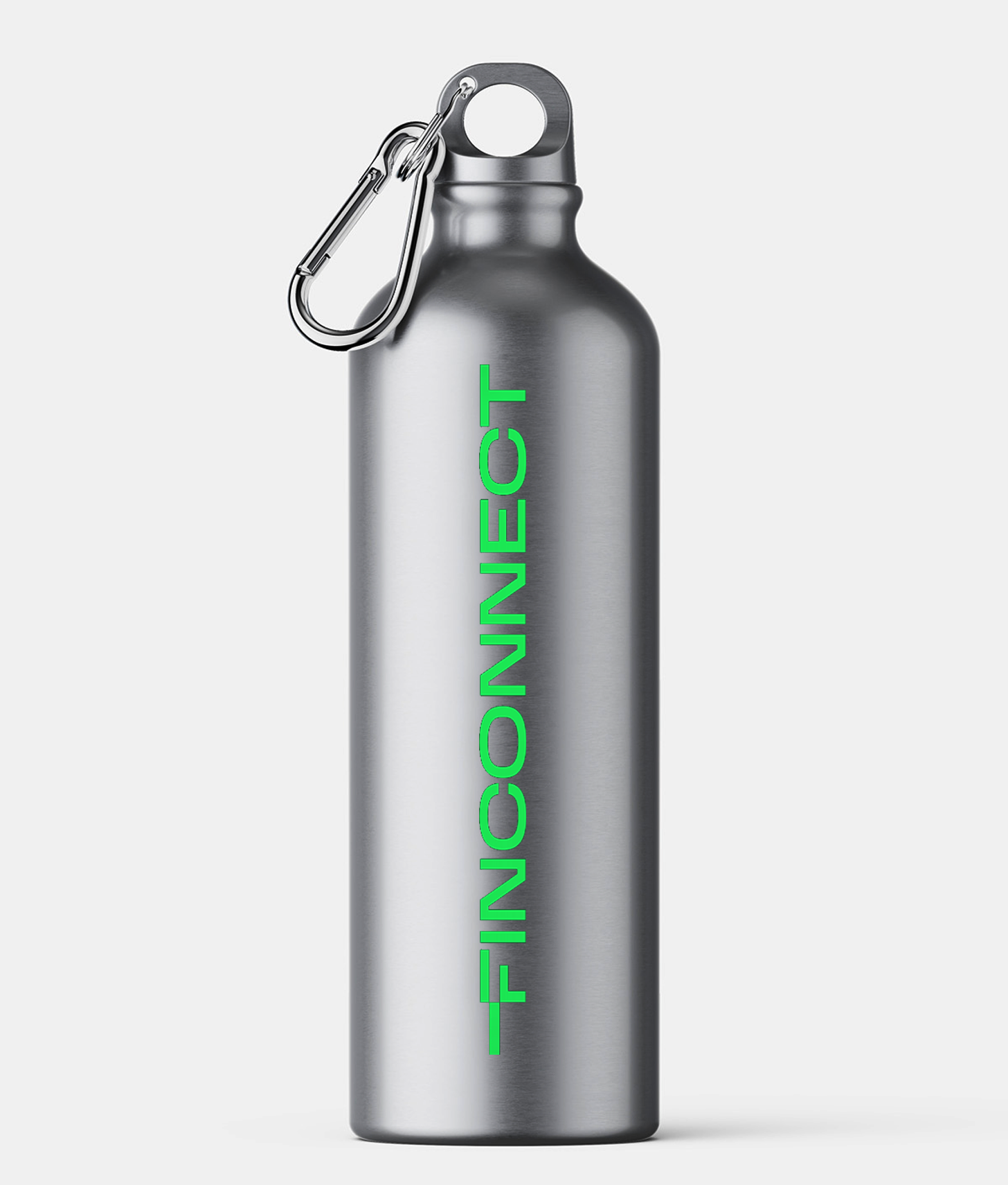
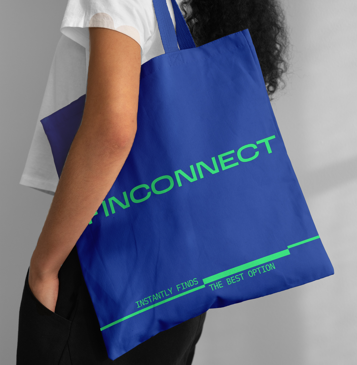
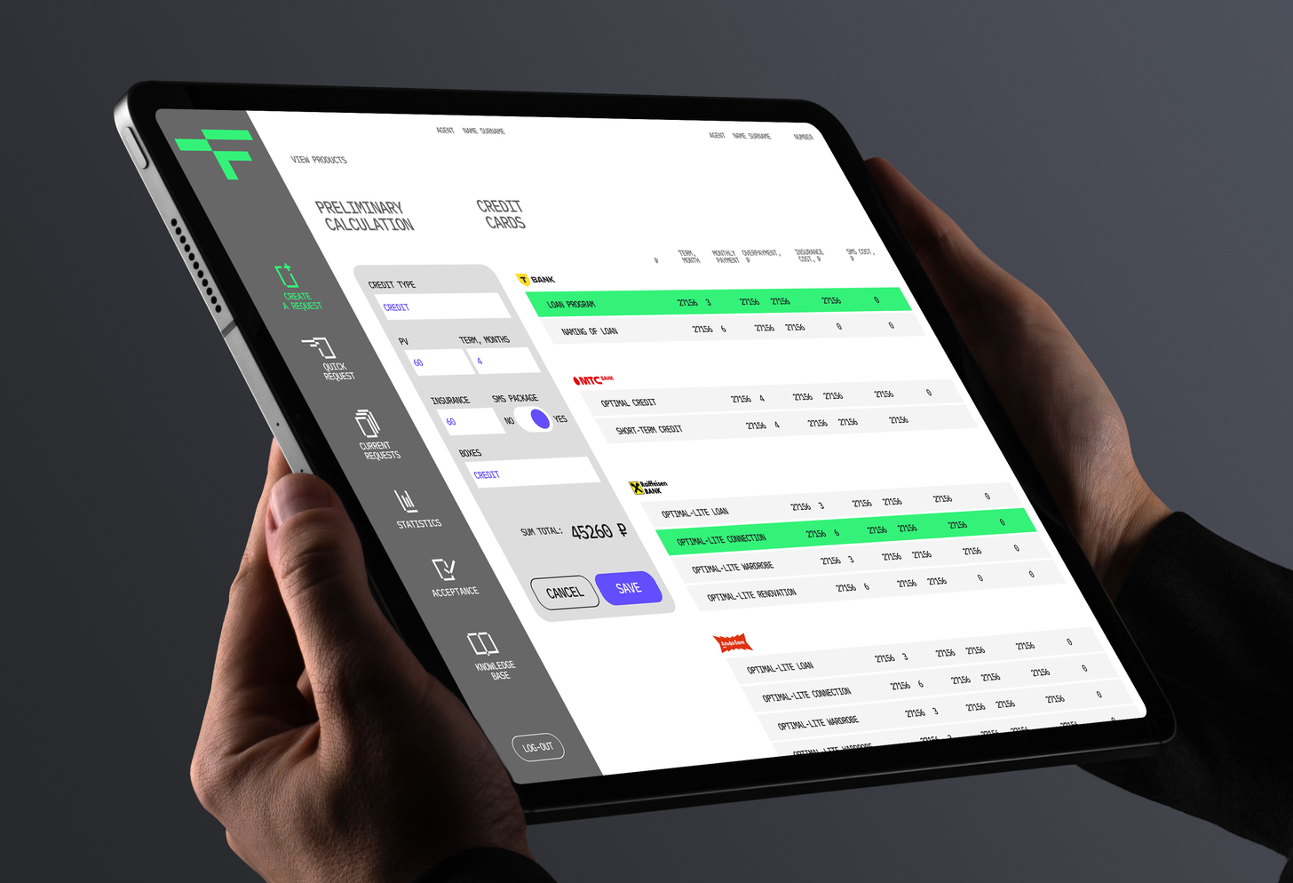
to develop wordmark that will reflect clearly the brand positioning and the same time most important points in service mechanic. the woodmark have to have potencial for building accomplished identity around it
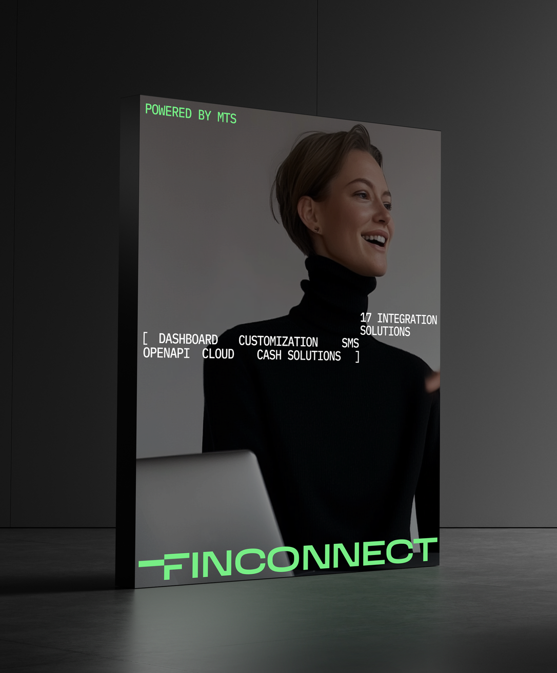
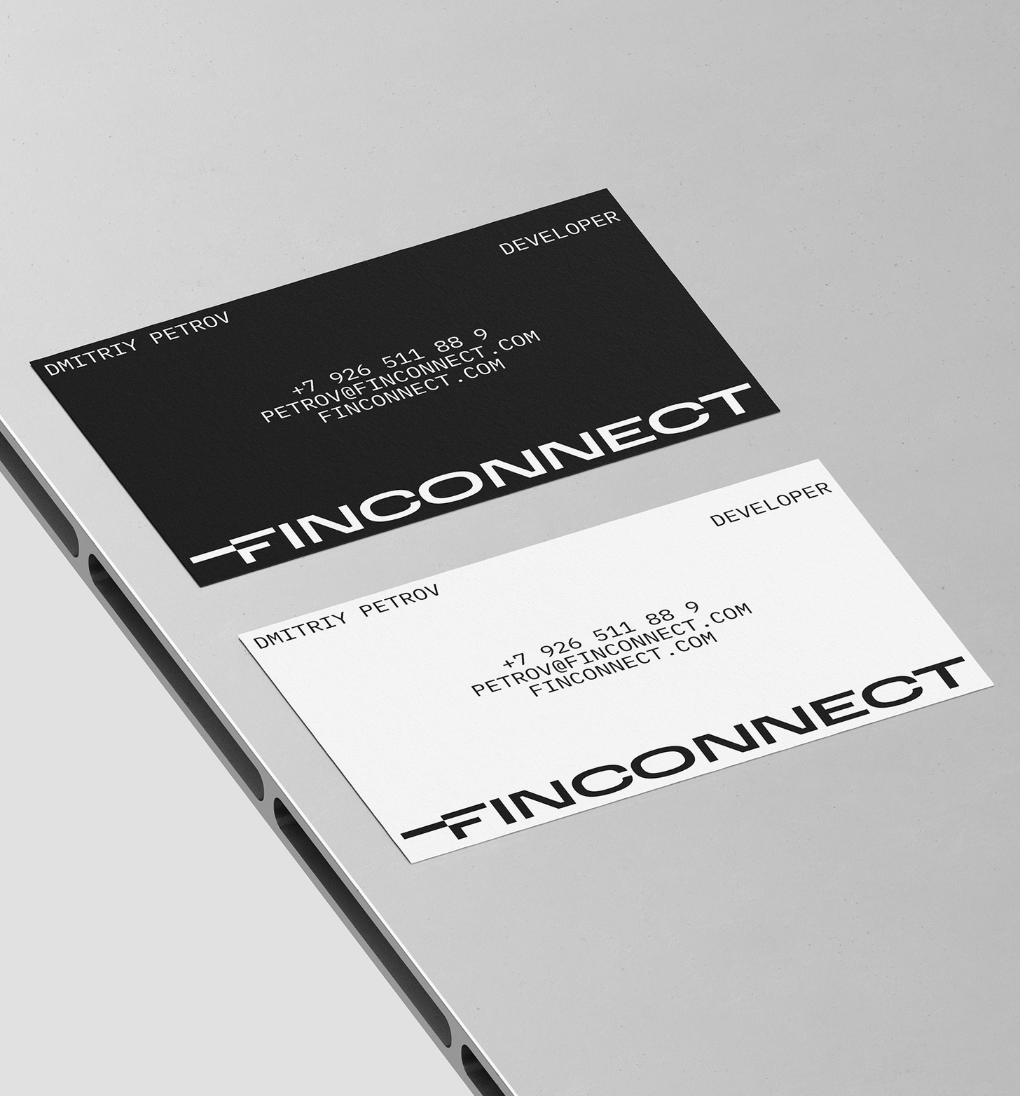
the striking logo represents several important points: assement of options, sharp connection, speed of service, cutting edge technologics. tailor made letter F transfers all this meanings and all the other support it
TARGET
solution
fintech
/
/
the characteristic letter F becomes the branded application icon
2023, 2025
FINCONNECT
TECHNOLOGICAL PLATFORM FOR RETAIL THAT QUICKLY picks up LOANS
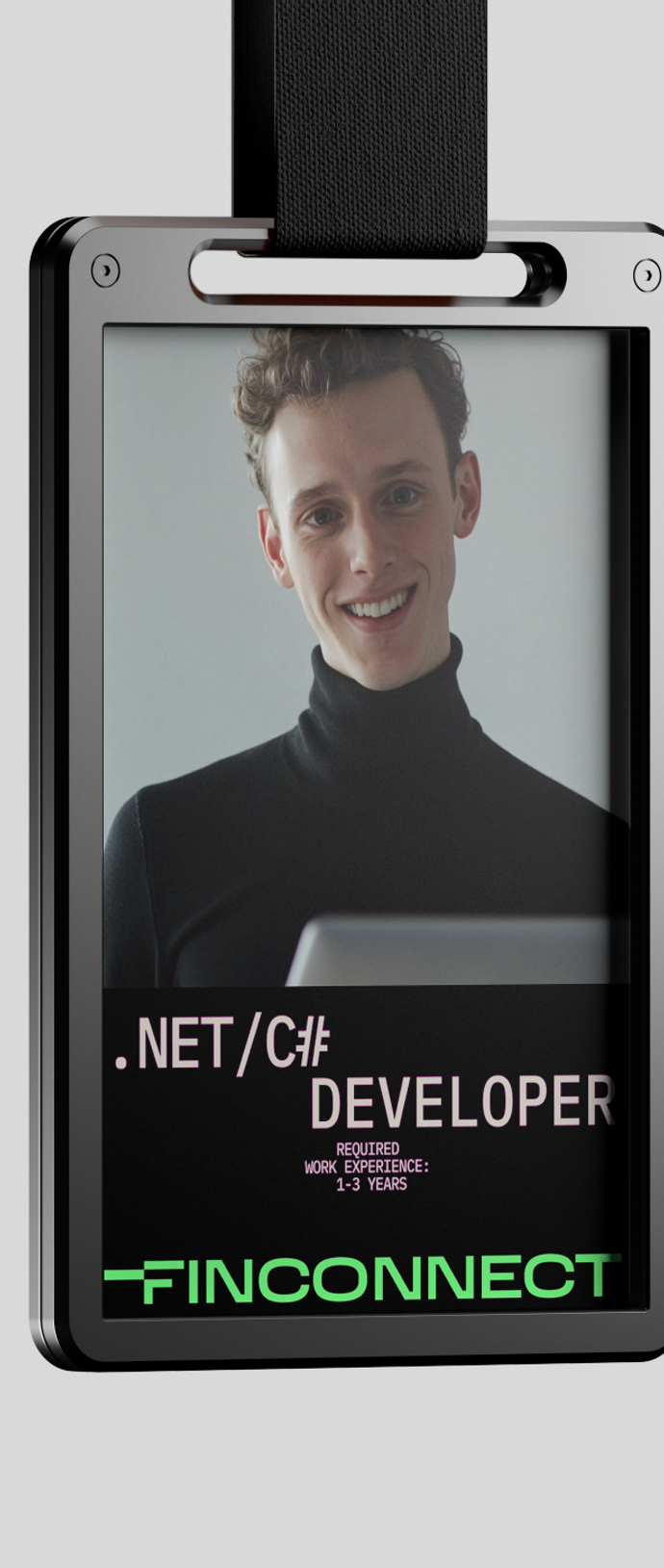
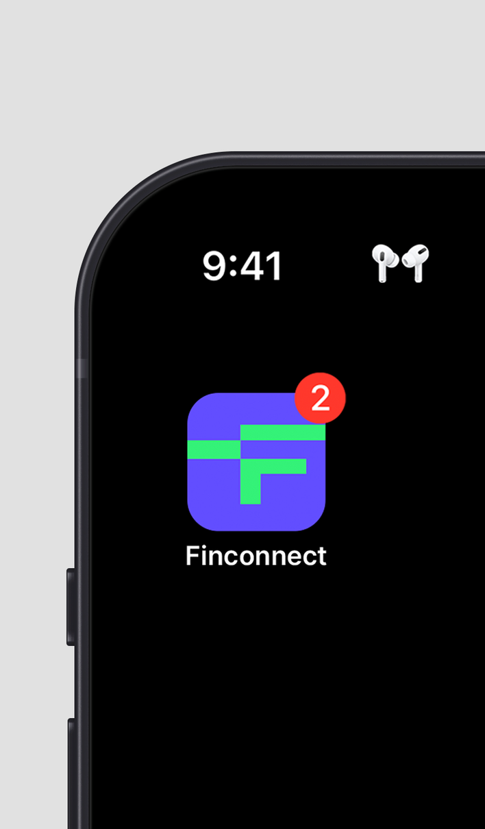
the characteristic letter F becomes the branded application icon
bbdo moscow
agency

ONO is a large fintech company, that provides support in the fueling, transportations and logistics. The company facilitates the partners growth through developing and streamlining their processes. It was important to showcase the flexibility of the service, seamlessness, optimality and top-notch technologies
THE ESSENCE OF THE CONCEPT IS THE IDEA THAT NATURE INSPIRED STRUCTURES AND SHAPES REFLECT THE FLEXIBILITY, GROWTH, SEAMLESS AND OPTIMAL APPROACH OF THE SERVICES.
THE CHARACTERISTIC TRAIT OF THE DESIGN IS COMBINATION OF ORGANIC INSPIRED GRADIENT SHAPES AND ALL THE OVER ELEMENTS THAT located along THE MODULAR GRID
TARGET
solution
fintech
/
/
The feeling of collaboration of elements and structure is essential
2023
ONO
b2b fintech operator providing services optimising businesses
bbdo moscow
agency
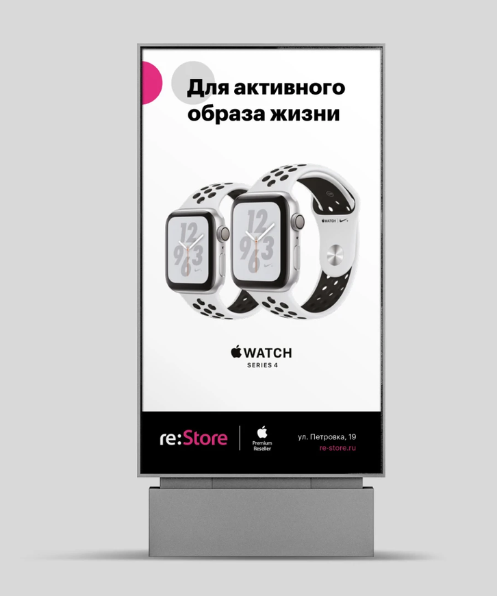
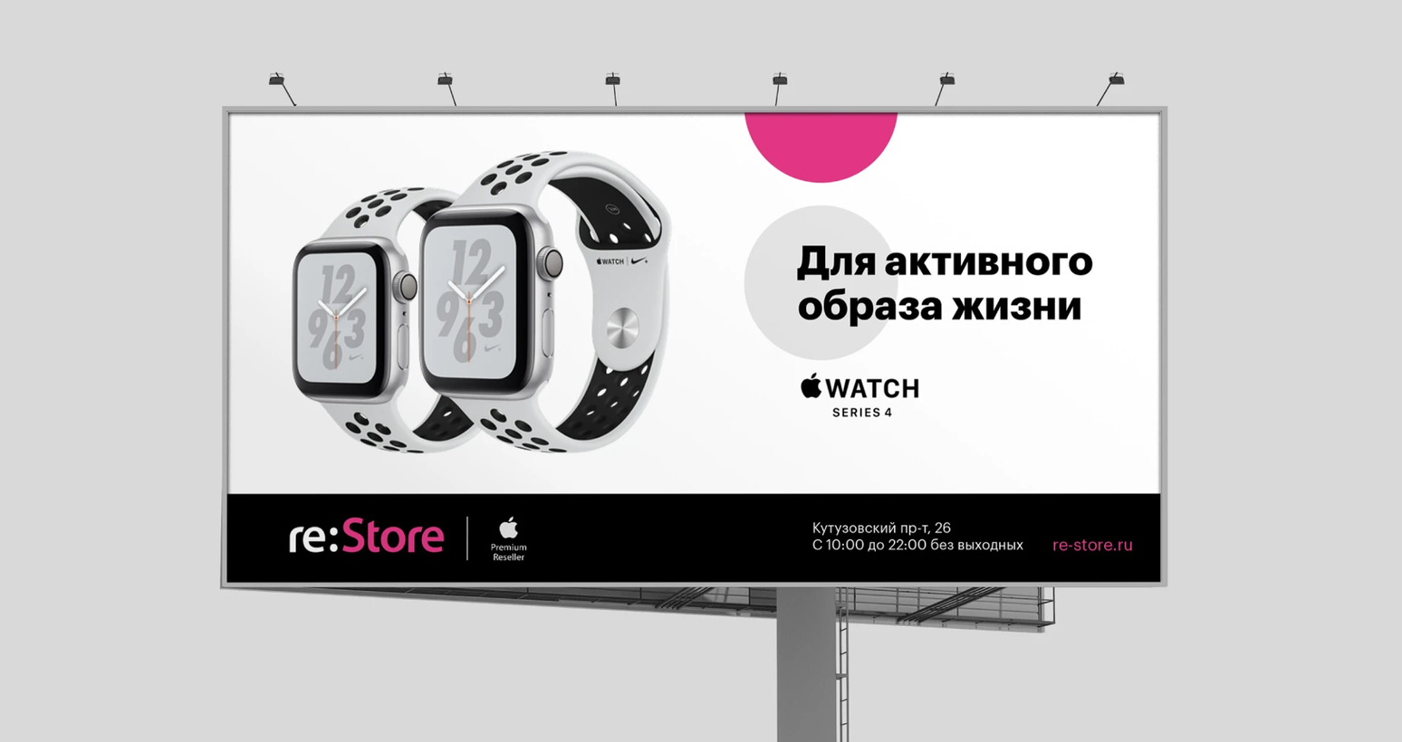
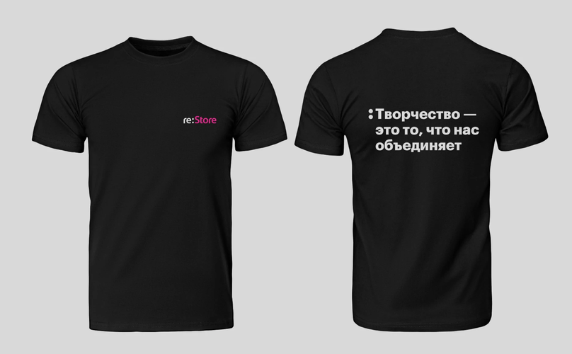
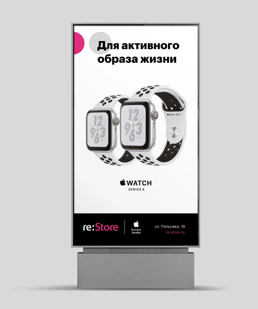
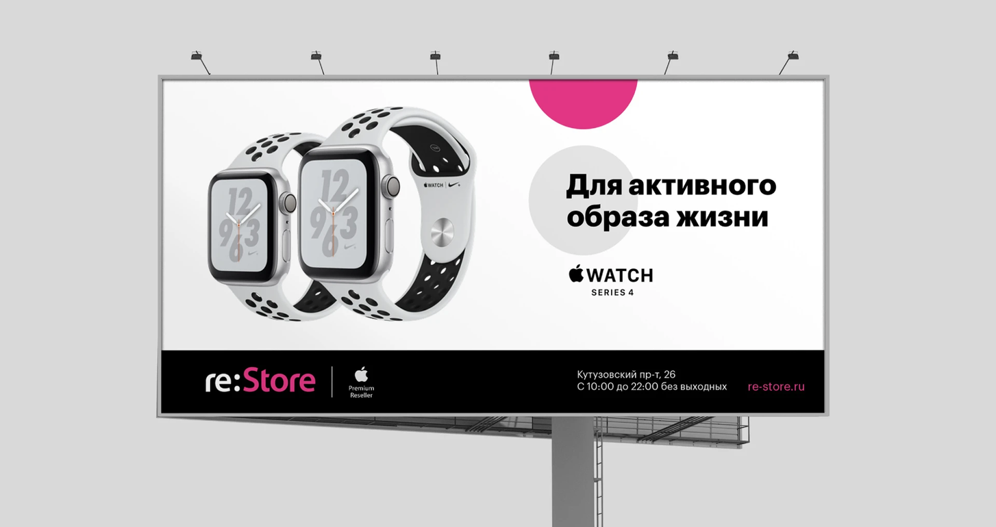
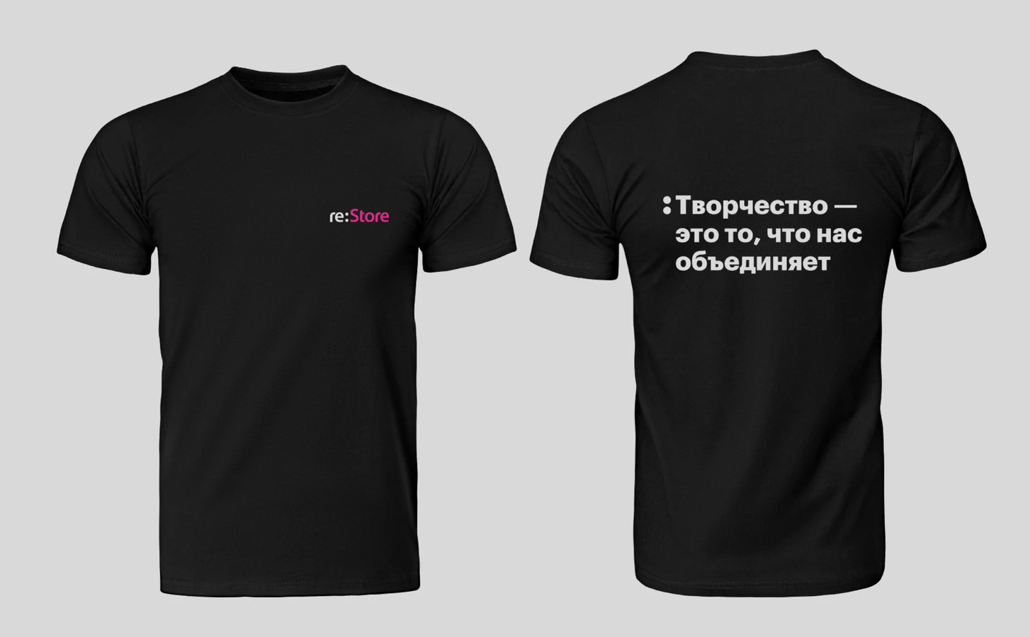
to create a new graphic style while preserving the logo and formalizing the communication system in the form of a brand book.
THE IDEA IS TO UNLEASH THE POTENTIAL OF THE COLON INCLUDED IN LOGO. THE LACONIC CHARACTER OF ELEMENTS LETS PLAY WITH THEM many DIFFERENT WAYS, KEEPING THE INTEGRITY OF THE BRAND COMMUNICATION THE SAME TIME
TARGET
solution
fintech
/
/
2019
RE:STORE
Identityand brand book
LINII
agency
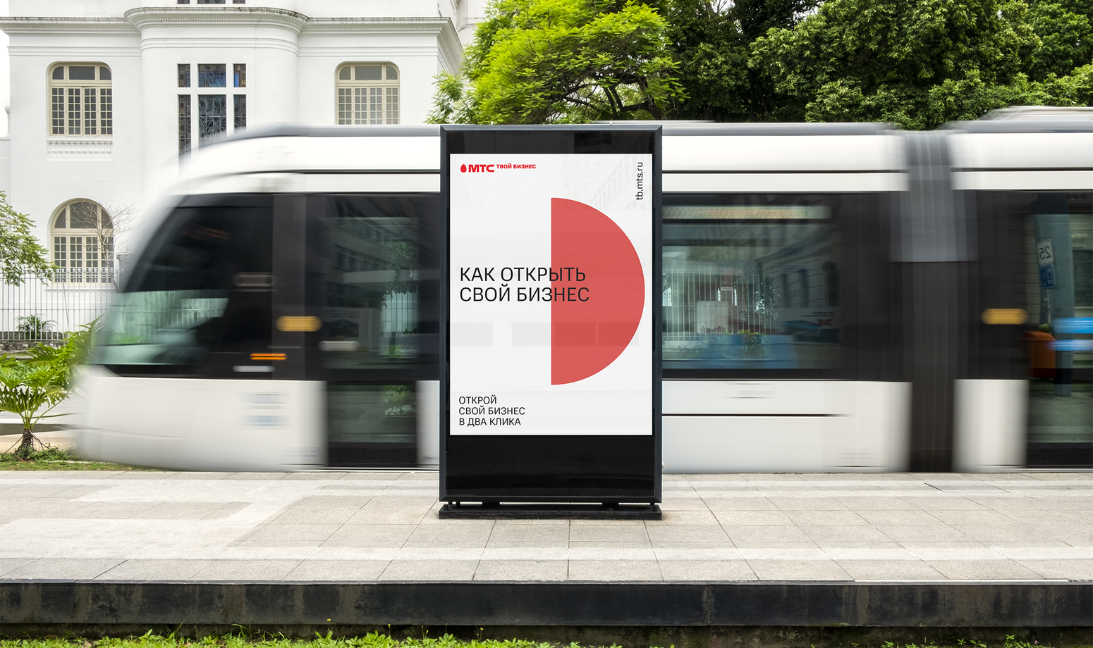
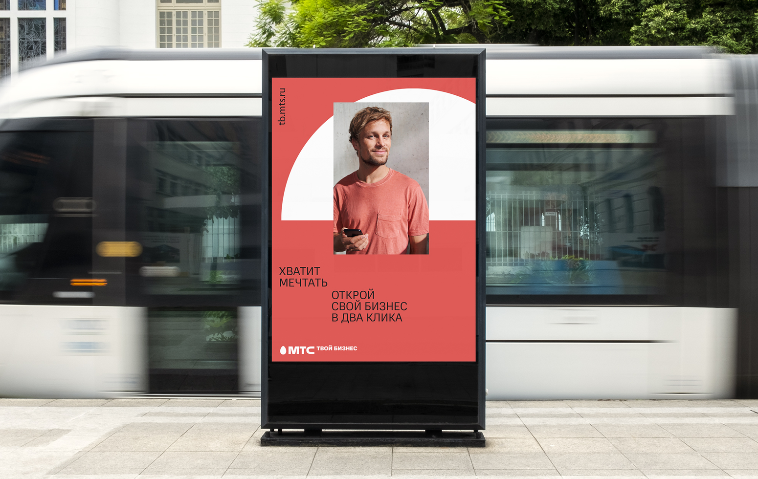
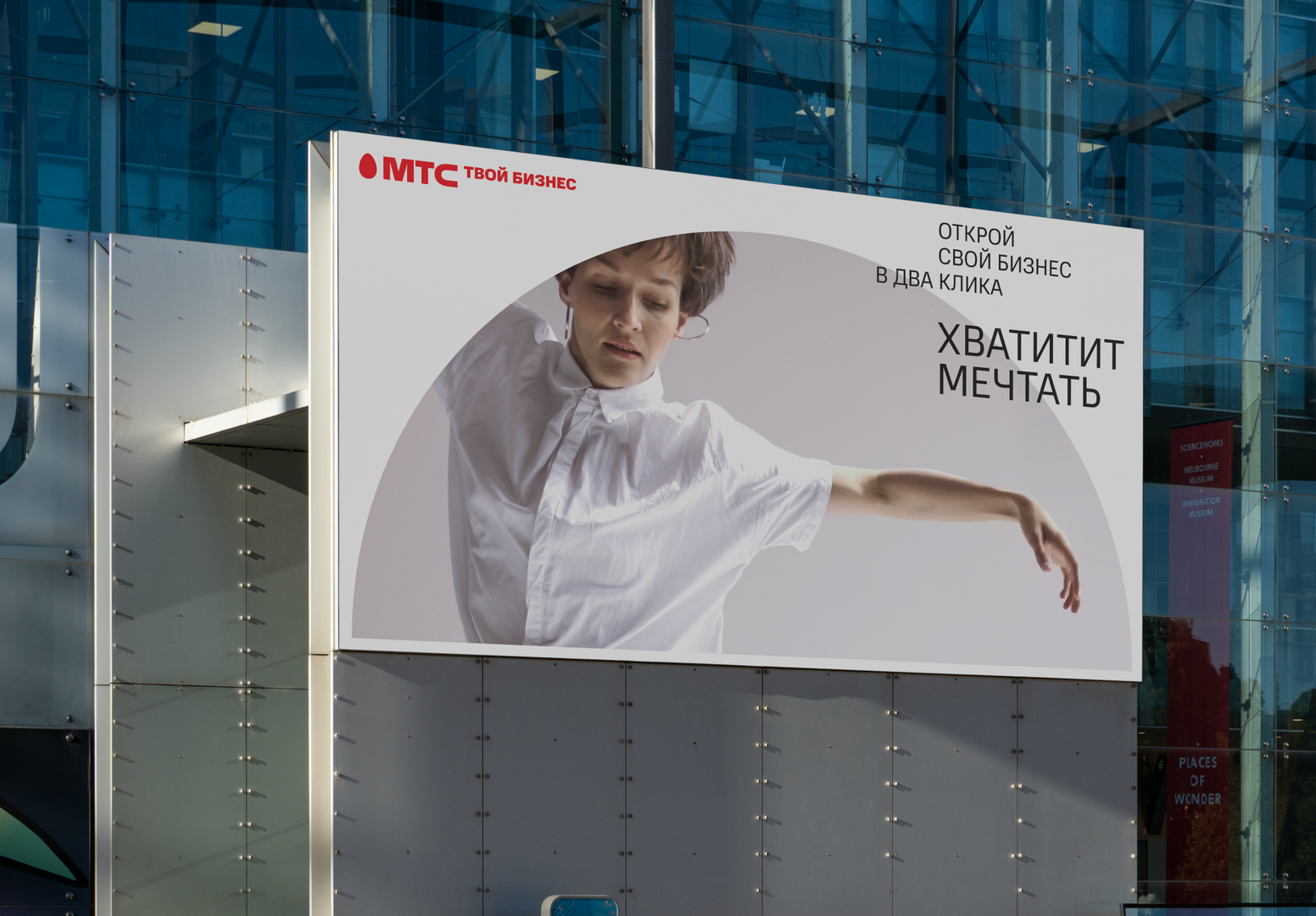
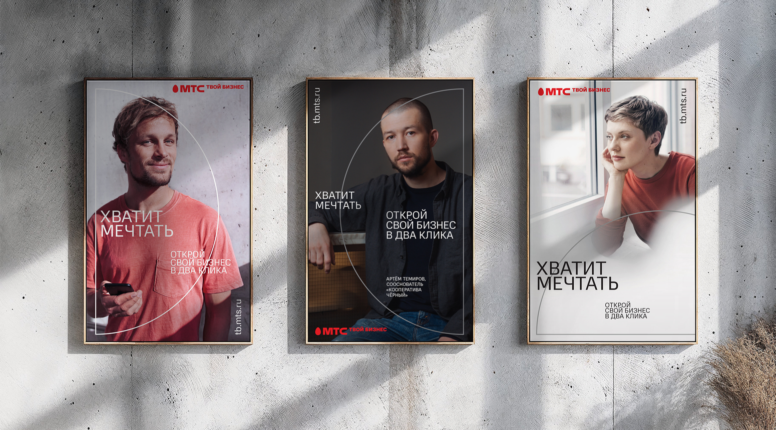
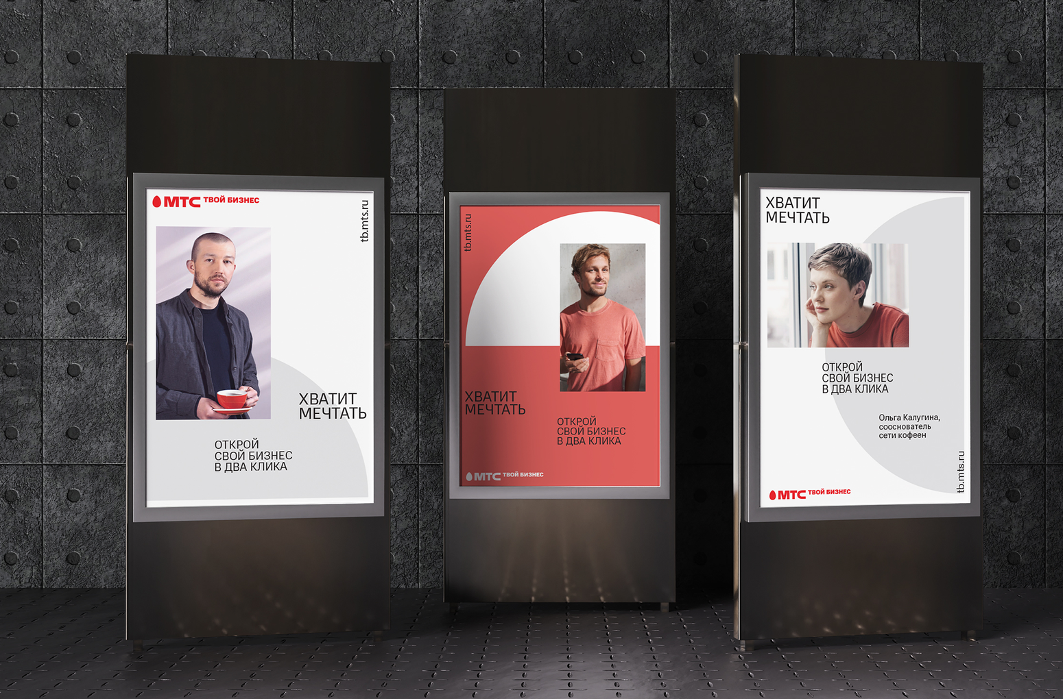
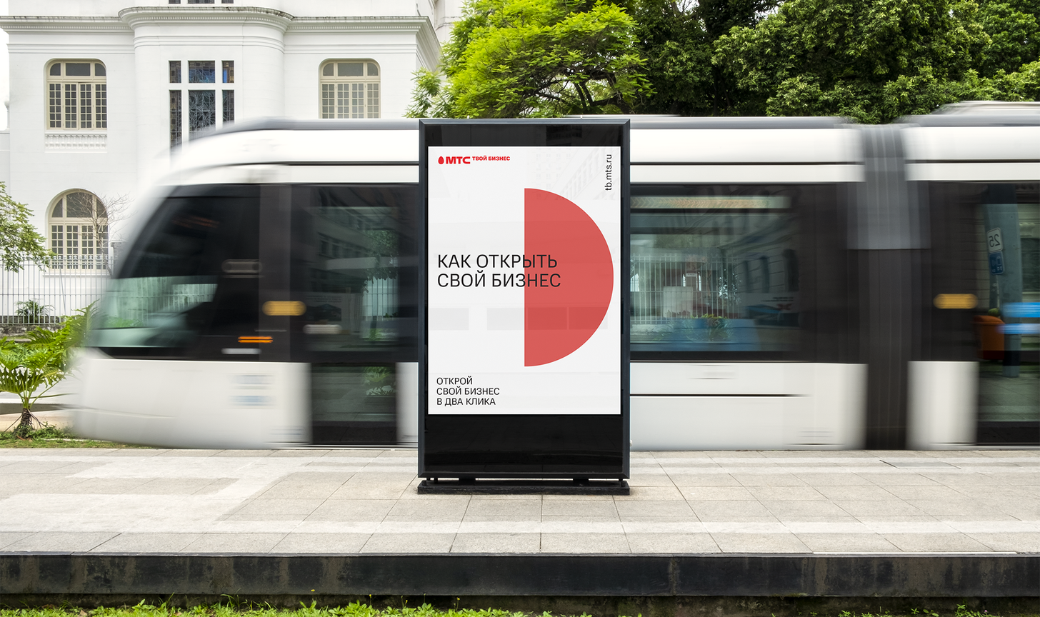
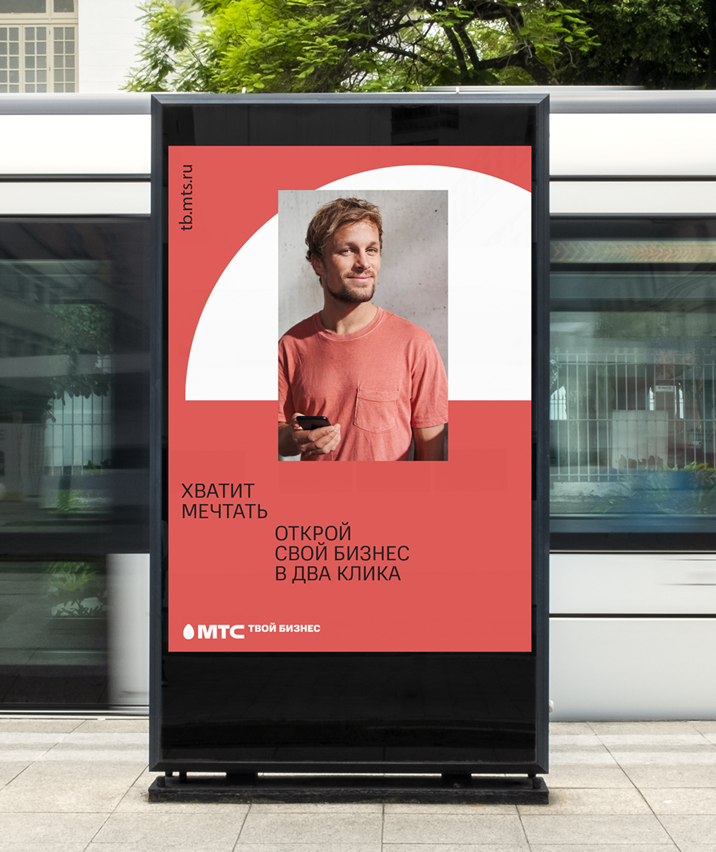
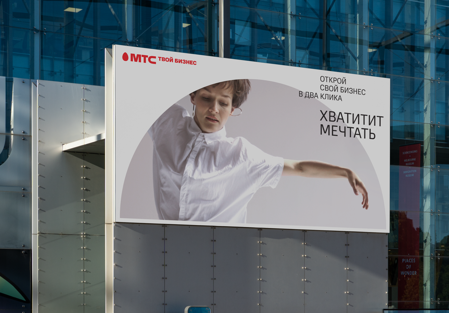
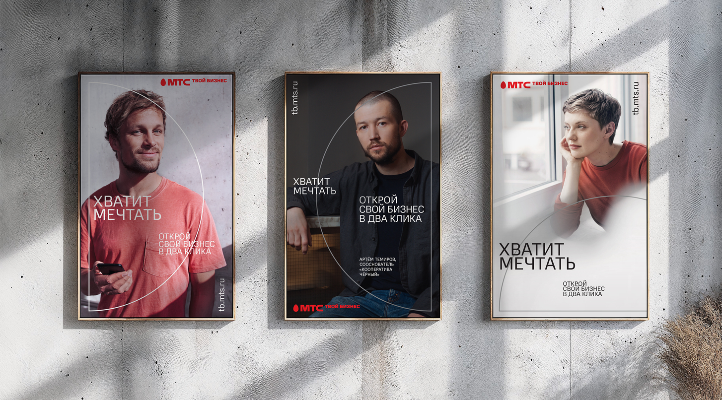
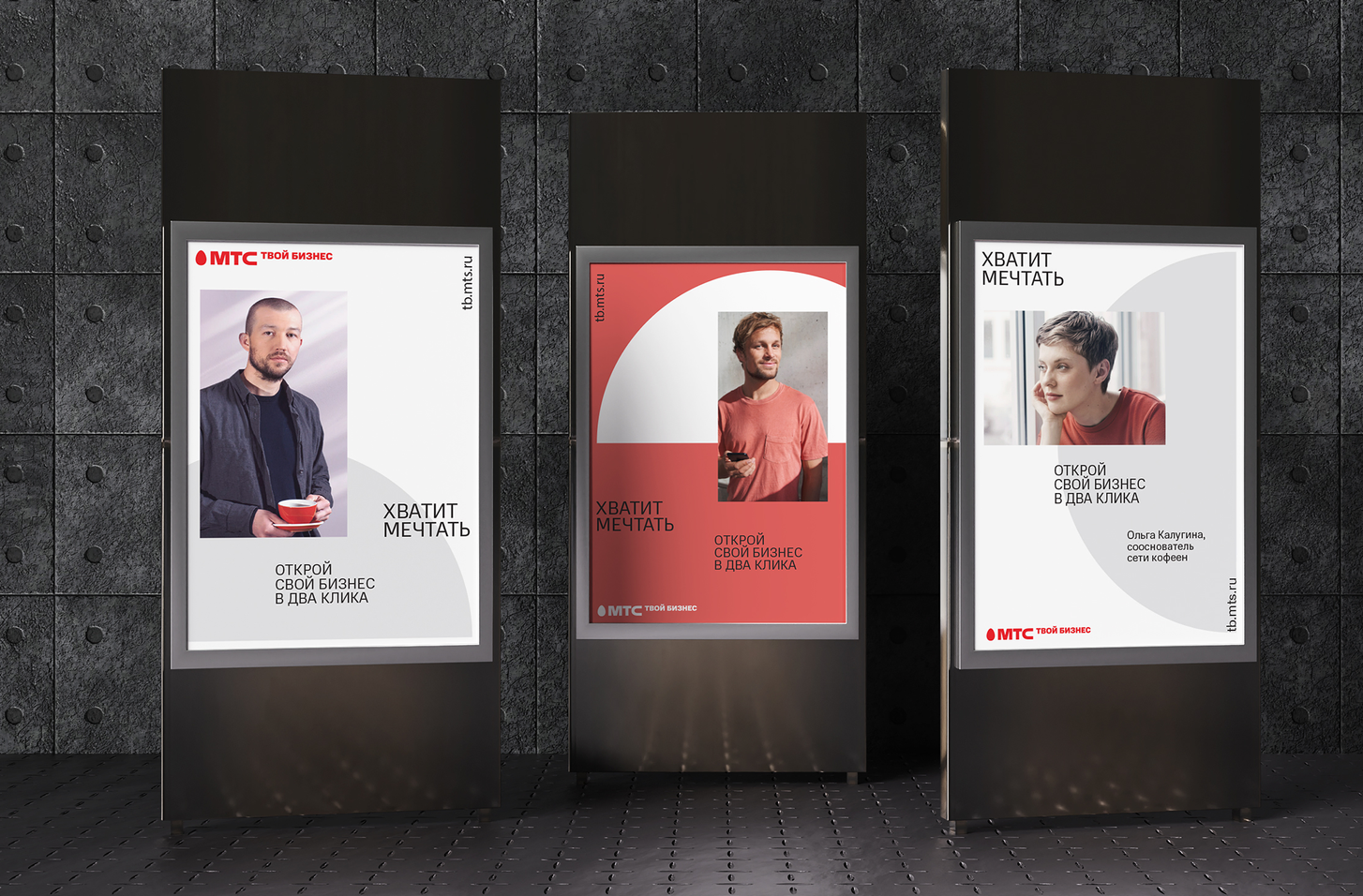
TO DEVELOP VISUAL IDENTITY FOR MTS YOUR BUSINESS SERVICE. THE BRAND ALREADY HAD TWO VISUAL CONSTANTS SUCH AS THE LOGO AND HALF OF THE CIRCLE SHAPE THAT CONSIDERED AS ALLUSION TO A COIN. SO THE CHALLENGE WAS TO BUILD A VISUAL IDENTITY THAT WILL include THESE CONSTANTS AND will enrich the brand narrative
THERE IS FIGURE IN SPEECH "BUSINESS TURNOVER" OR "BUSINESS IS SPINNING". AND THIS IDEA BECAME THE ESSENTIAL ONE. It IS TO CONSIDER HALF OF THE CIRCLE NOT AS A STATIC SHAPE BUT AS A MOVING ONE, THE ONE THAT ROTATES REMINDING THE rythm of CLOCKS. IT REPRESENTS HOW THE BUSINESS SHOULD WORK: TO spin AND BE sharp as CLOCKS
TARGET
solution
fintech
/
/
2022
mts your business
Identity and brand book
bbdo moscow
agency
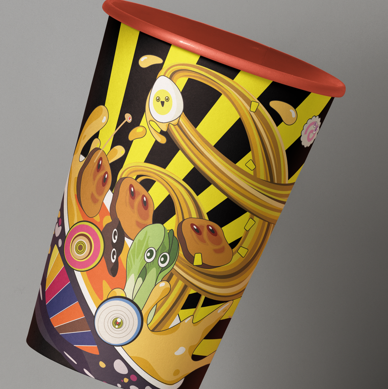
the graphic style allows you to take parts of it and use them to brand different objects and situations. graphics mix well with real photos or objects, which helps to prepare content for social networks, decorate pumpkins for Halloween in the style of a brand, or once make your own branded mask for instagram with crazy eyes and a smile like branded characters, or even make your own game app with augmented reality.

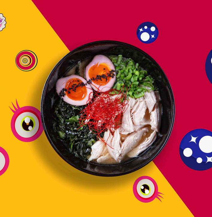
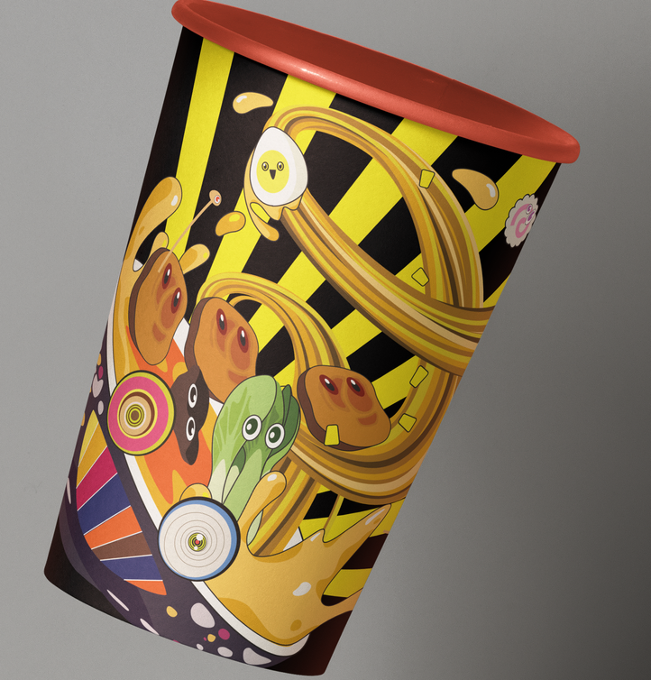
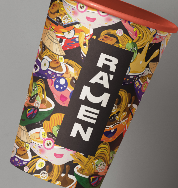
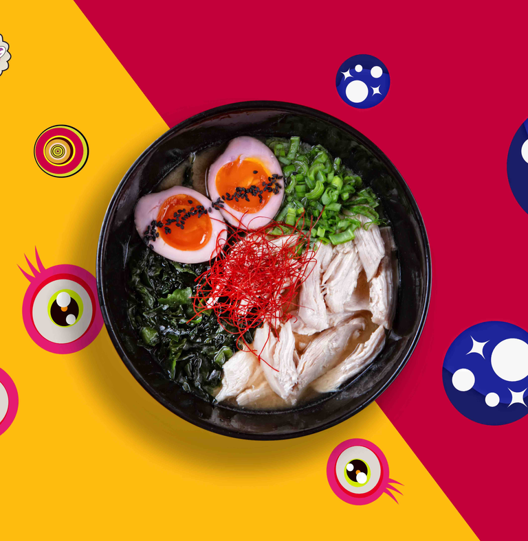
THE BAR'S IDENTITY WAS SUPPOSED TO CONVEY ITS CHARACTER: HIGH QUALITY PRODUCT, CLEAN MINIMALIST INTERIOR, MODERATE DEMOCRACY, AND ALL THIS WITHOUT TRYING TO DEPICT AUTHENTIC JAPAN
THE IDENTITY THAT WAS BEING DEVELOPED HAD TO COMBINE AN INTERESTING SET OF IMAGES: JAPAN, BUT NOT TOO TRADITIONAL, A GEEK CHARACTER, AN URBAN SPIRIT, AND AT THE SAME TIME LACONICISM.
TARGET
solution
HORECA
/
/
2019
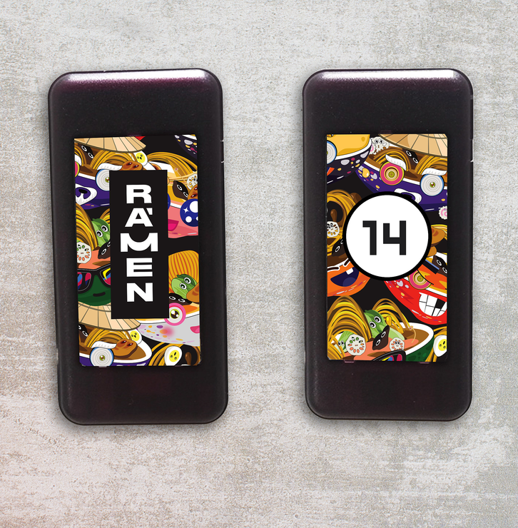
RAMEN BAR
CHAIN OF MODERN JAPAN CUISINE PLACES
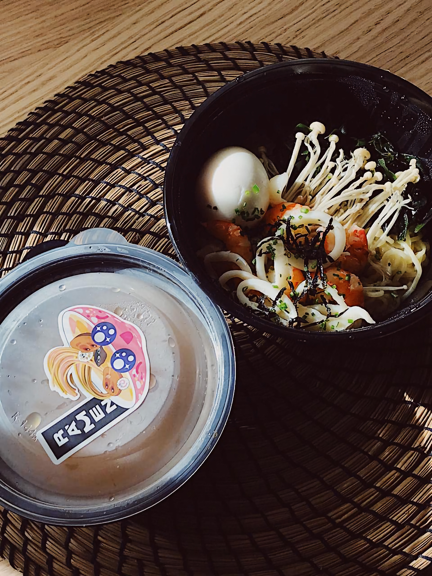

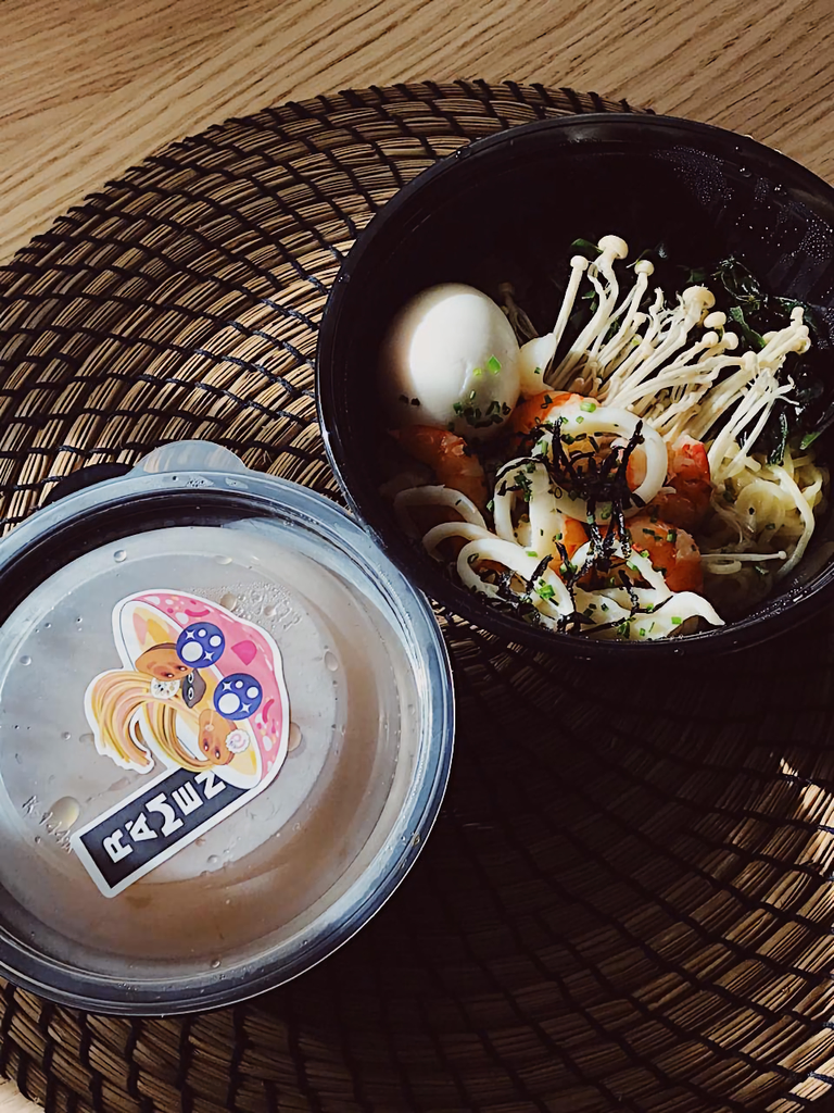
some more implementation photo
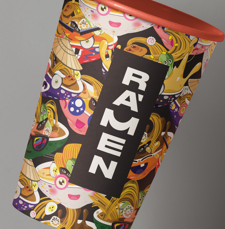
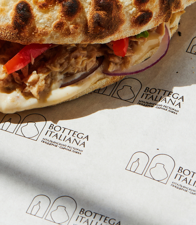
the design of the logo makes it easy to integrate the logo into the text set. examples of such integration are branded paper bags with branded copyrights that refer to fragments of Japanese popular culture well known throughout the world.
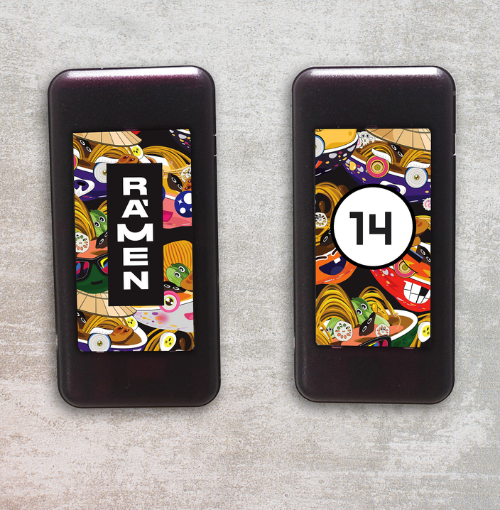
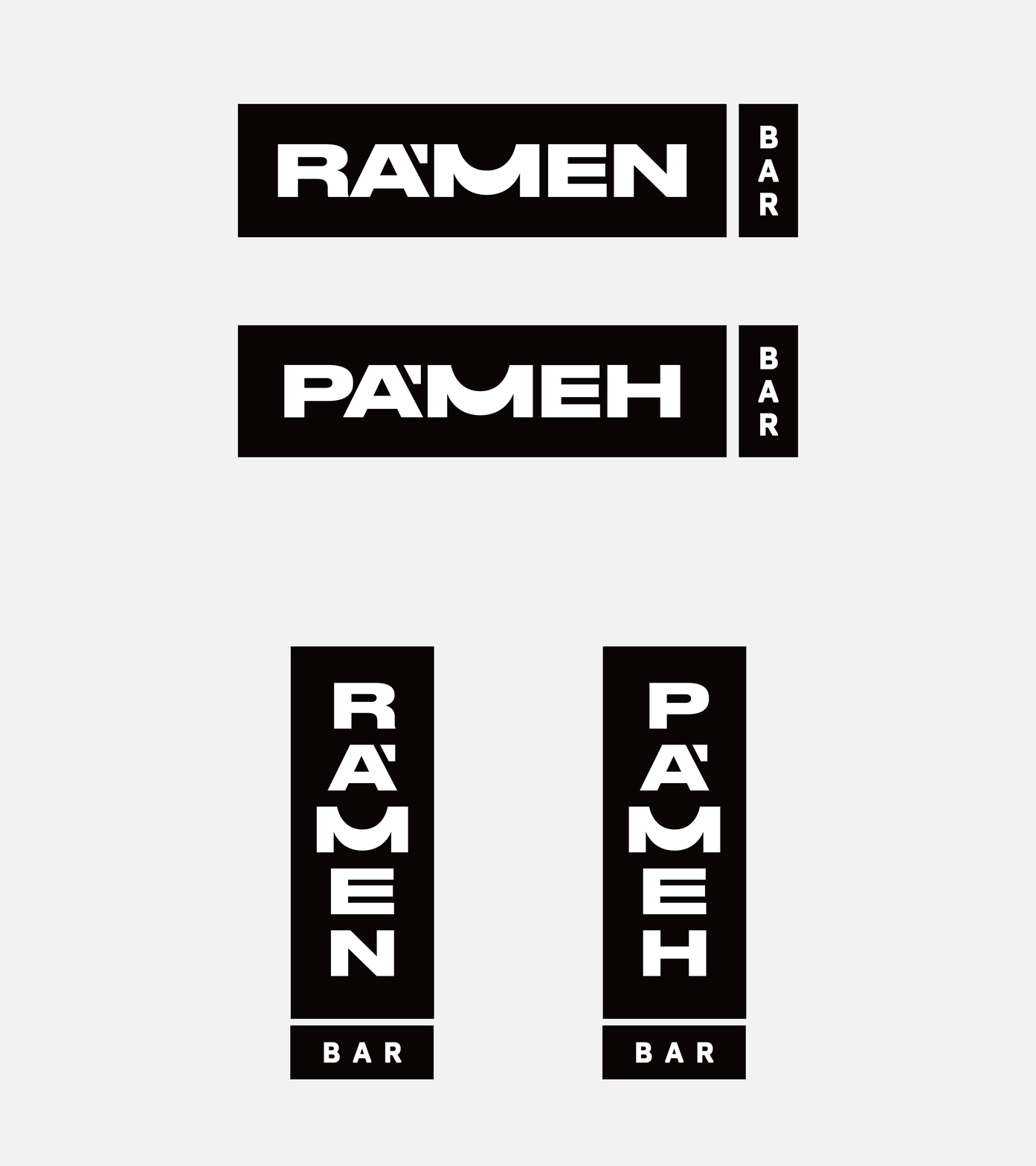
this simple solution allows the logo to work in cyrillic and in latin vertically and horisontally
THE LOGO IS CONSCIOUSLY SOLVED WITH THE HELP OF A NUANCE INTERVENTION IN THE CHARACTER OF THE ORIGINAL FONT, A SPECIALLY DRAWN M IS USED, WHICH HAS A REFERENCE TO THE SHAPE OF A BOWL WITH A RAMEN AND and a nice hint of a smile and, to the right extent, refers to Japanese typography

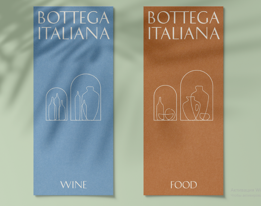
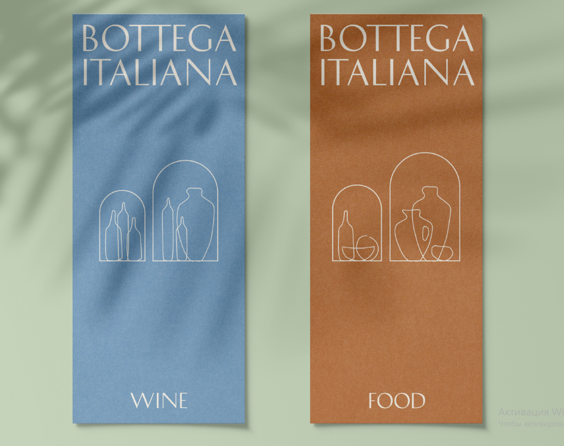
BOTTEGA ITALIANA
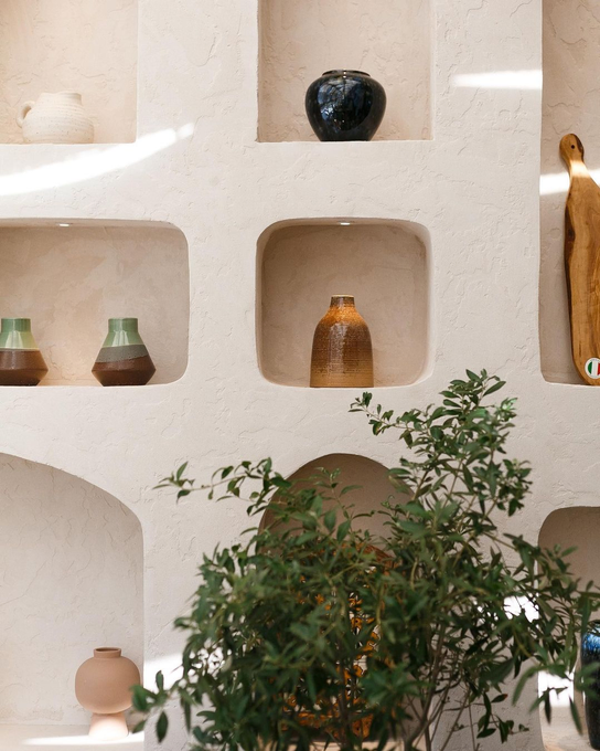
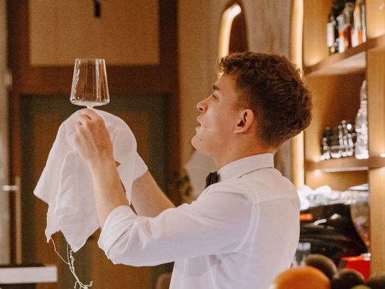
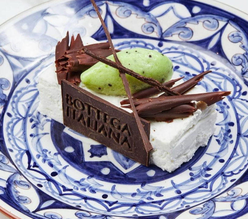
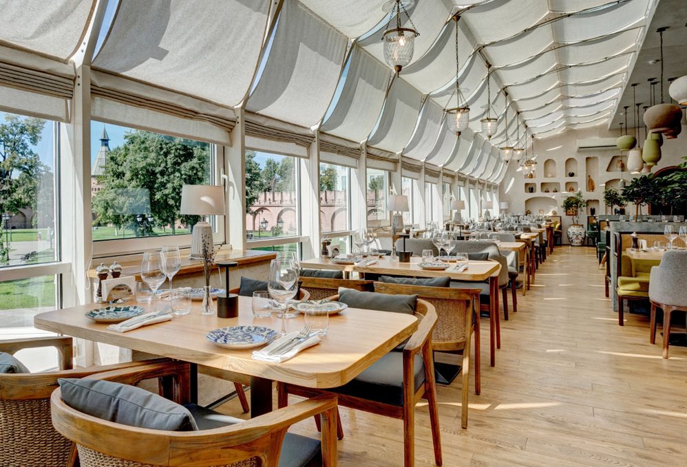
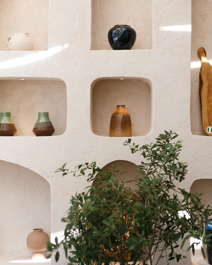
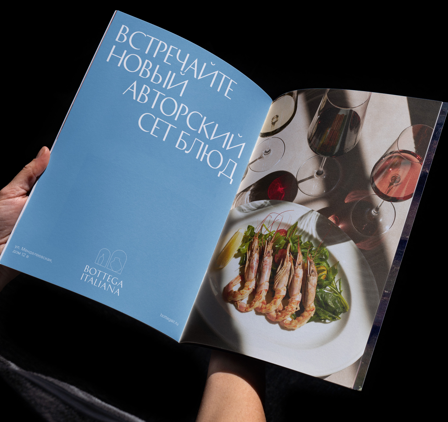
Bottega (translated from Italian) is a craft workshop. The restaurant's image combines elegance and references to craftsmanship. The restaurant's interior is full of arches and niches. Traditional vessels and pots are also used in the design of the restaurant; they are placed in niches and even turned into chandeliers. The artisanal image is emphasized not only by the interior and decor, but also by its own cheese factory and a large wood-burning oven in which delicious pizza is baked.
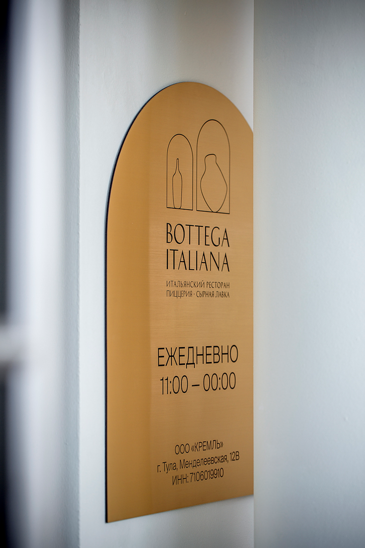
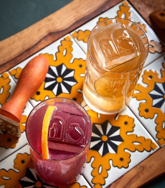
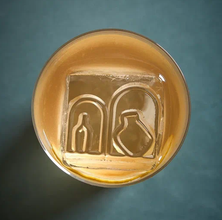
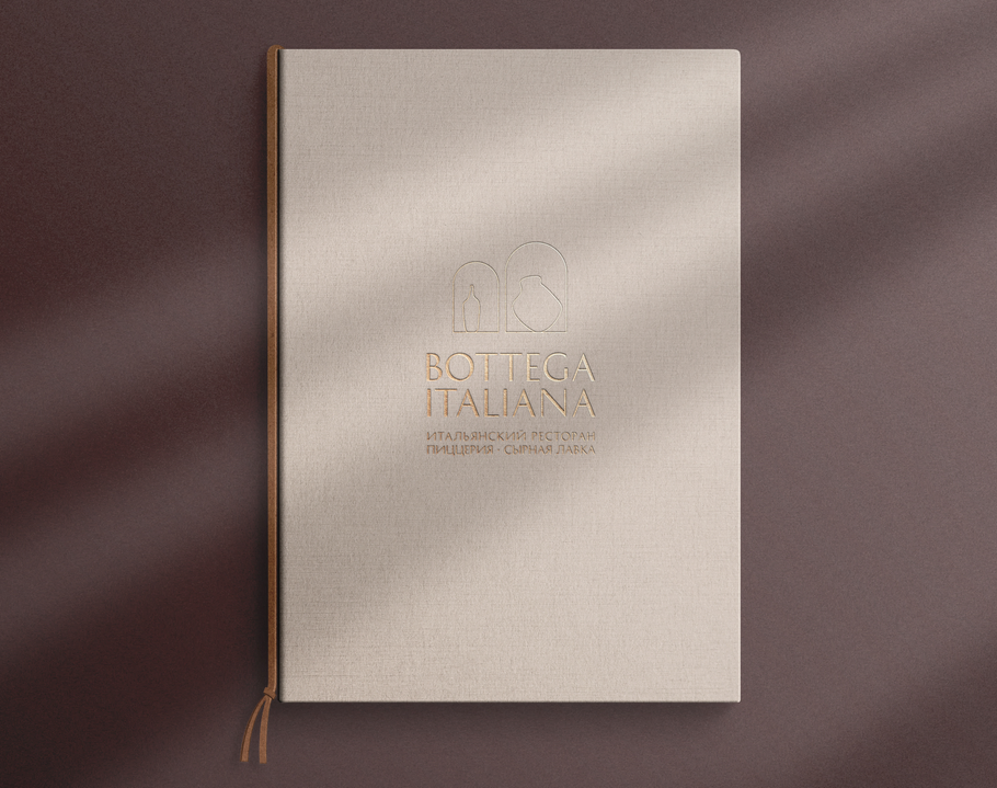
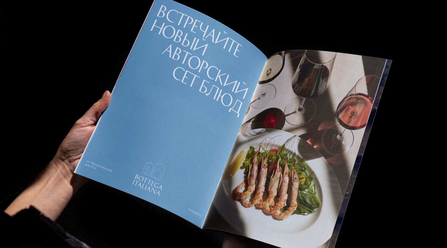
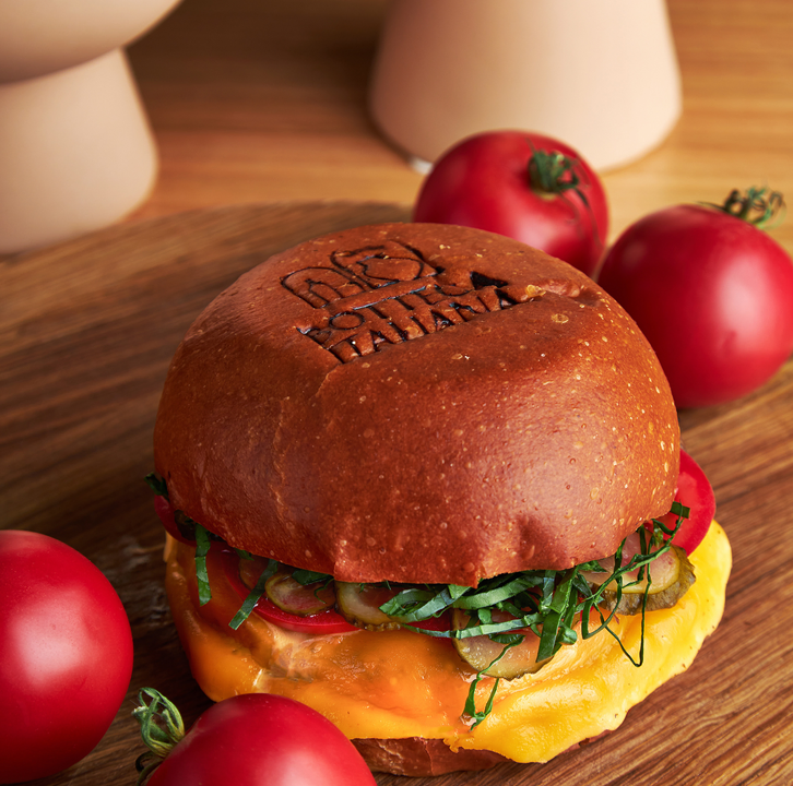
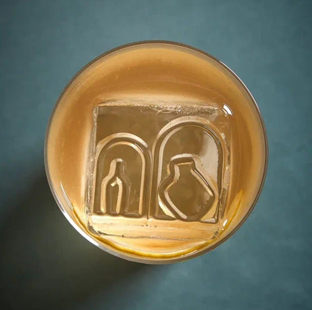
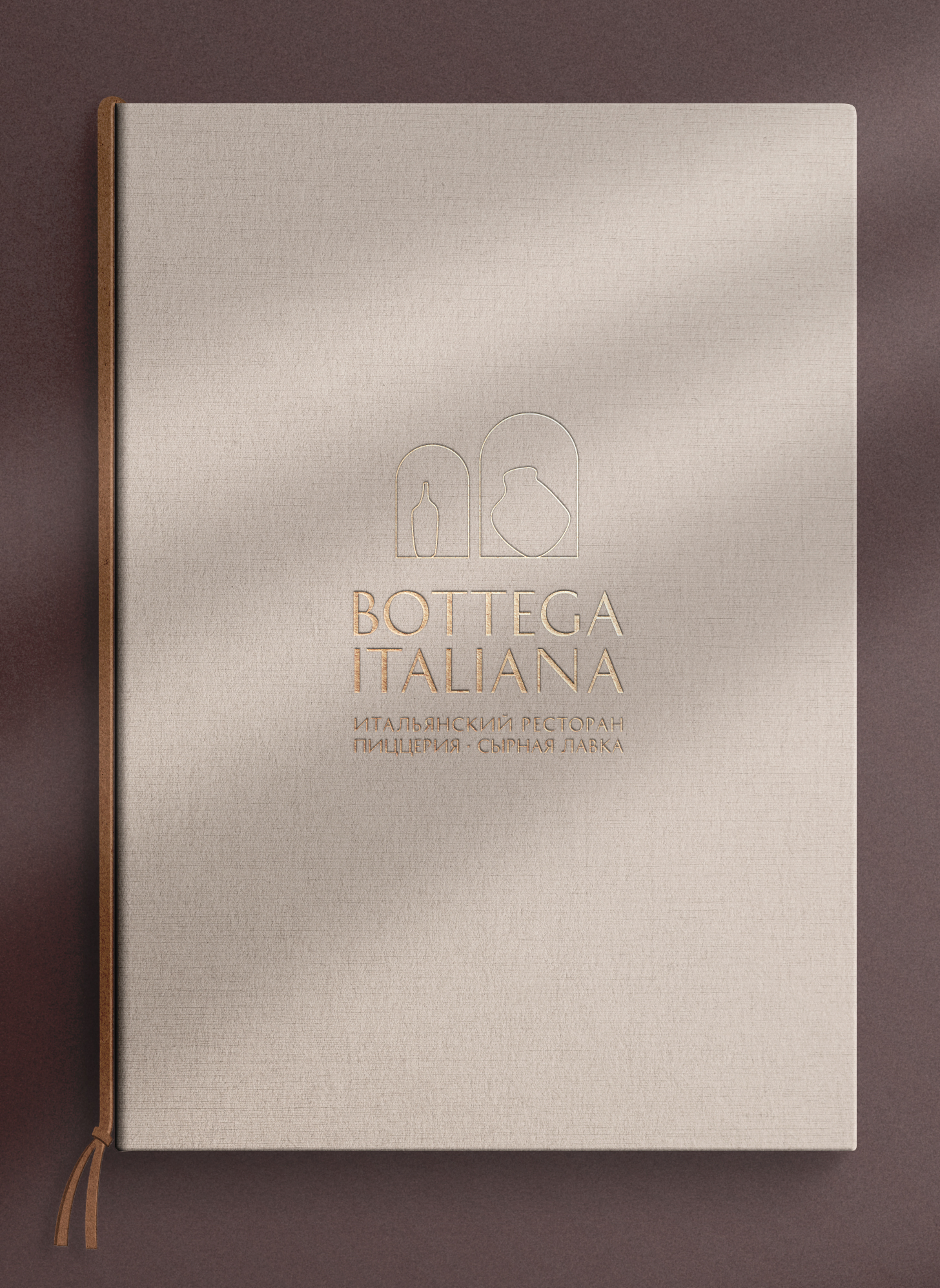
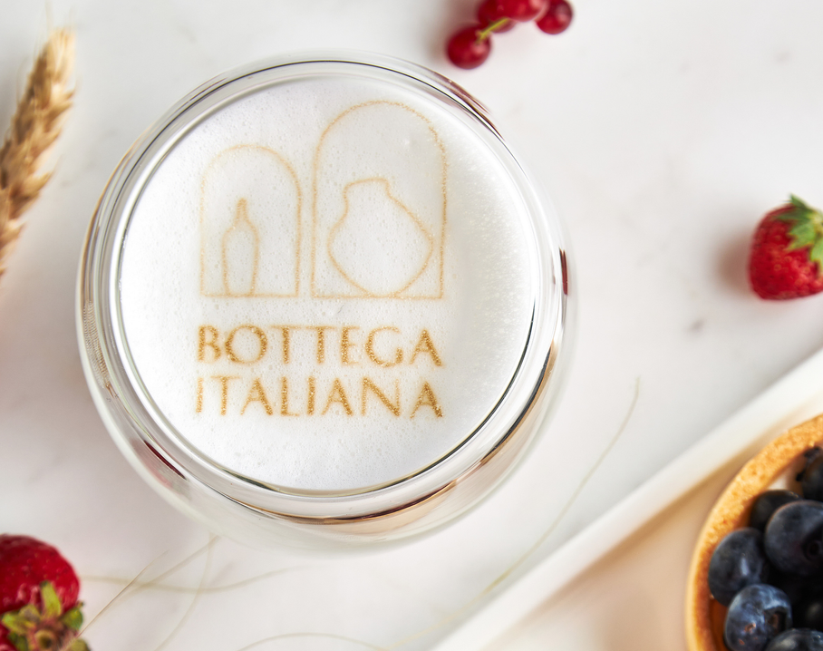
The identity is inspired by the combination of an elegant restaurant interior and a craft workshop theme. The restaurant sign reveals this contrast, it consists of two arches of pure geometric shape and in each of the arches there is a vessel of a living man-made form. The two arches not only refer to the interior, but also refer to the first letter of the name “B”. THE ARCH, WHICH HAS BECOME A BRAND ELEMENT, IS FURTHER USED IN BRAND COMMUNICATION
TARGET
solution
elegant ITALIAN RESTAURANT WITH wood stove and CRAFTED CHEESES
2021
HORECA
/
/
/
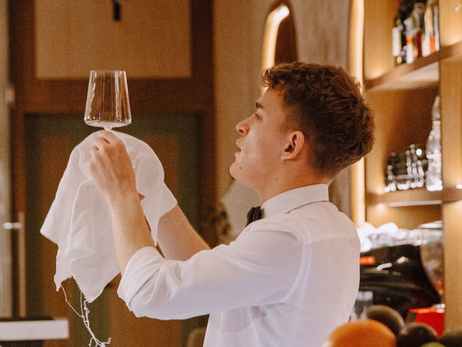
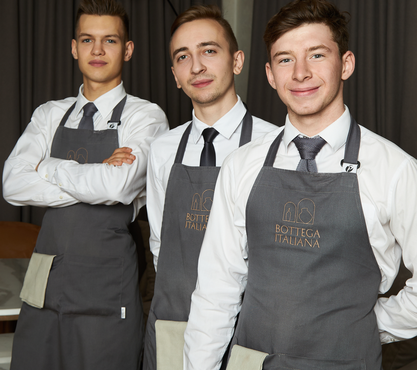
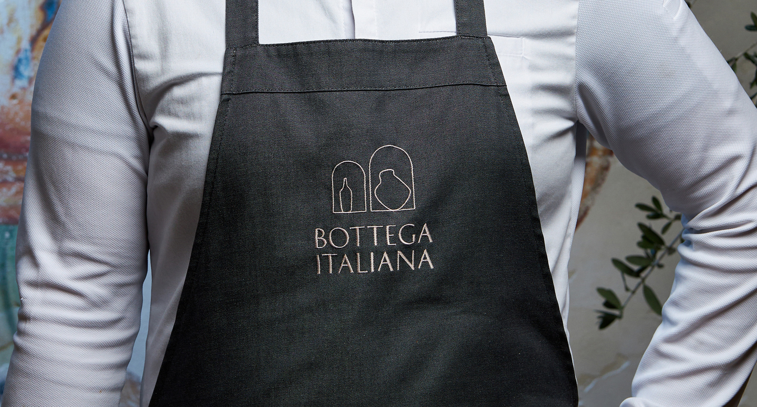
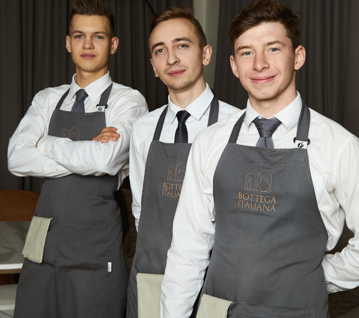
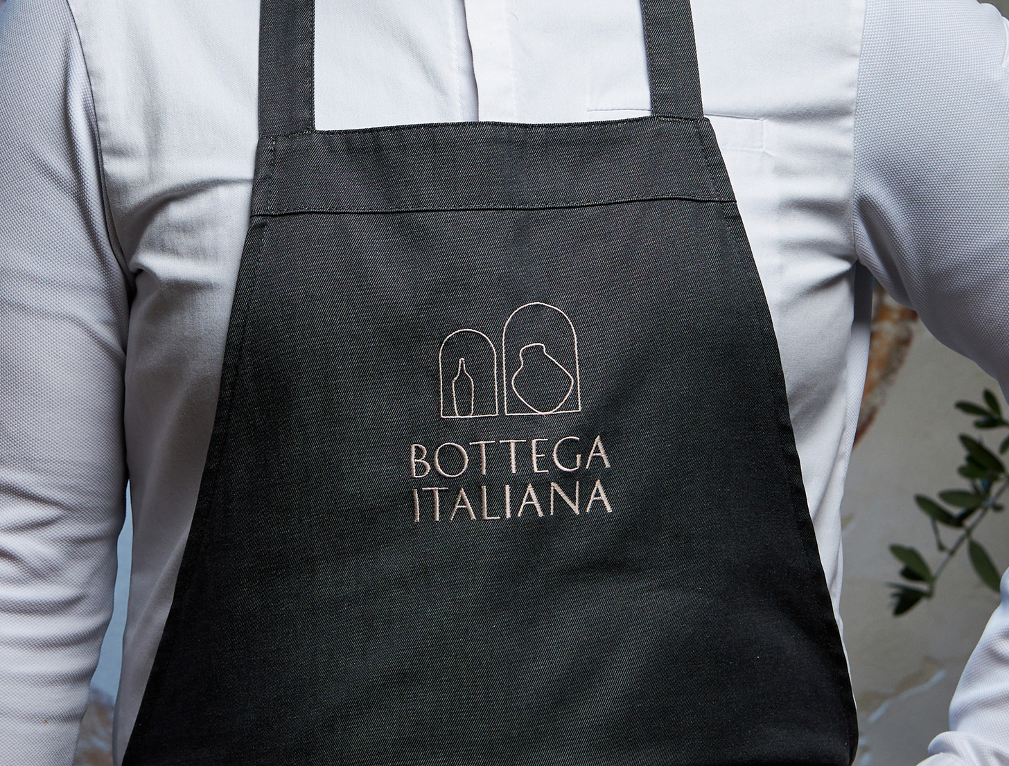
the laconic shape of the logo allows it to be reproduced using different techniques, such as embroidery
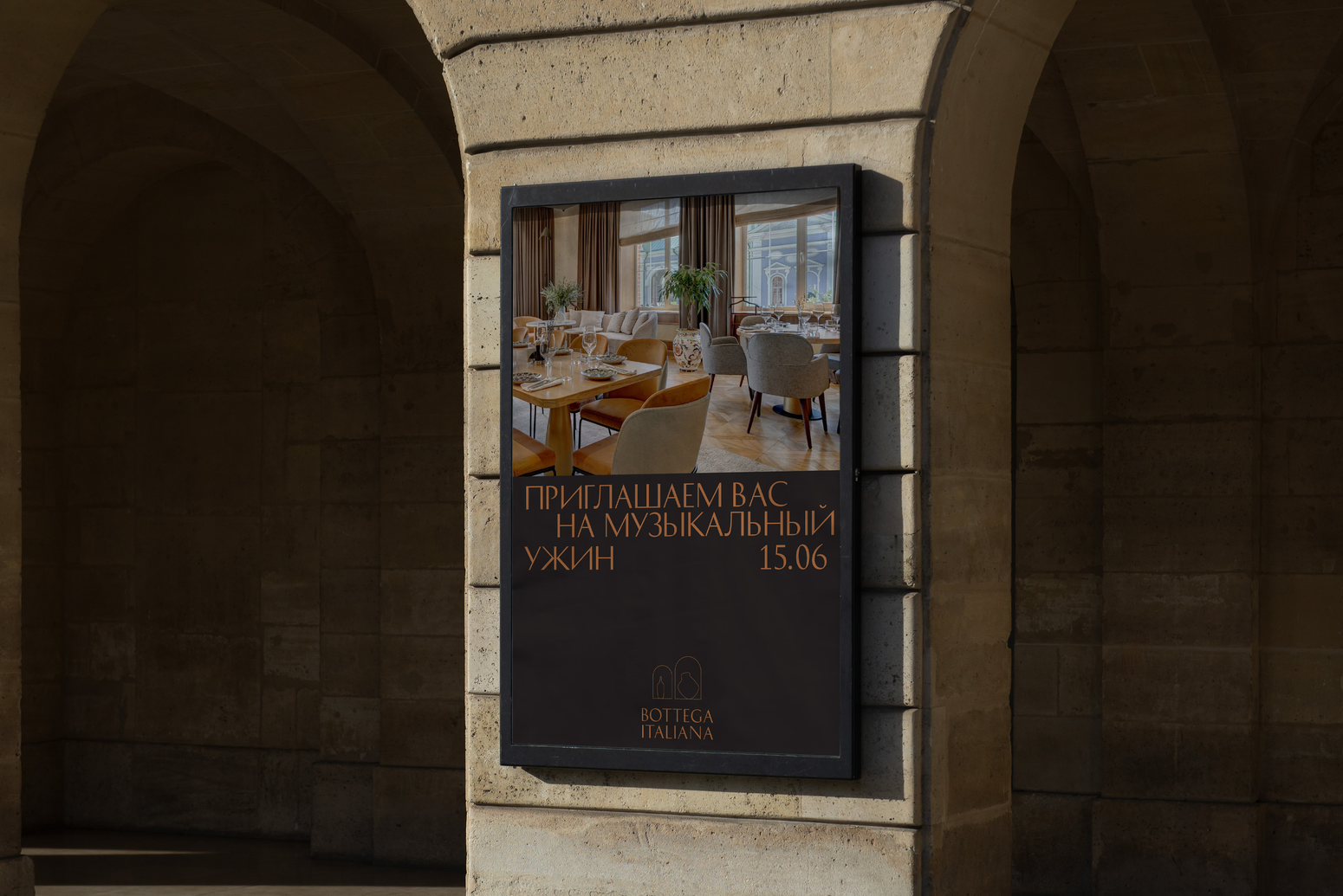
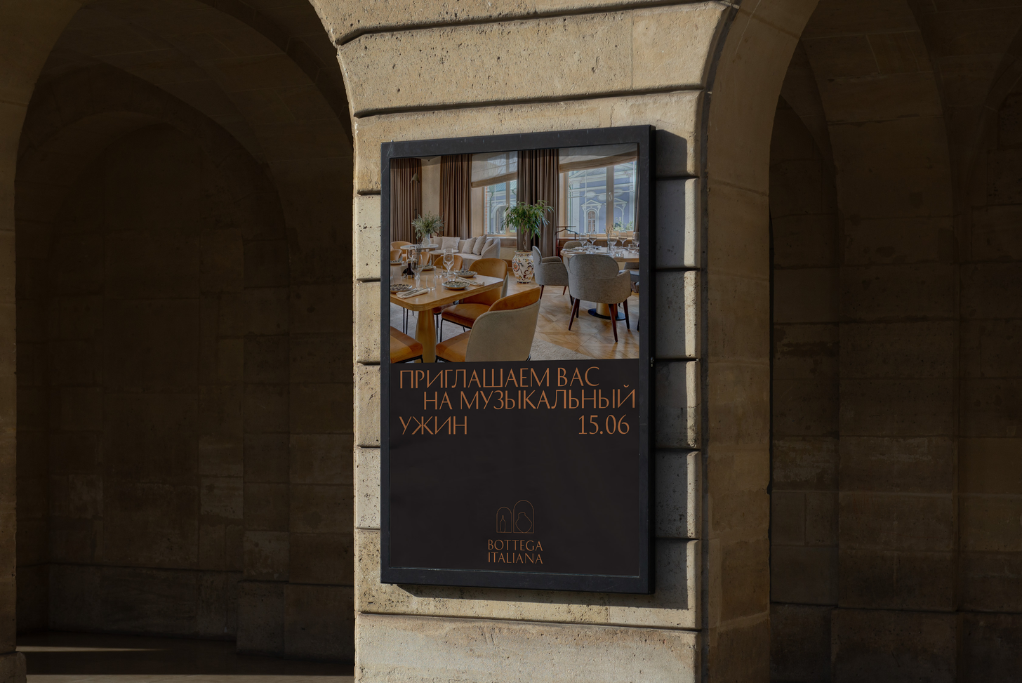
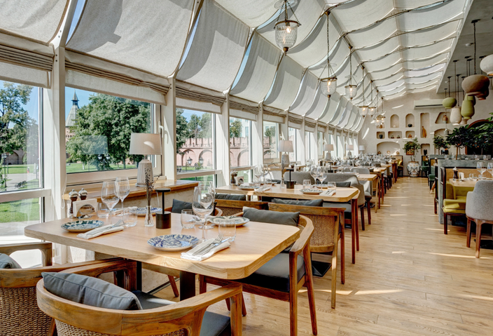
The restaurant's interior is full of arches, niches and vessels
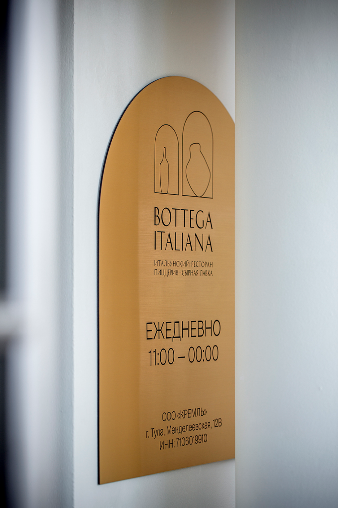
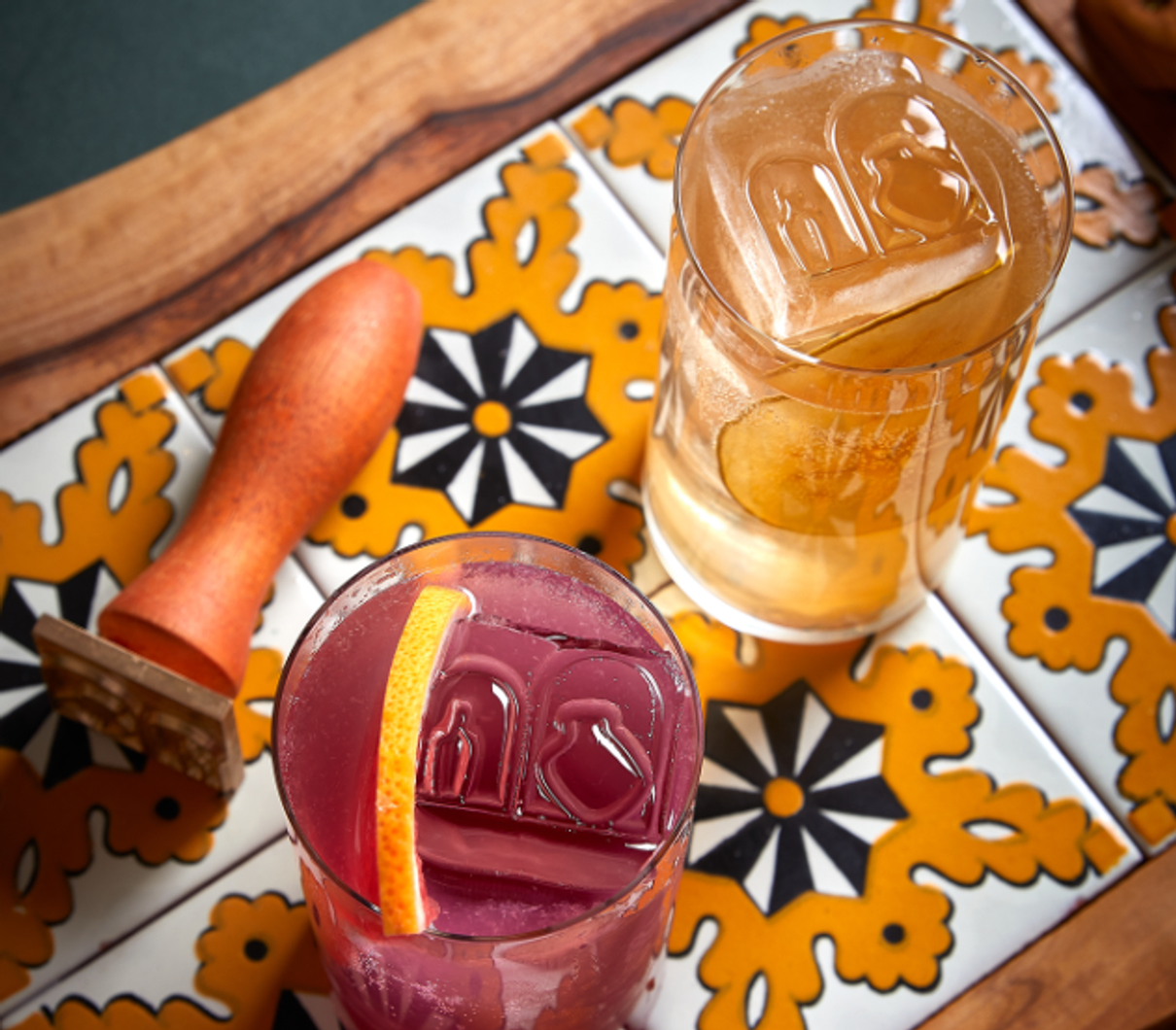
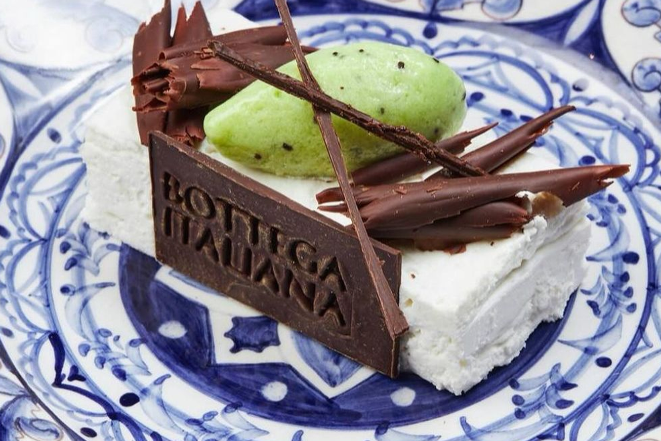
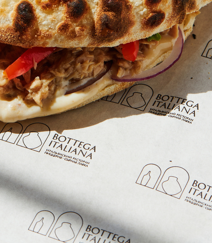
the simple shape of the logo allows you to place it on dishes, enriching it with a craft texture
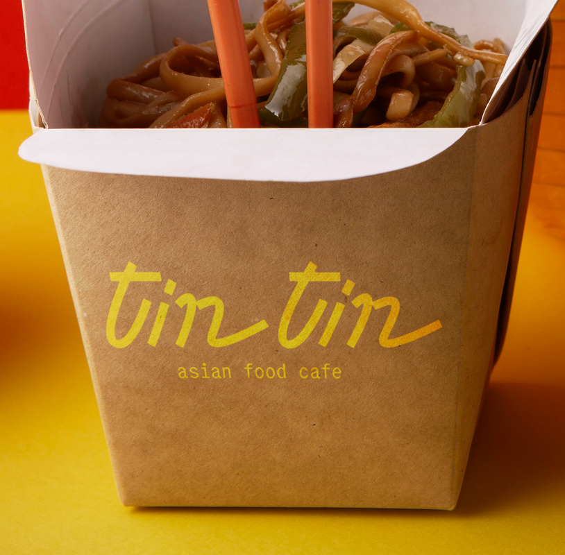
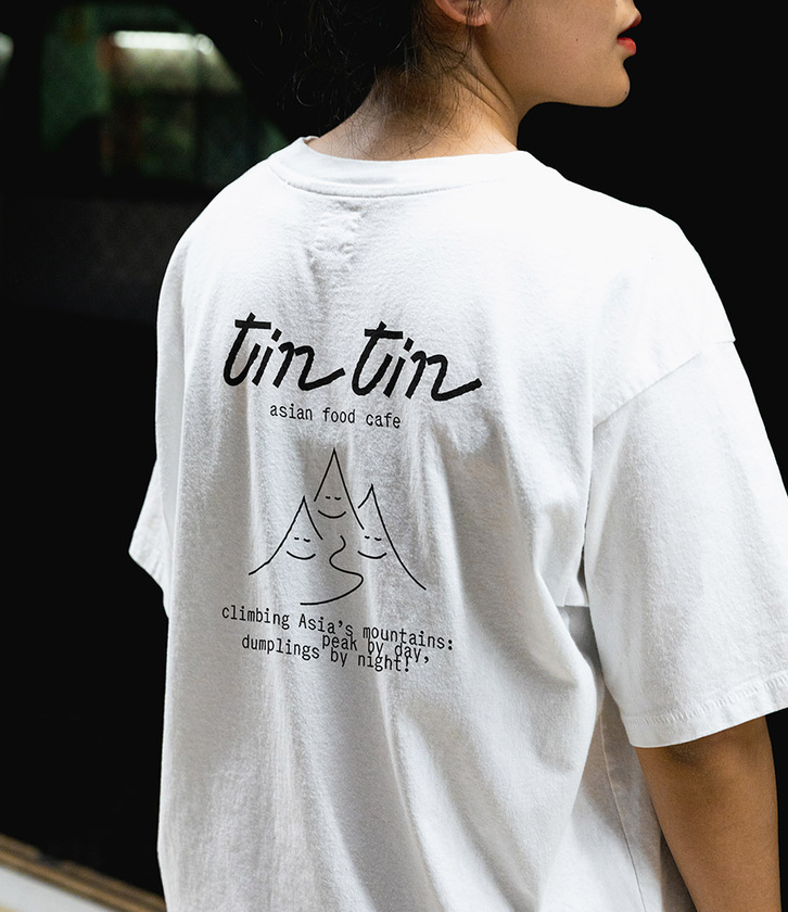
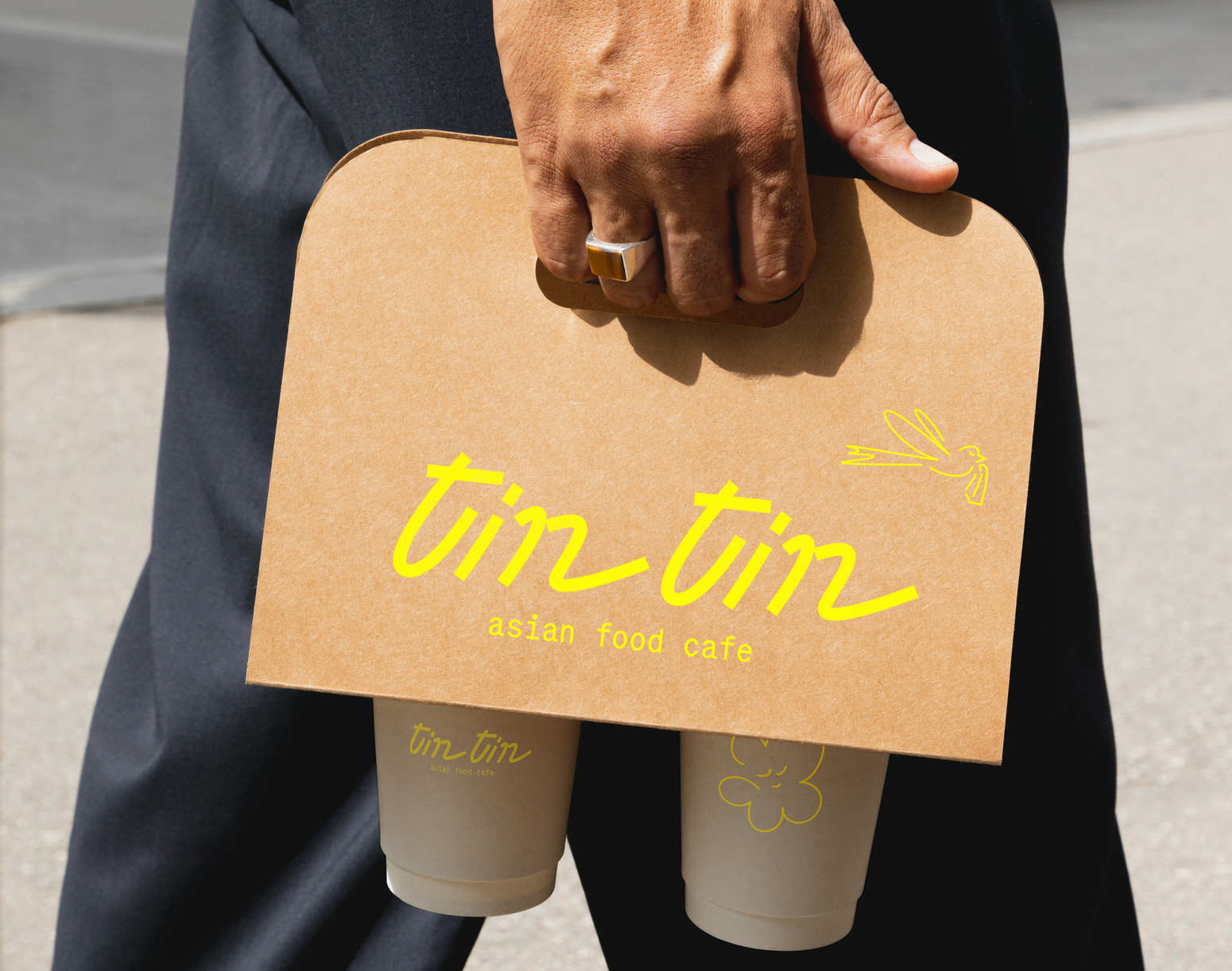
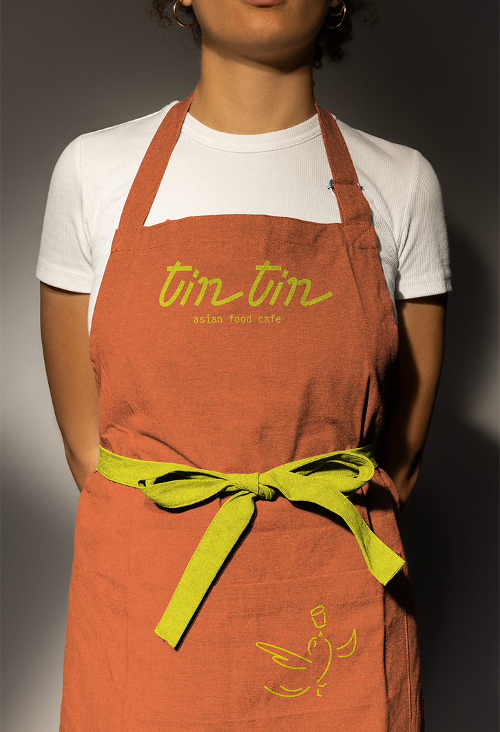
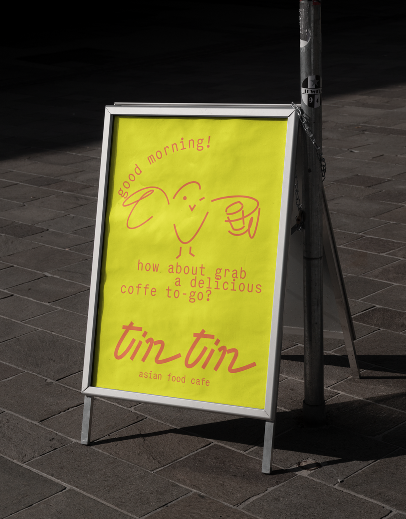
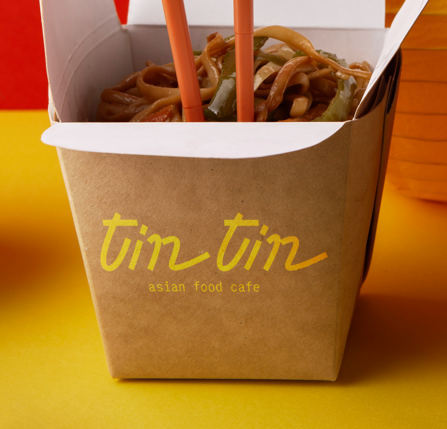
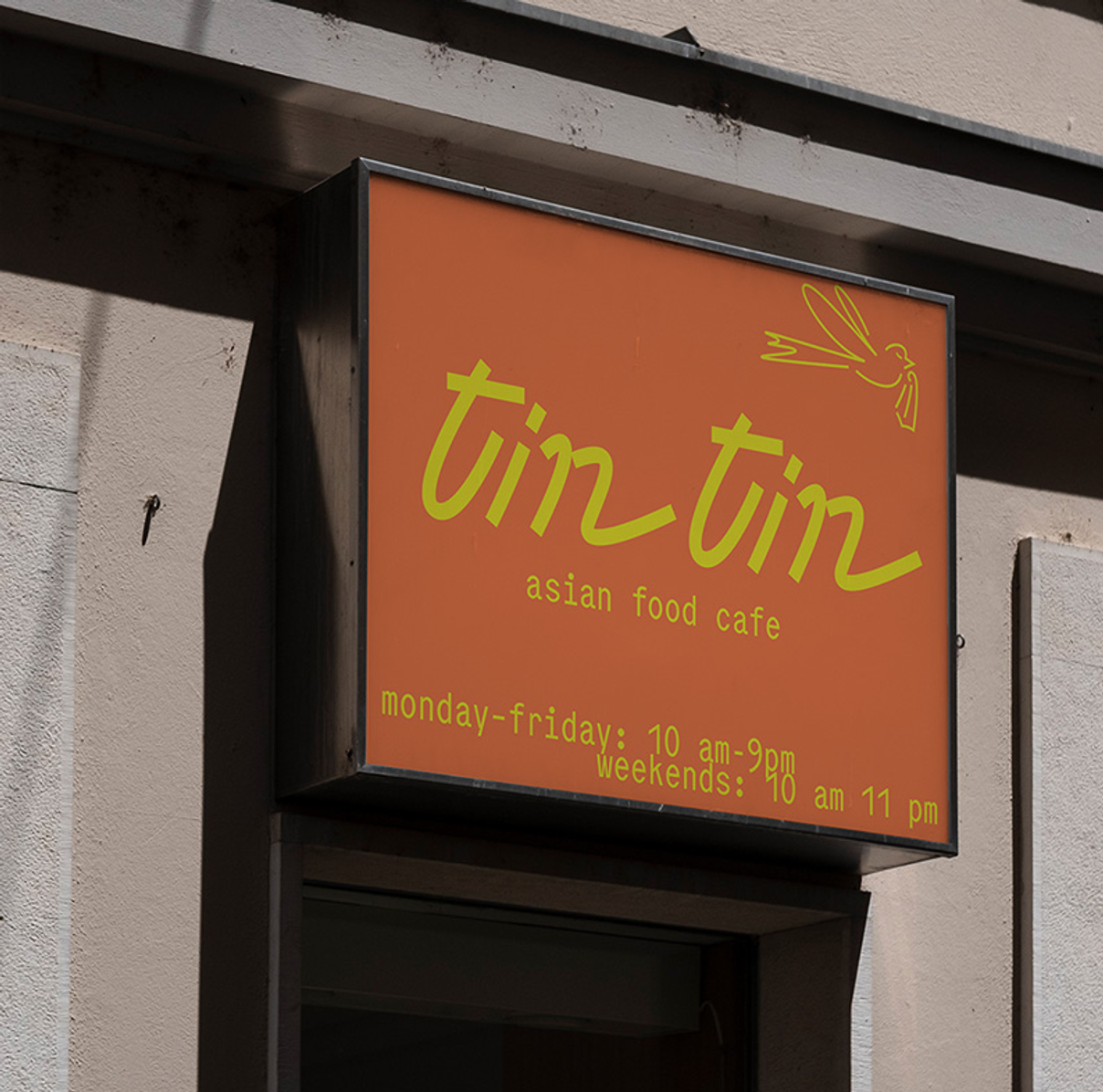
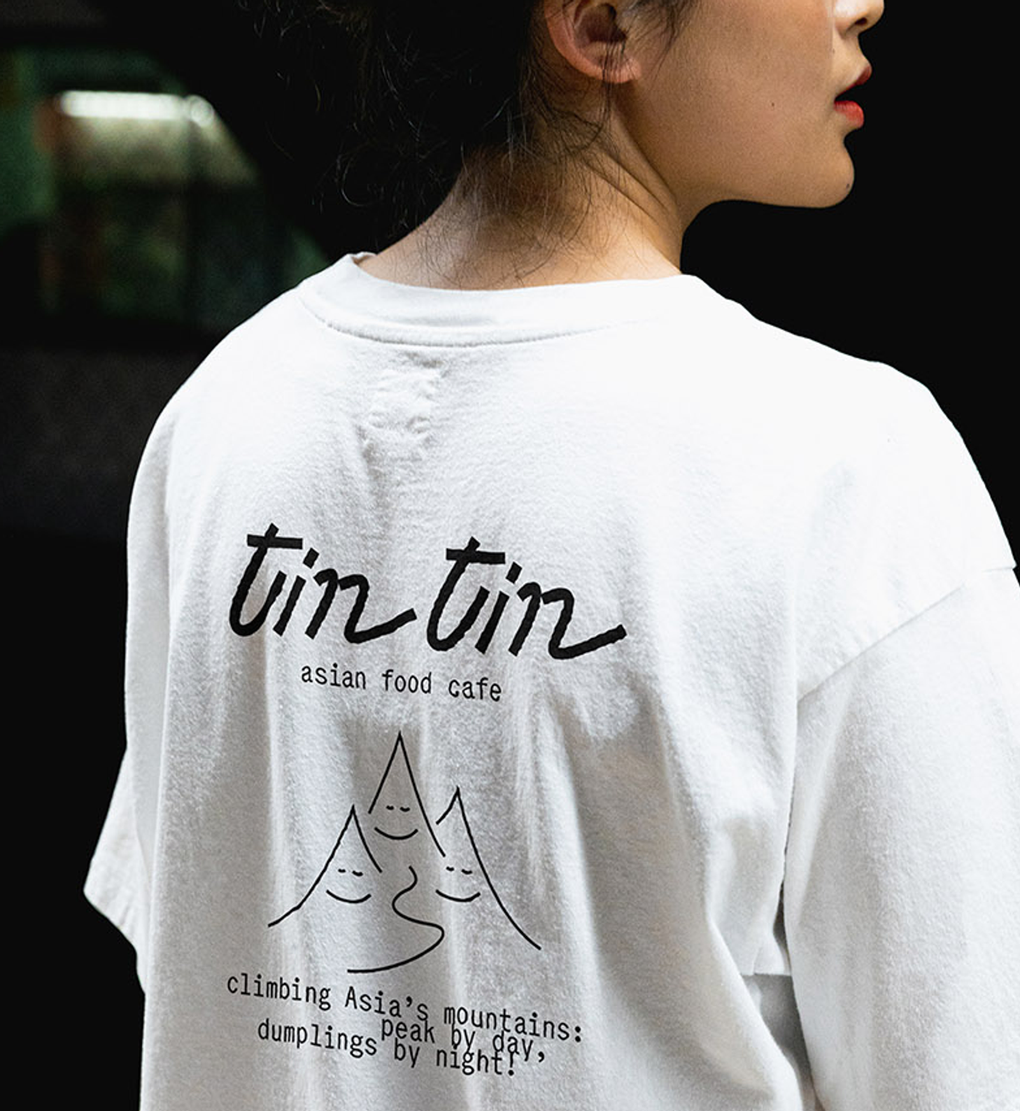
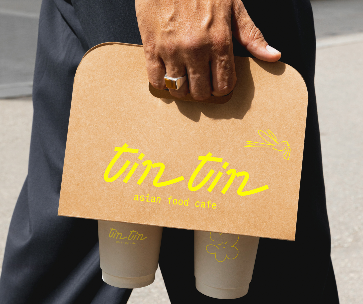
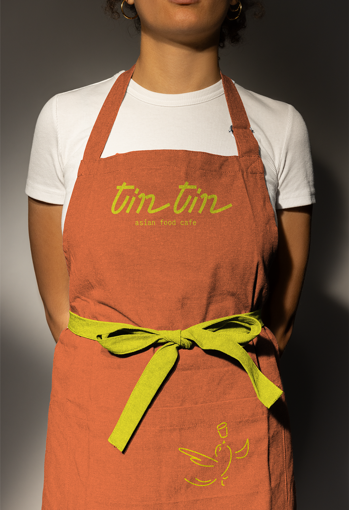
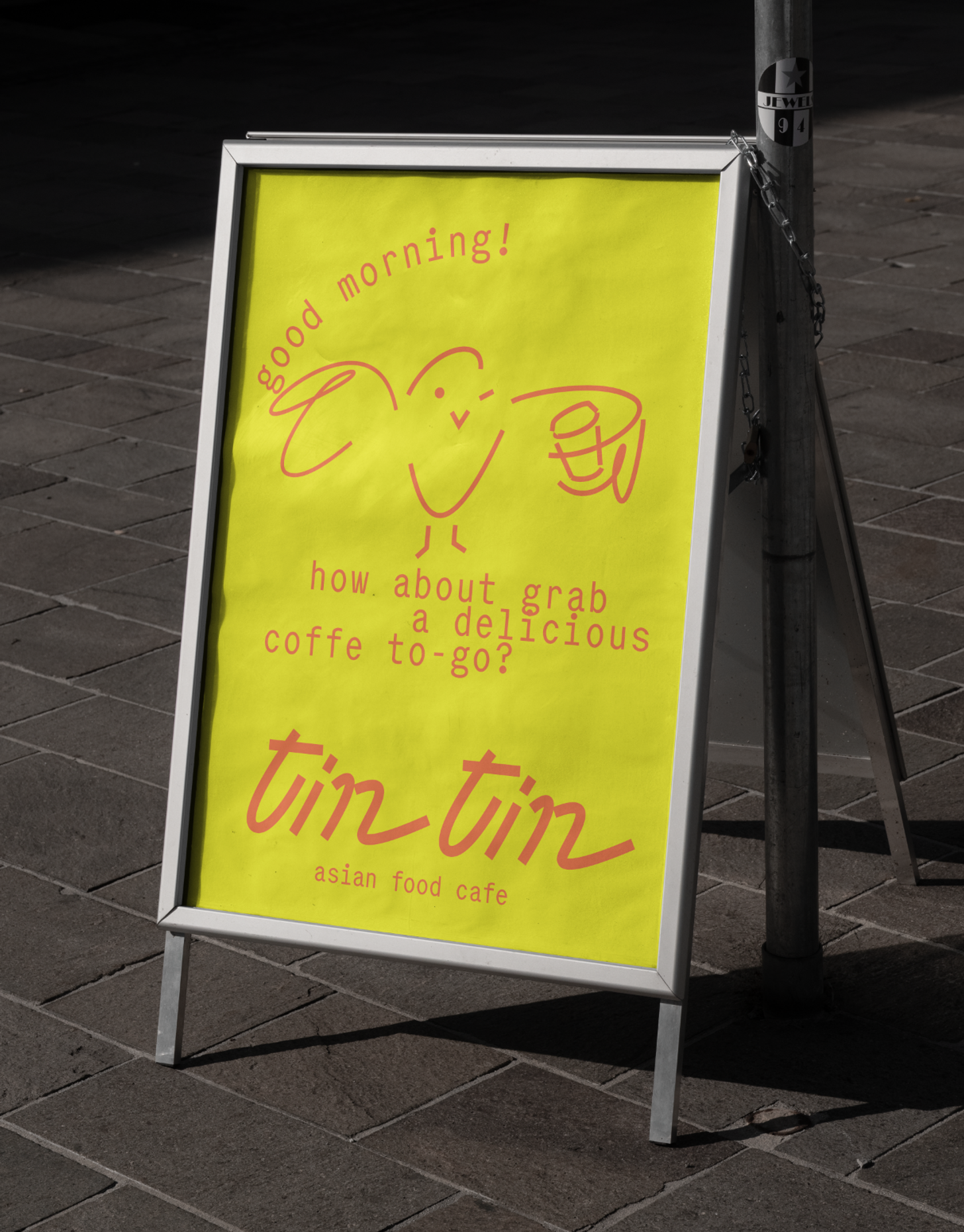
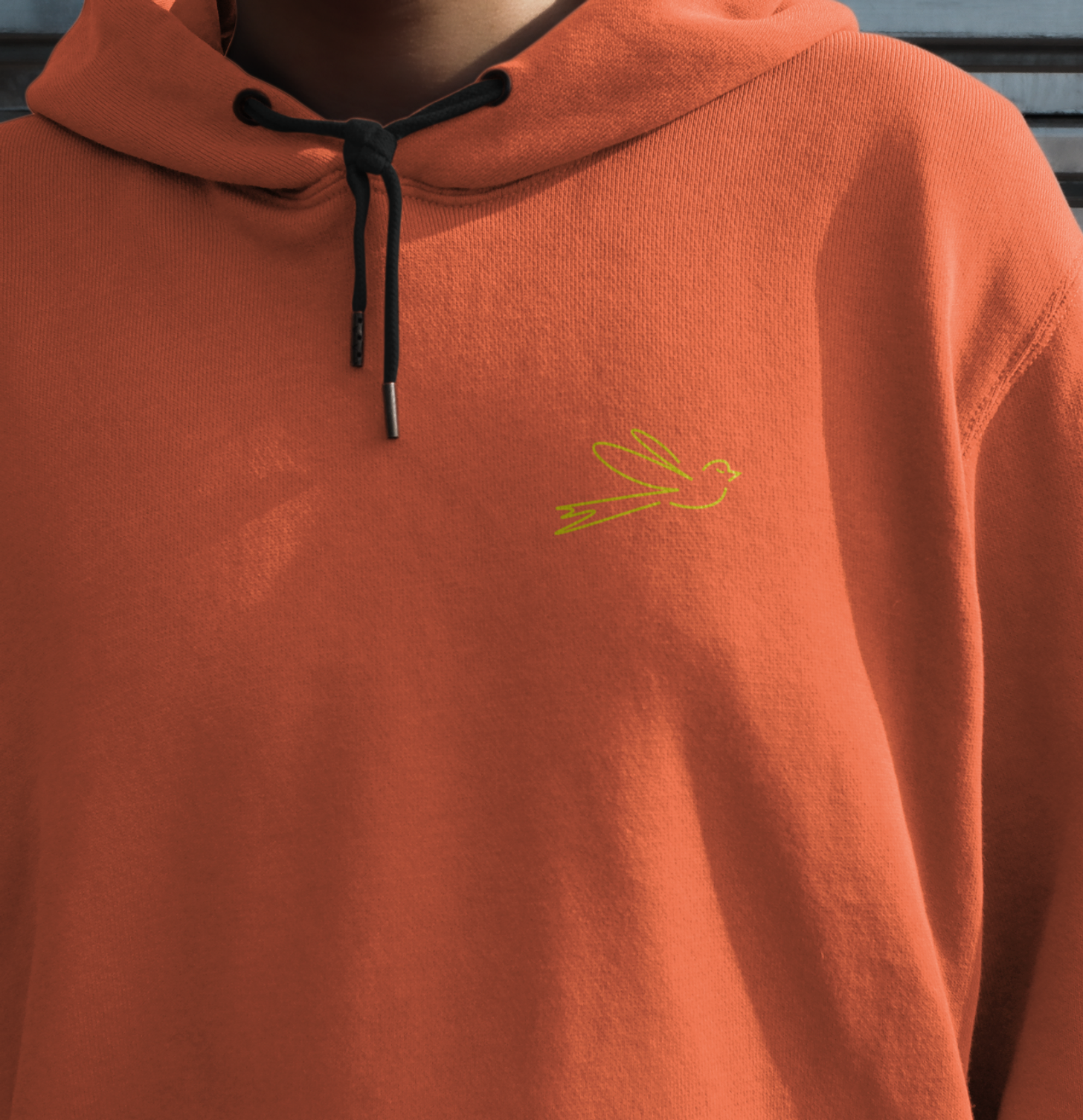
tin tin cafe
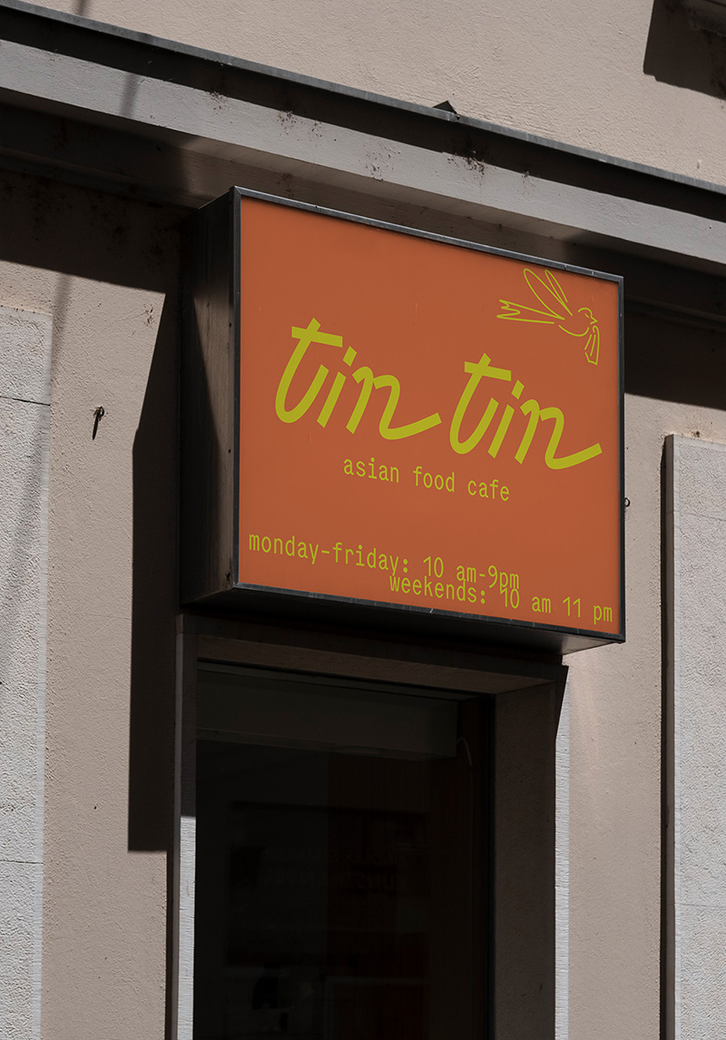
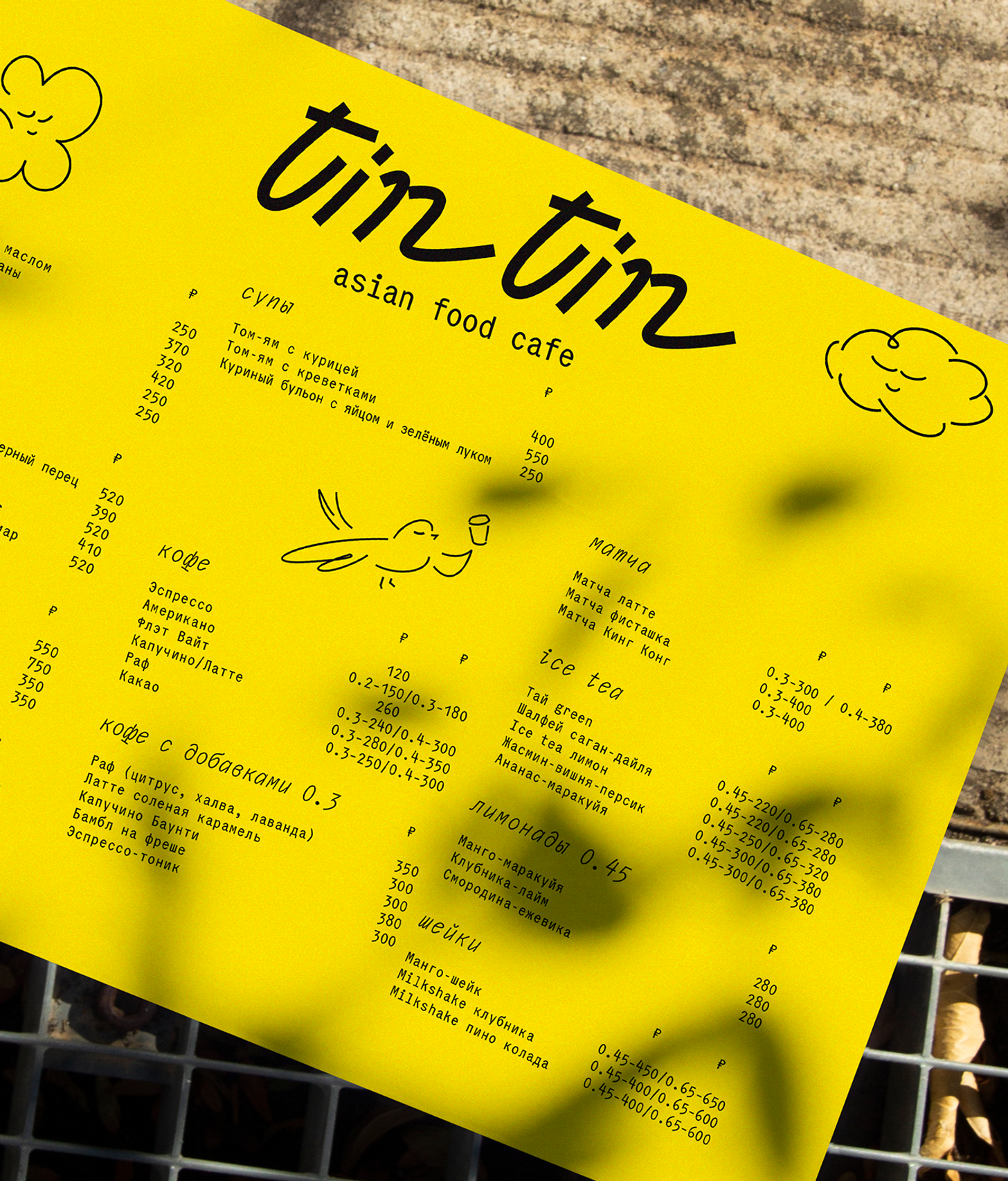
The small and cozy cafe offers a lot of dishes from Asia. There is a lovely name, but there's no story for it. The founders want to avoid paternalistic references to Asian countries and Asia in general.
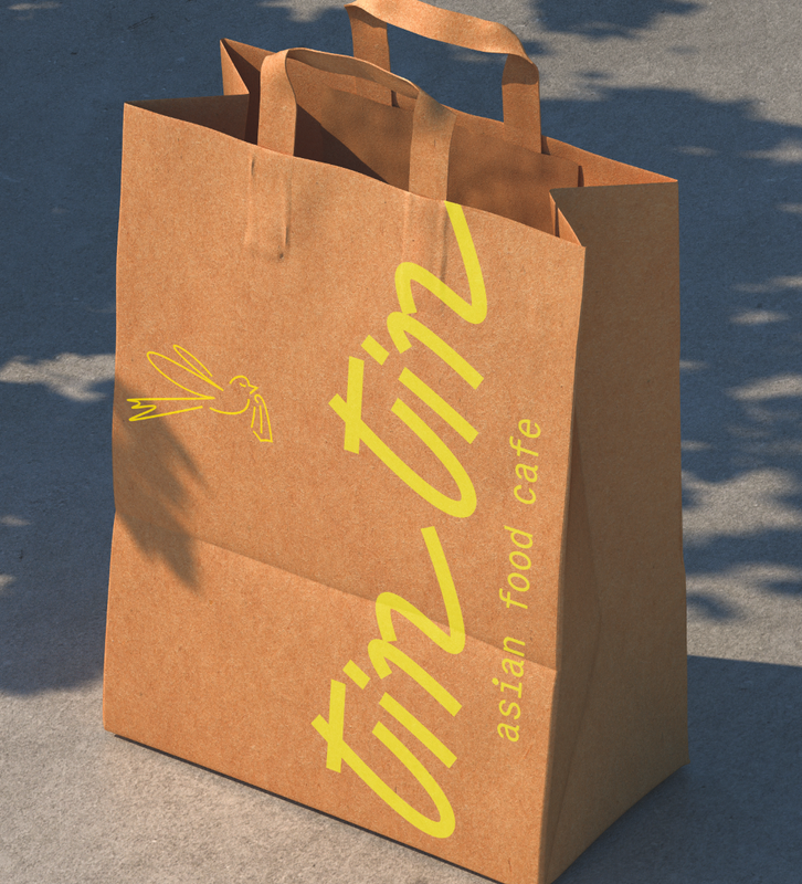
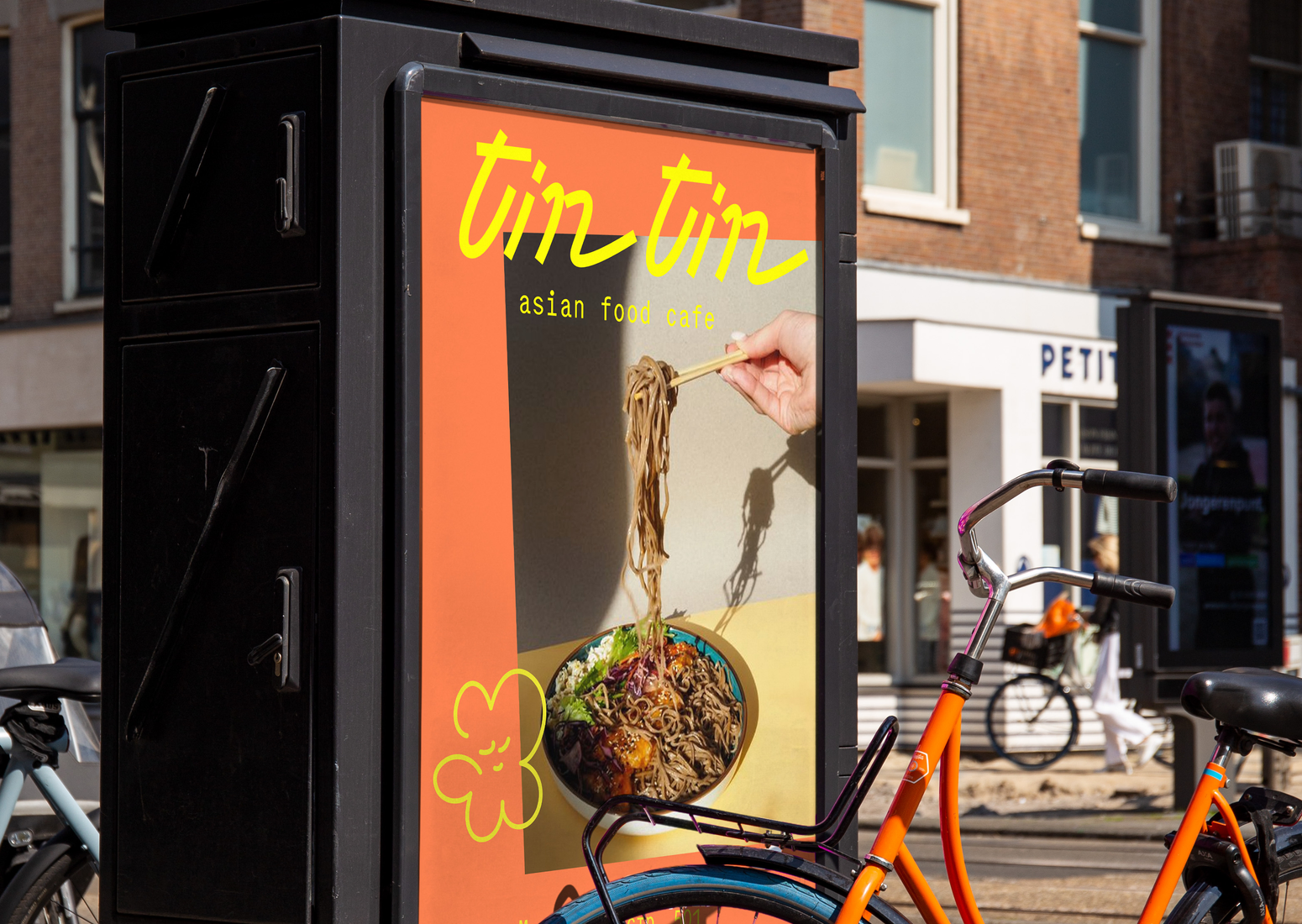
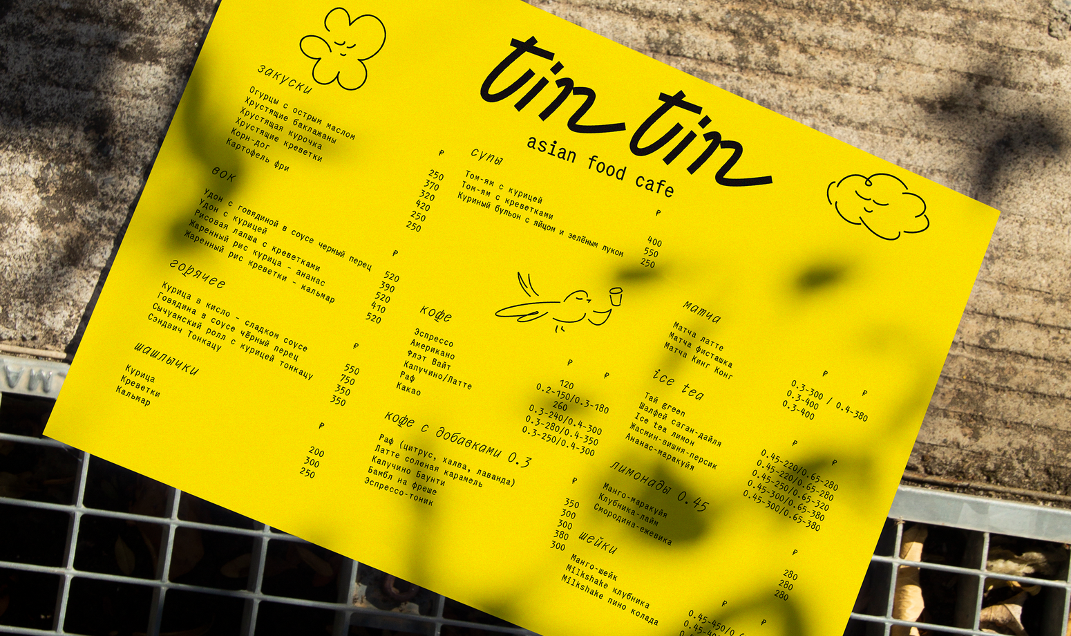
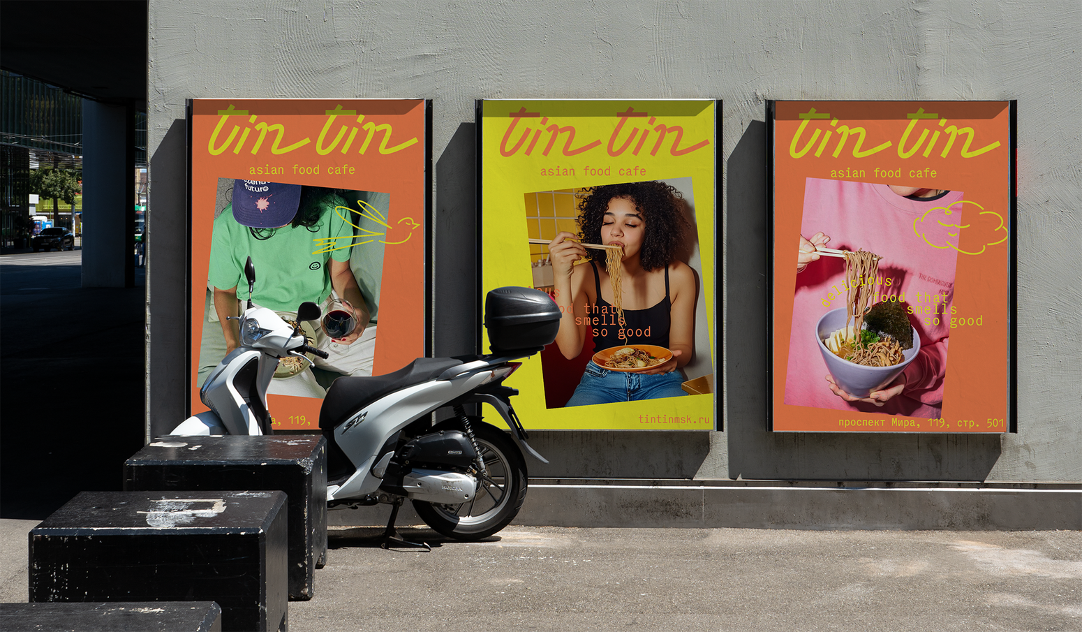
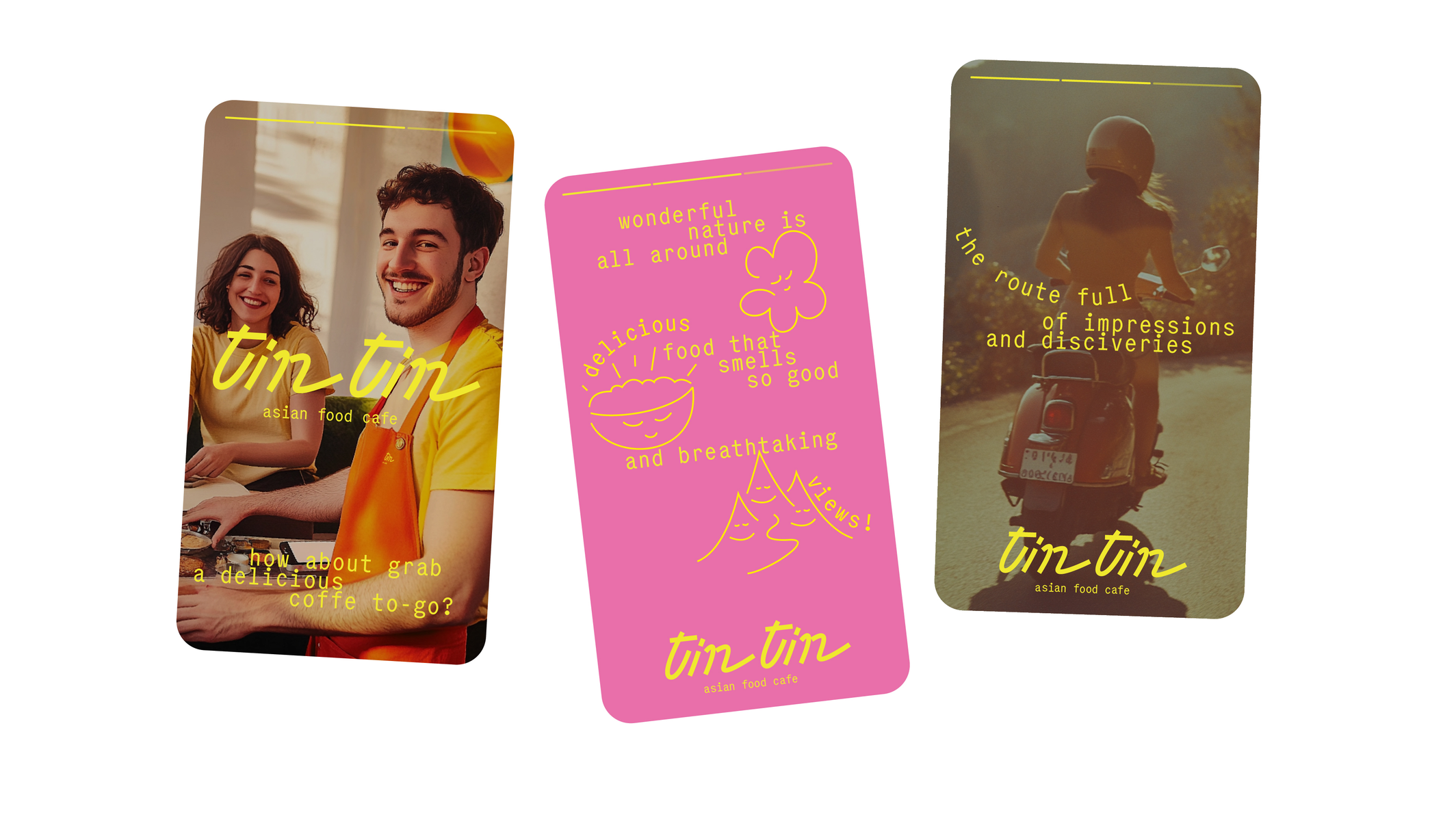
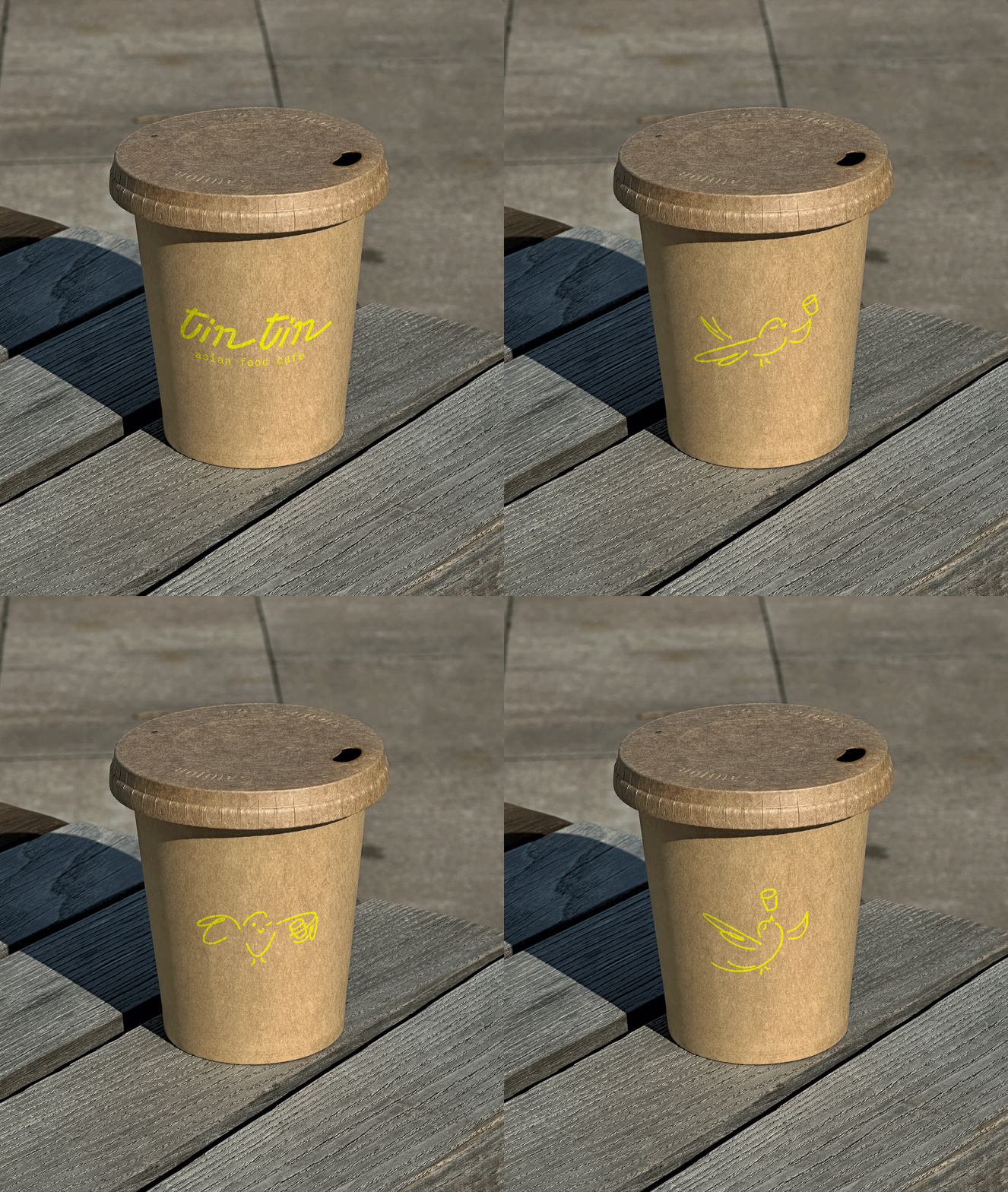
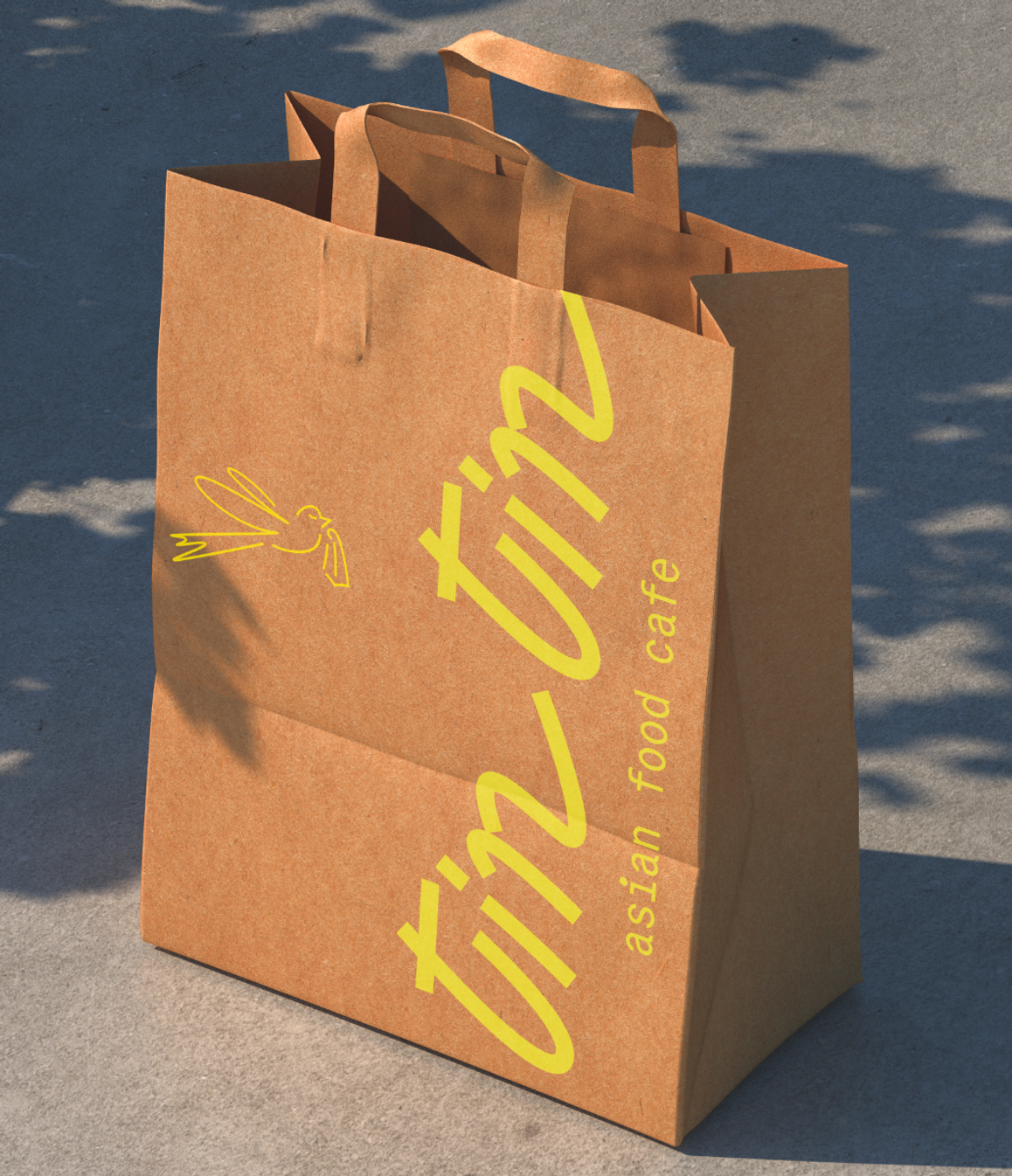
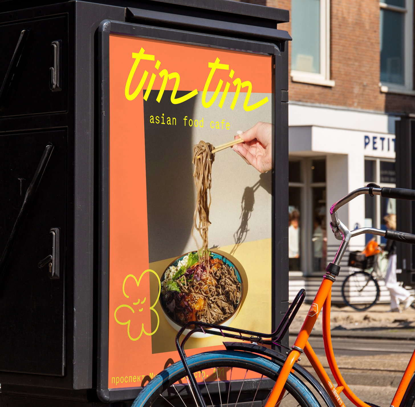
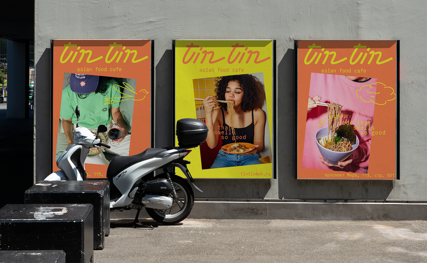
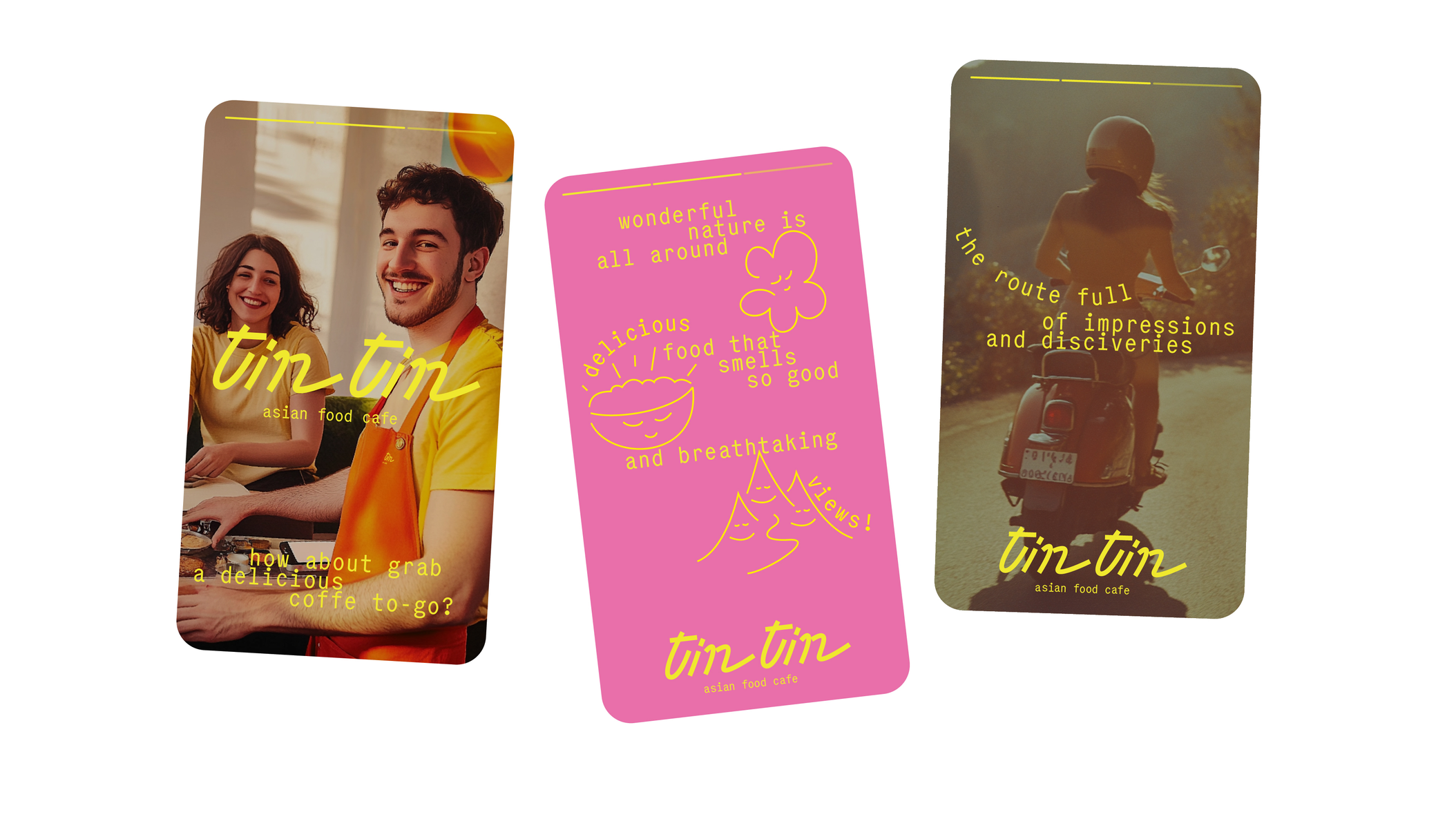
The main metaphor of the style is travel notes. The visual identity is inspired by the aesthetics of moped journeys, travel diaries, sketches, and vivid figurative stories. Noodles are the main dish on the menu. That’s why the logo simultaneously plays with the theme of road travel and the shape of noodles. It also references the retro lettering of vintage moped logos.
TARGET
solution
Identity of a café inspired by a journey across Asia
2023
art & culture
/
/
/
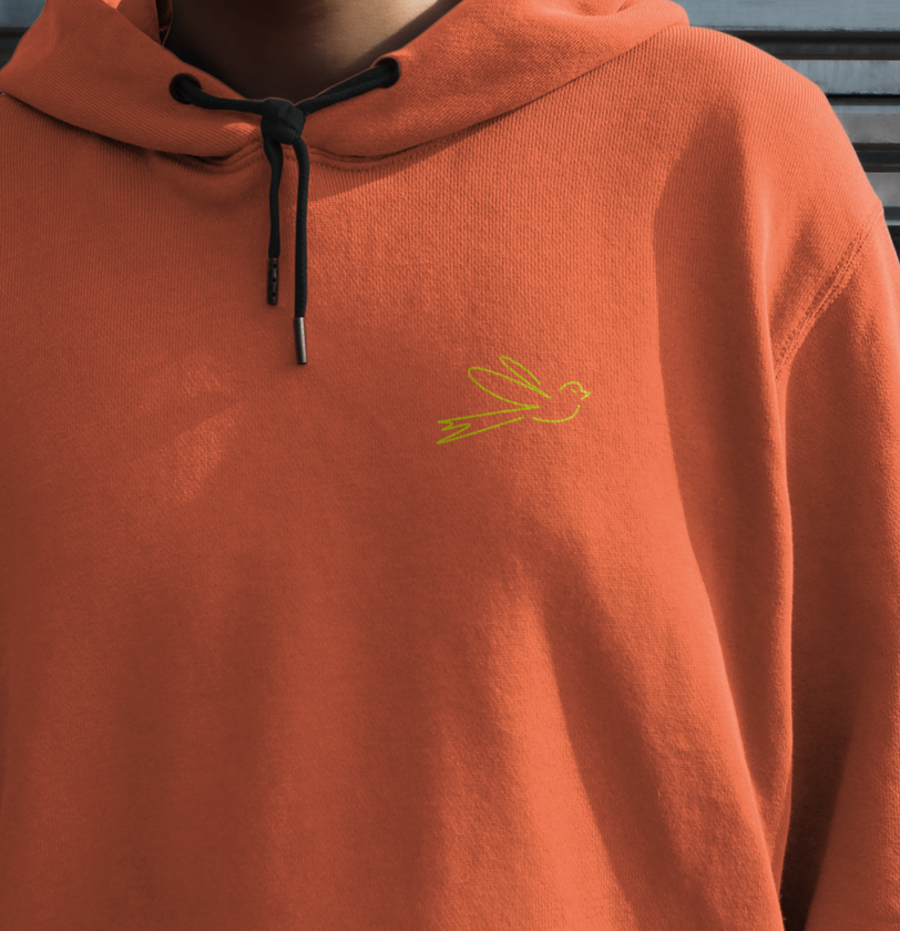
The brand's mascot is a little bird, Tin Tin, who accompanies us on our journey, while other characters appear along the way. The illustrations stylistically align with the logo and remind us of travel sketches. All the characters close their eyes with delight from the food and impressions, just like the heroes of the café’s photography style!
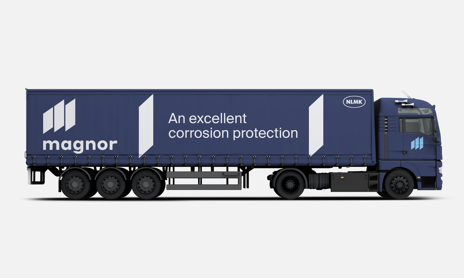
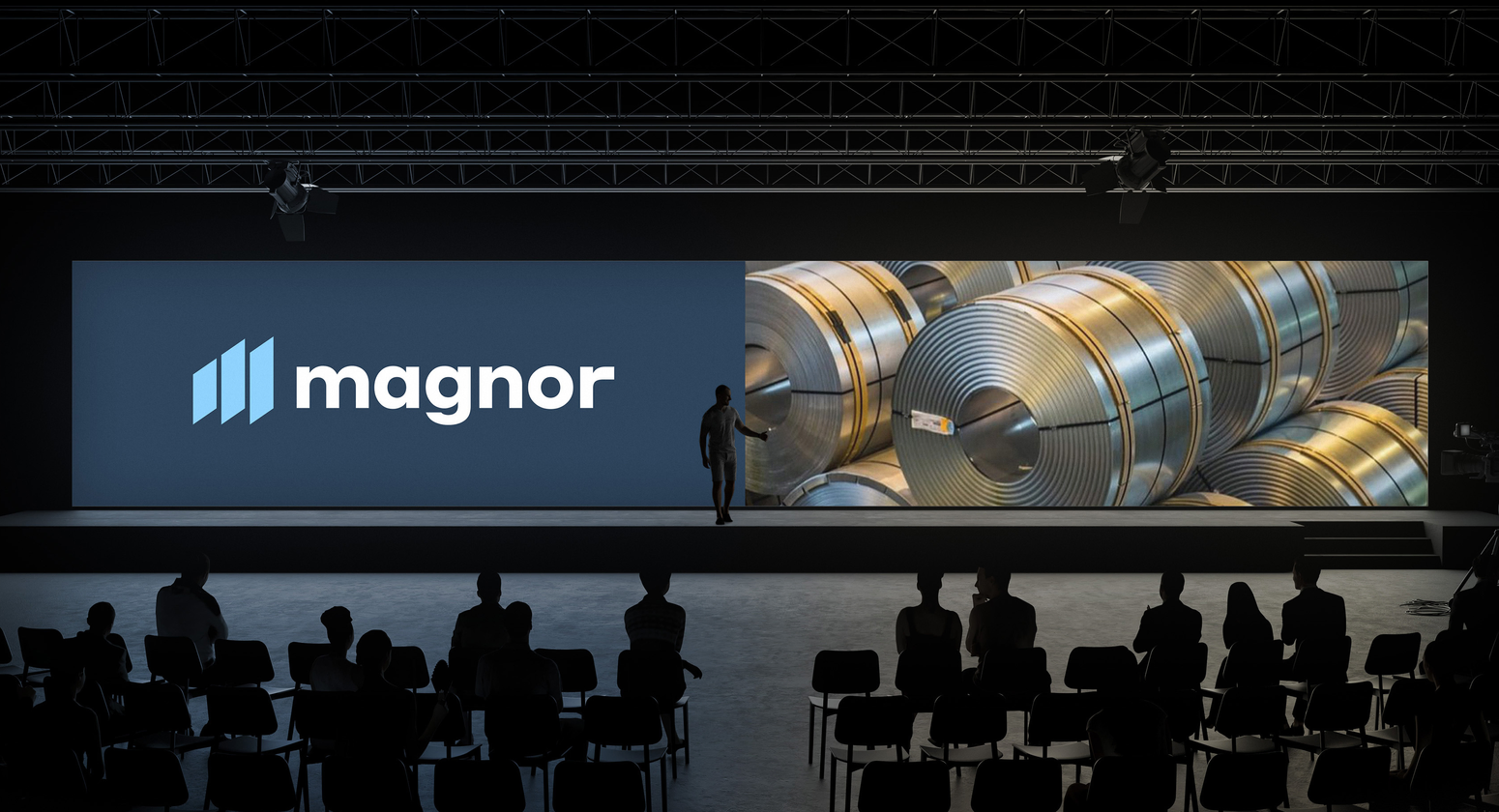
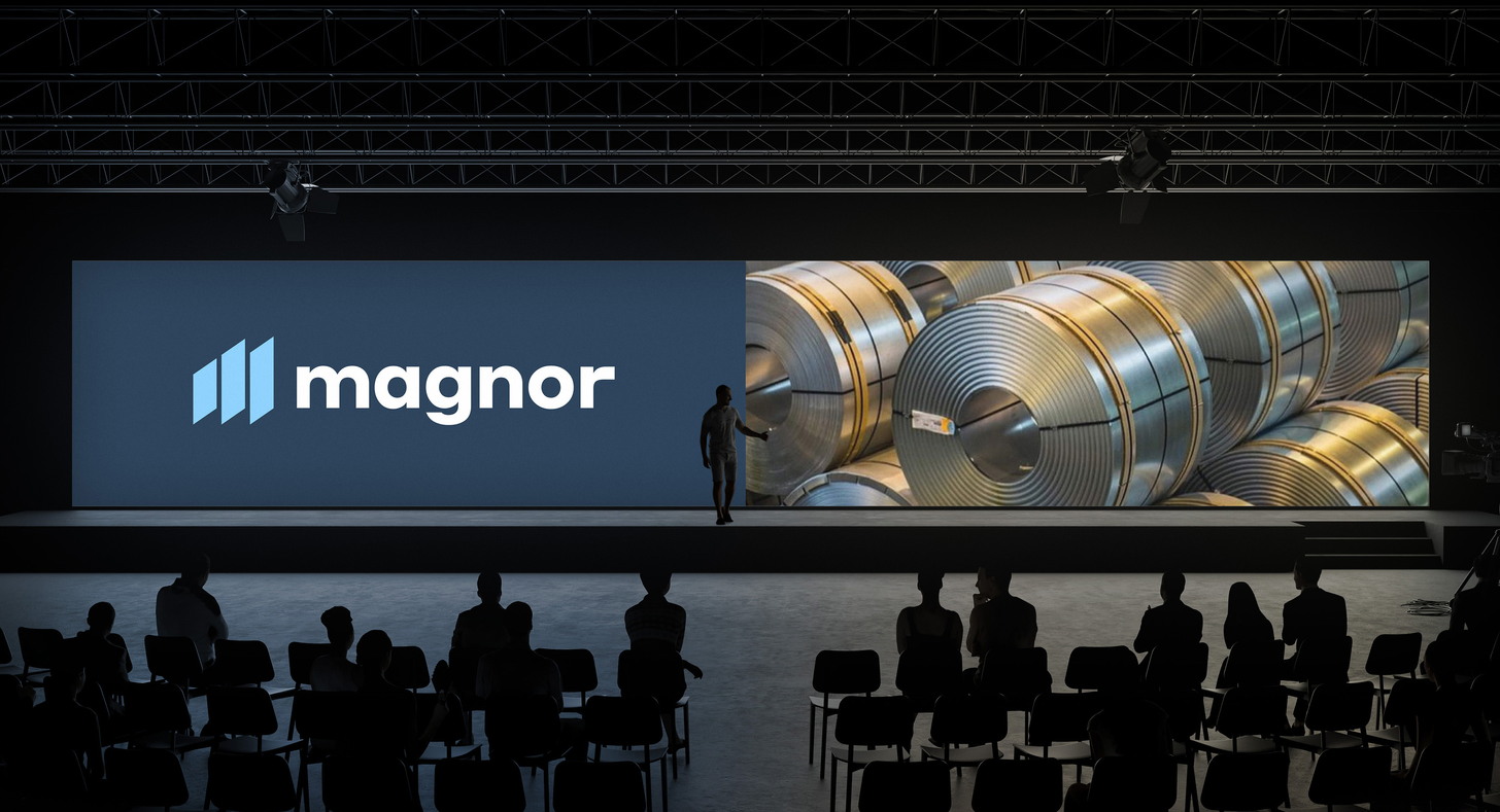
Cause Magnor uses for industrial applications, it's wordmark is bolder
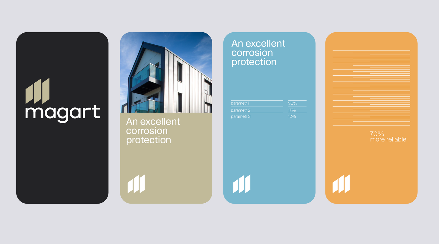
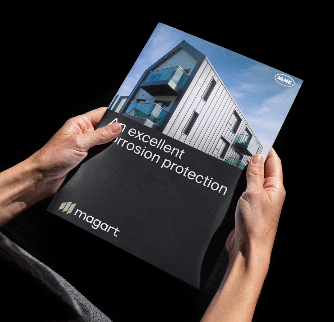
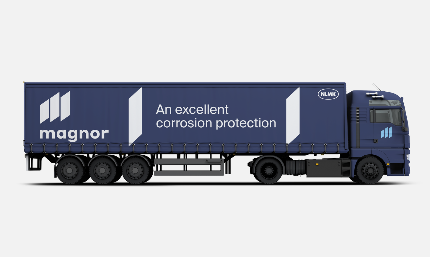
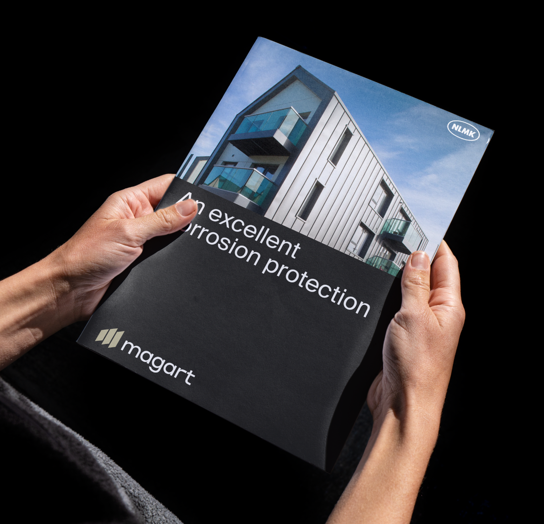
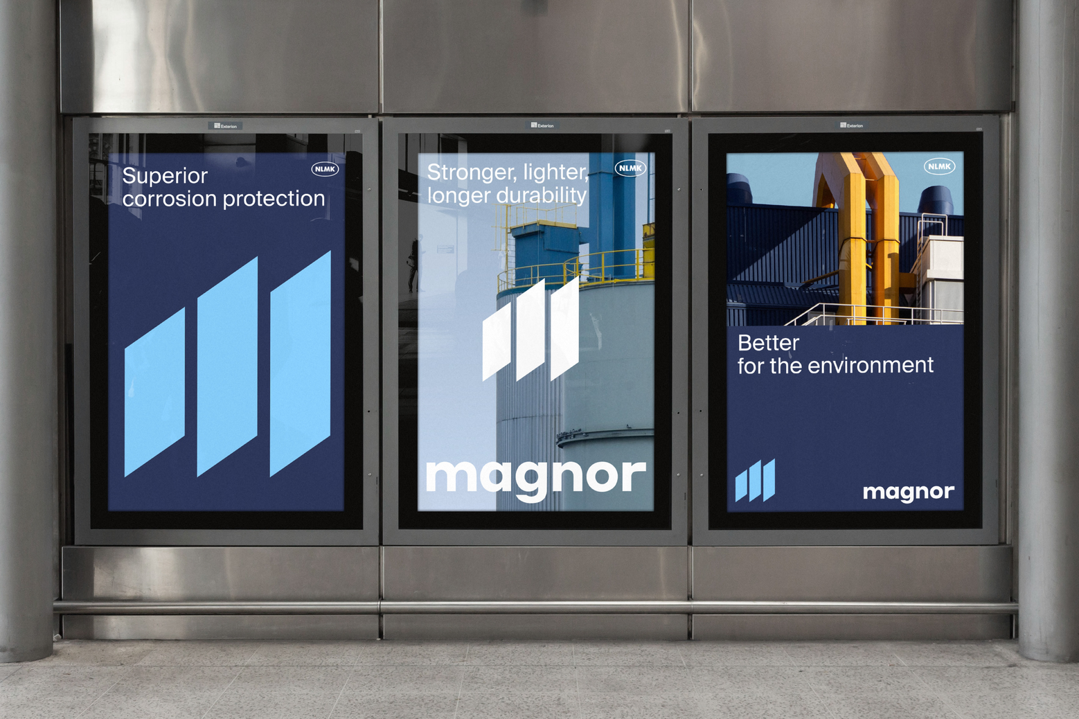
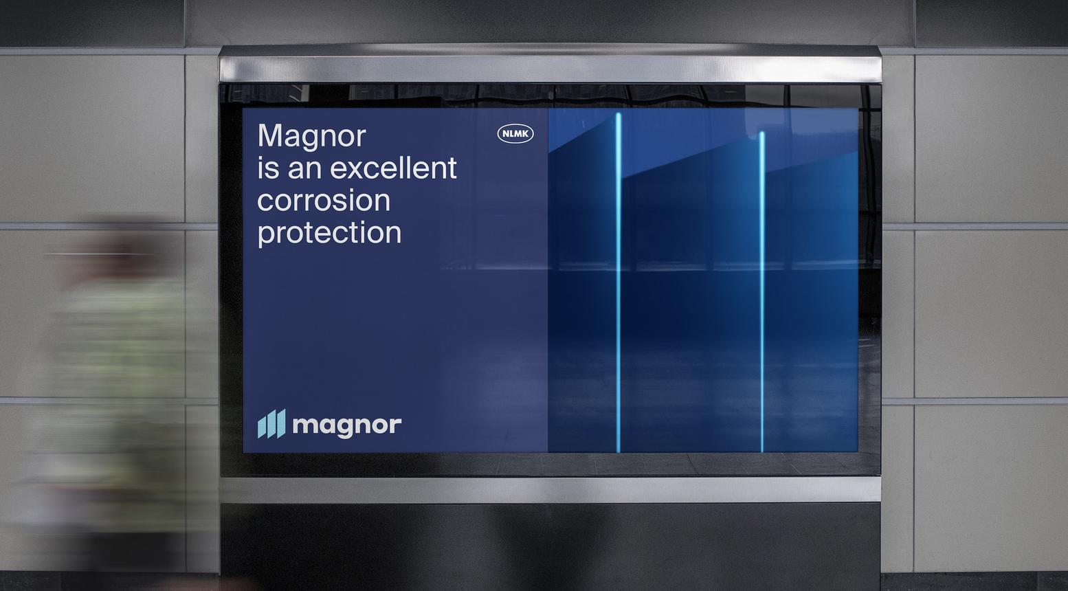
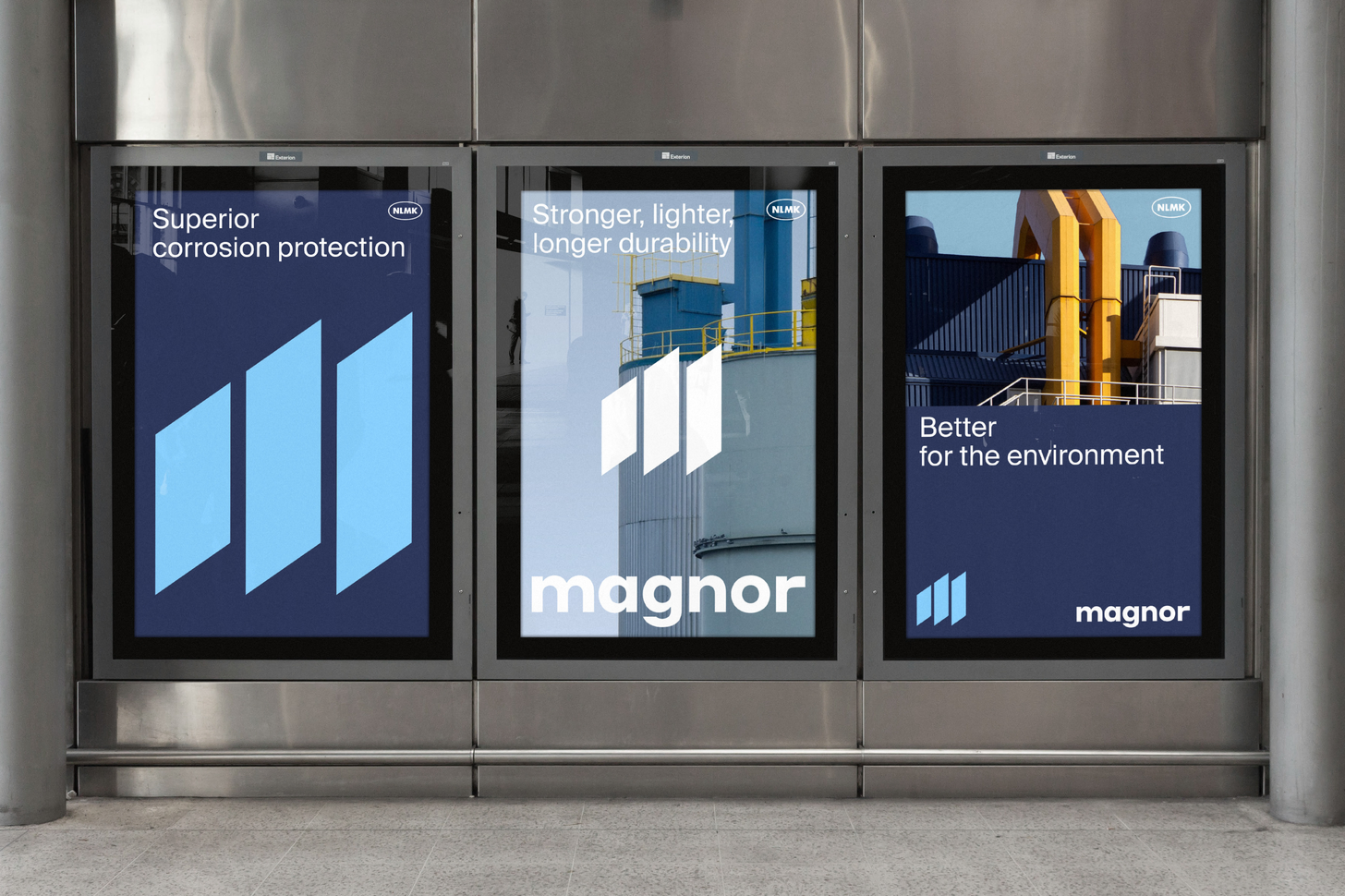
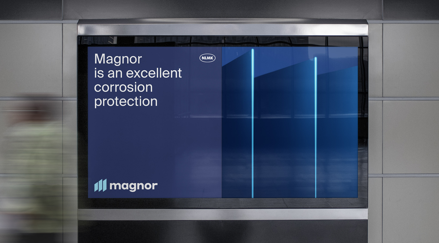
Develop an identity for two similar brands of protective coatings, so as to emphasize their connection and at the same time highlight the differences. MAGNOR offers superior corrosion protection. It is a strong solution for scaffolding, shelving, building structural parts, modular construction, silos, solar panel supports, motorway safety barriers, chicken farm equipment.
The naming of the products is consonant and the first letter of both names is M. Thanks to this, a single sign was developed for both brands.
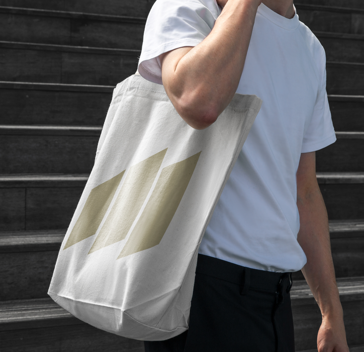
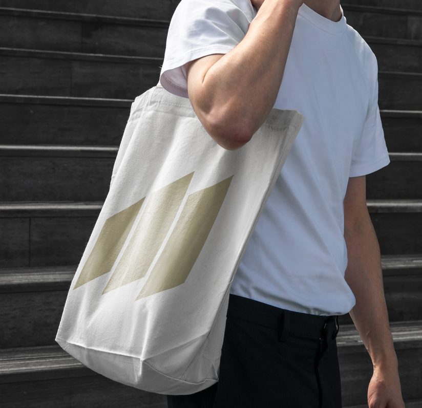
The sign is a stylized letter M, formed from three layers. This refers us both to how the product itself looks and to its function as protective layers. Also, 3 layers in the sign refer us to the three ingredients in the product.
TARGET
solution
2023
metallurgical products
/
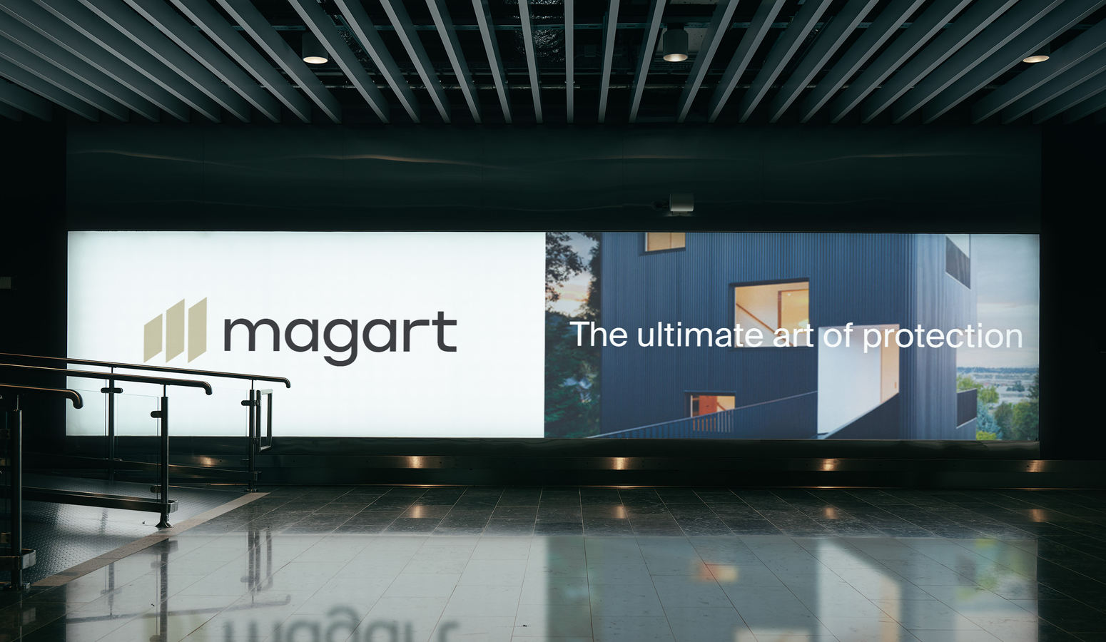
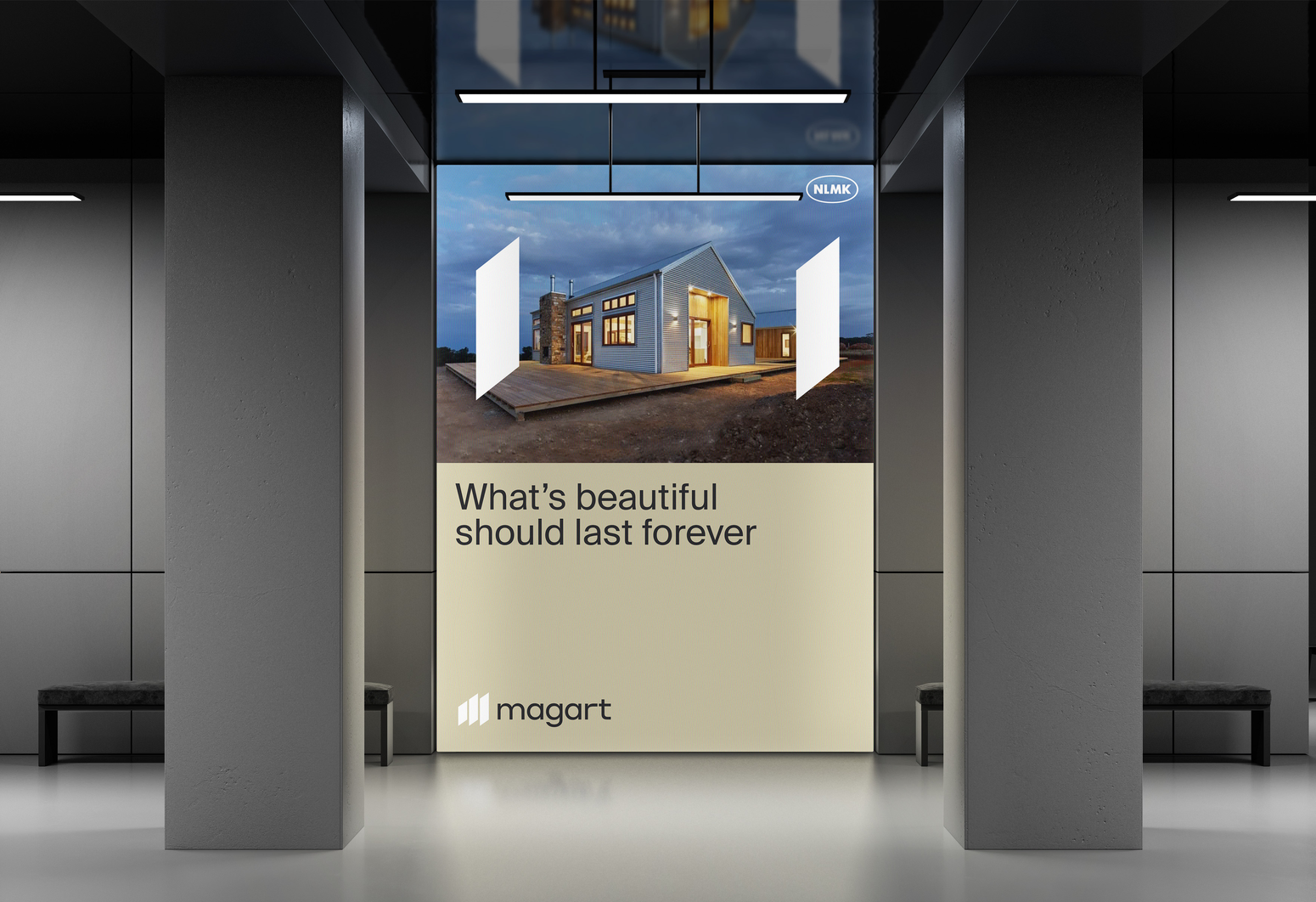
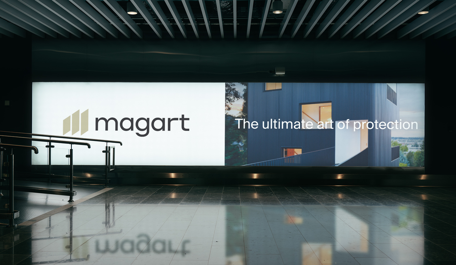
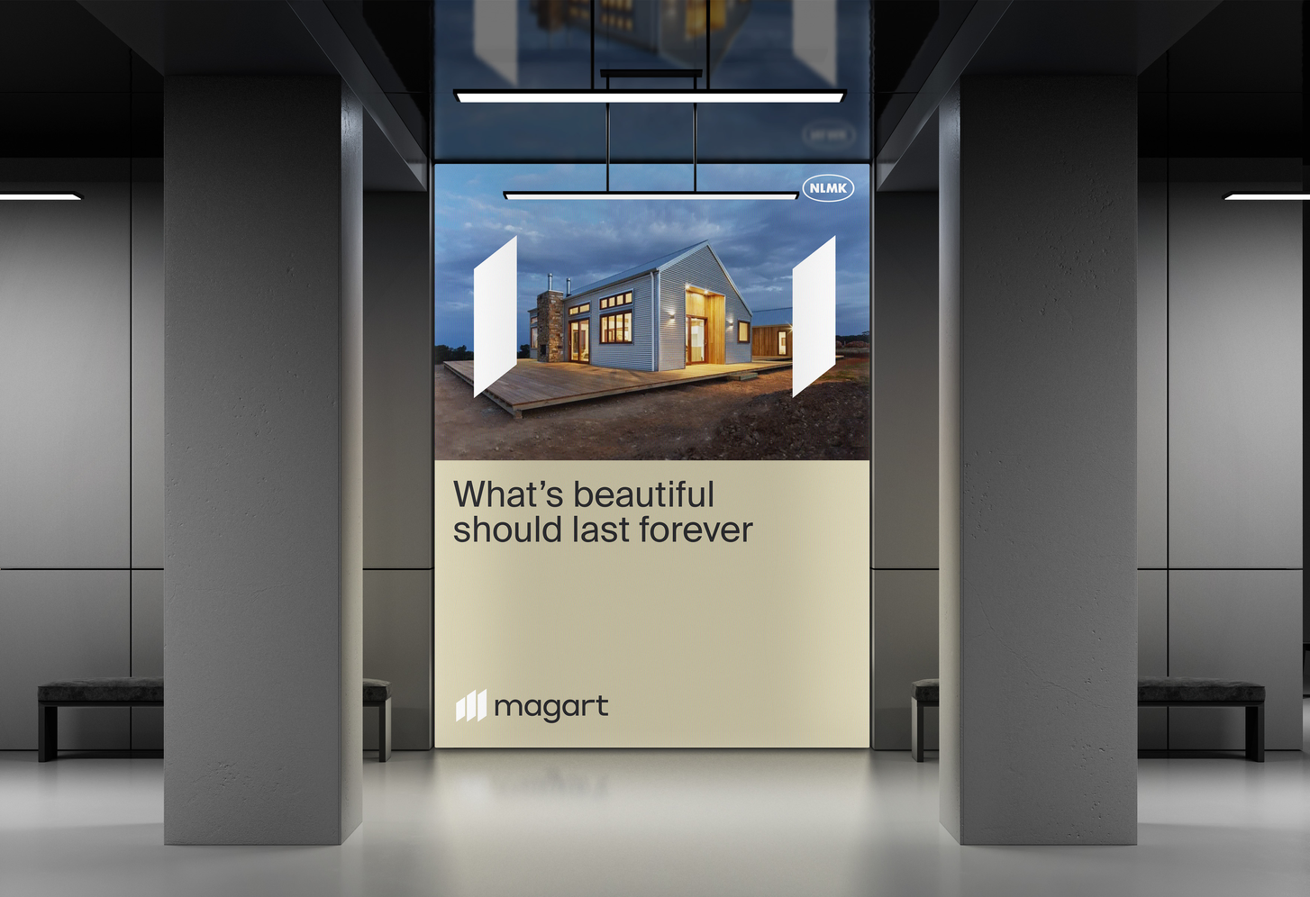
MAGART steel is an excellent corrosion resistance. It could be used in roofing, siding, flat profile, sandwich panel, sectional door panels and many more. MAGART provides not only surface protection but also an aesthetics because it could be prepainted with bright colors. the product is based on 3 ingredients: Zinc Aluminium and Magnesium
MAGNOR & MAGART
TWO BRANDS OF PROTECTIVE COATINGS
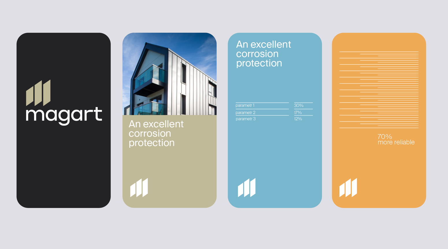
are used in identity development. They let to build structure around layout.
layers
colors IN MAGART IDENTITY ARE MORE DIVERSE AND vivid yet ELEGANT . BECAUSE IT'S COATING THAT OFTEN EMPLOYED FOR HOUSES building.
Colors
bbdo moscow
agency
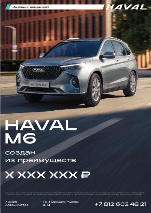
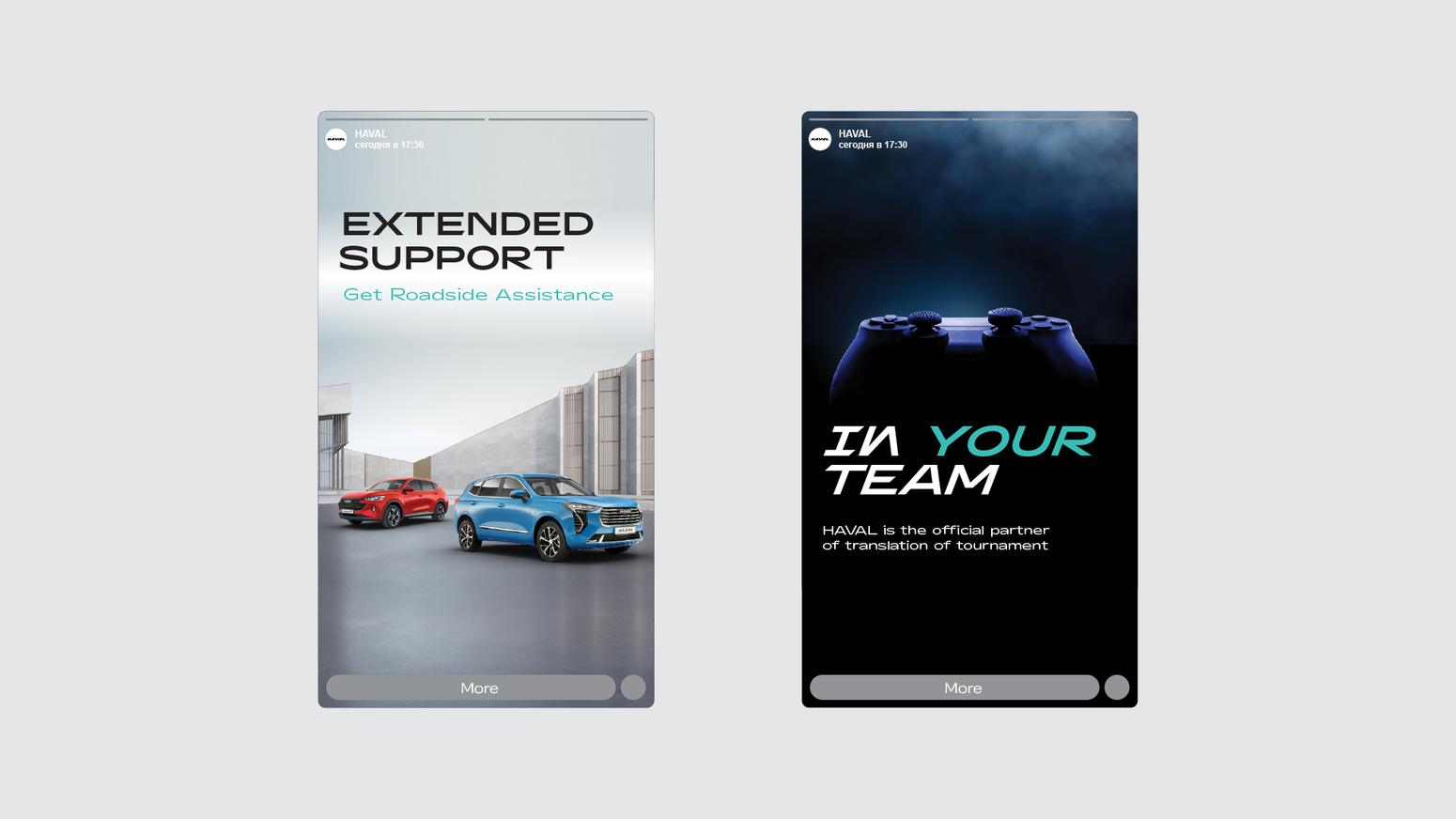
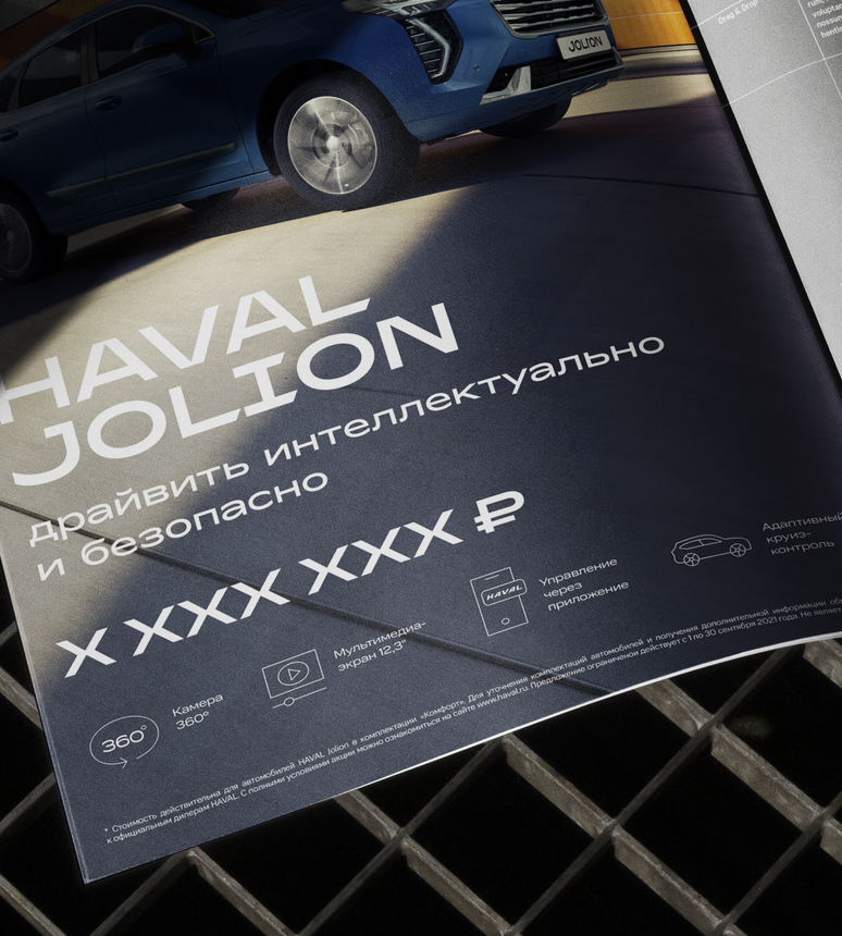
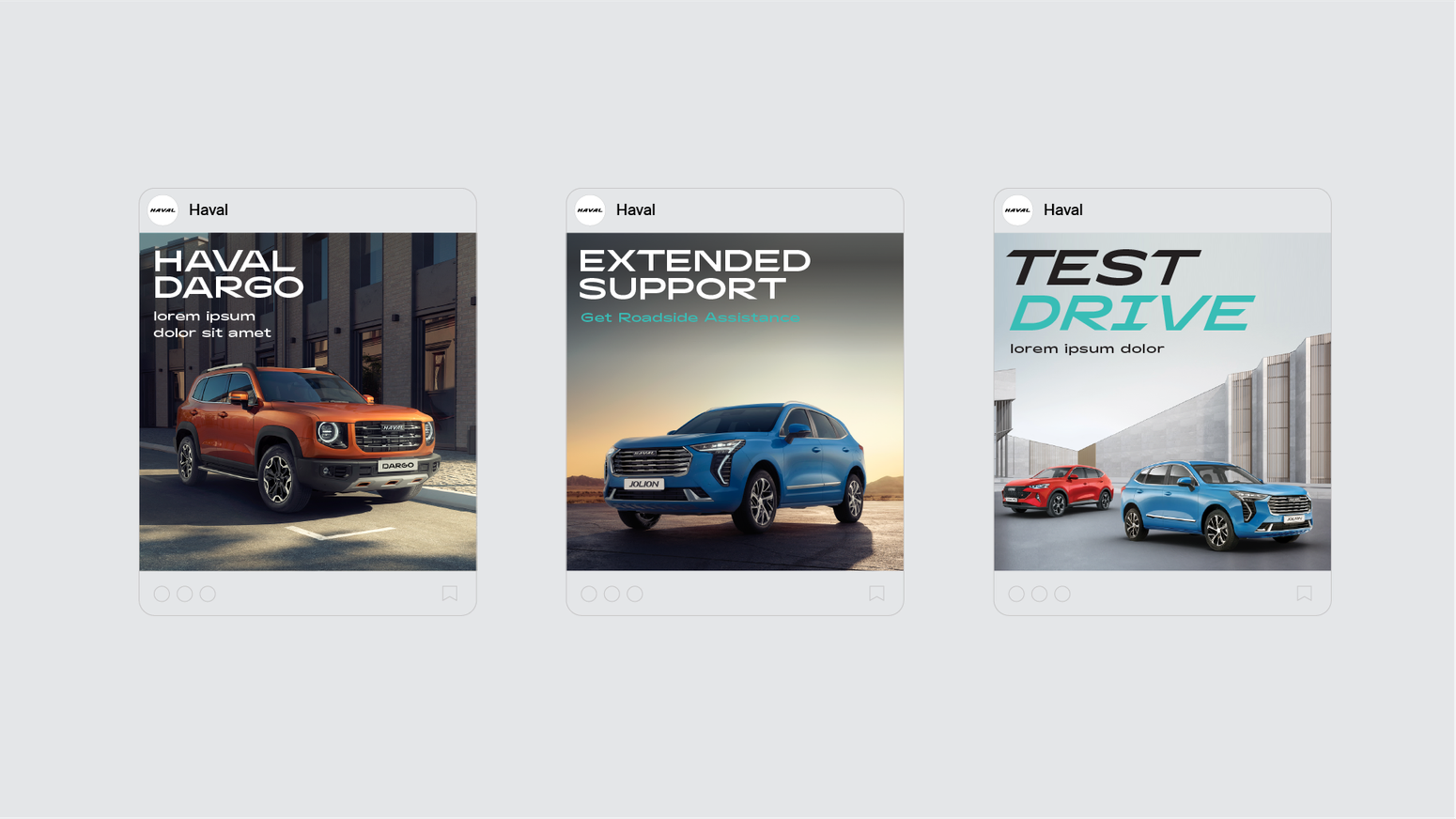
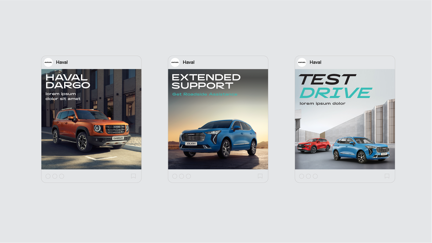
HAVAL
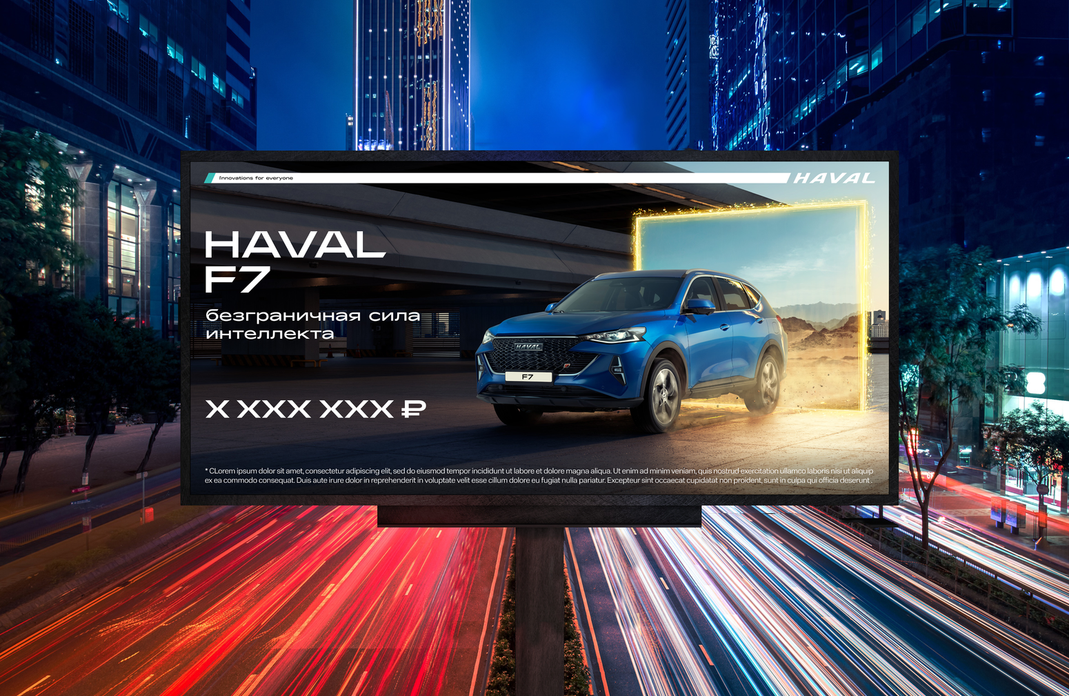
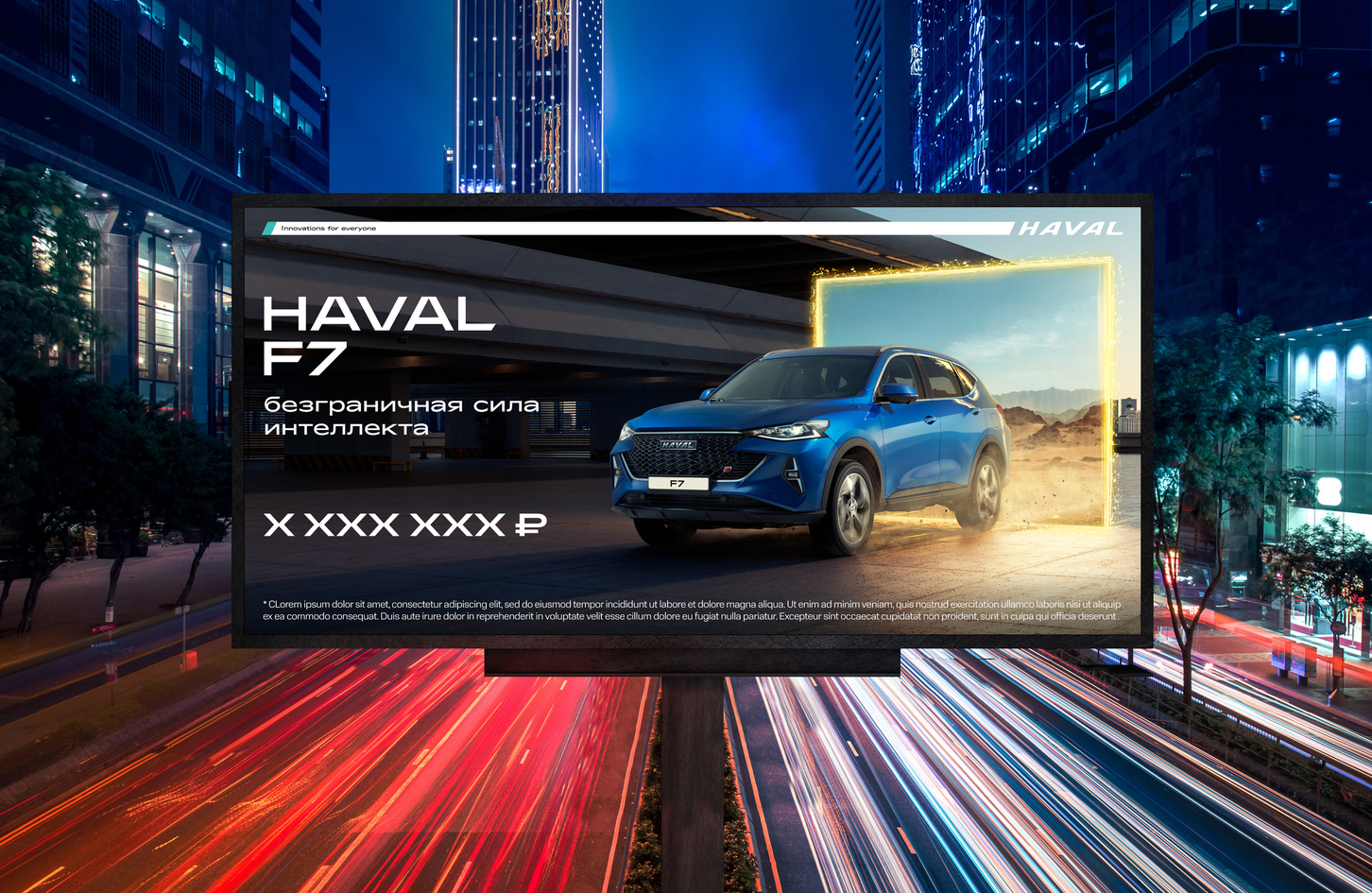
Haval is a brand that strives to make innovation accessible to everyone. The brand's personality is decisive, approachable and technology-focused. The brand offers every person everything so that they can enjoy mobility and time spent in the car to the maximum thanks to being equipped with all the latest technologies.
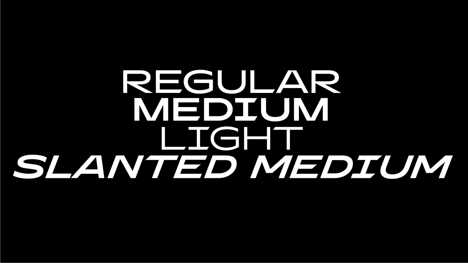
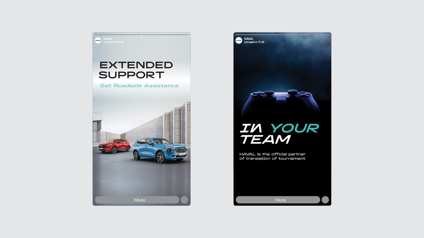
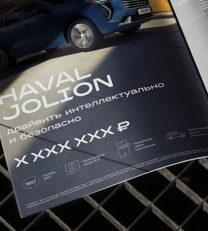
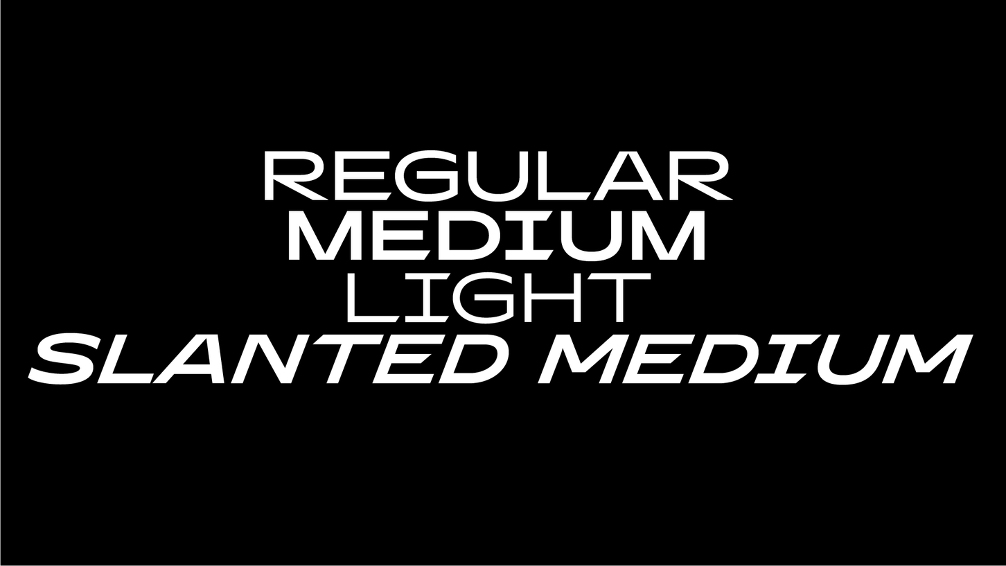
The brand identity expresses determination, dynamism and technology. The brand acquired a corporate element - the search bar, which embodies the meaning of an accessible search among the brand’s assortment. The key element of the style is a specially designed corporate font that expresses the character of the brand.
TARGET
solution
AUTOMOTIVE BRAND IDENTITY AND BRANDBOOK
2023
auto industry
/
/
/
creative directors: Alexander Zagorsky, Sergei Kozhevnikov, art-director: evgenya juravleva, font-design: Vladimir Kolomeytsev
TEAM
bbdo moscow
agency
CONTACTS
CV
VASILII KHROMOV
WORKS
CWAL
CWAL is a community and collaboration and exhibition space for artists and art enthusiasts in the city of Cleveland. CWAL's mission: to cultivate the local arts community through exhibitions and collaborations, by providing resources and education, and by raising public awareness. CWAL covers the range from academic art to street art and equally interested in their development
there was a play on the words "c wall" in the name of CWAL, and the inclusion of this idea in the form of the logo and in communication turned out to be as organic as possible. the style of the logo "rhymes" with this play on words, in which the letter C can be seen as both a frame and a wall, as references to both academic and contemporary art.
TARGET
solution
cleveland west art league
2018
HORECA
/
/
/
the outline of the logo, with active diagonals and ligatures, is inspired by the Avant Garde font of Herb Lubalin. on the one hand, the letters of the logo create an alliance with ligatures, on the other hand, thanks to the diagonals, they have a strong internal dynamics. these two features: union and development are in line with the main objectives that CWAL sets for itself.
due to its design, the logo works as a flexible corporate frame element that can cover the entire format or highlight the desired fragment in it. this is a metaphor for CWAL's activity - to find art, to highlight it, to present it to the audience. based on the work of this element, a style is built.
the simplicity and specificity of the logo make it recognizable by hand or, for example, with adhesive tape. this opens up great opportunities for working with a logo, as a basis for objects or just for situational solutions for making a logo.
nikola-lenivets
Nikola-Lenivets is a huge park located next to a small village. Here, objects of modern art and architecture are placed in the open air, many of the objects are made of wood.
Famous artists and local residents take part in the creation of objects.
The main idea of the style is to convey the atmosphere of traveling through the “wooden space” locations that exists in the park. For this purpose, logos of location objects were made, which are collected together on the park map. The park’s logo follows the same style – it refers to the landscape and objects. The logo has a monogram version
TARGET
solution
land art park branding concept
2015
art & culture
/
/
/
The map
is one of the main carriers of style. Here the graphics appear: hand-drawn with modifications in Ps,with noise.
The Art objects
are depicted on the map with large icons, and buildings and infrastructure facilities are also present on the map (they are indicated by small icons).
Business Media Associates
Brand identity of a large company in the field of concept development, design, construction and organization of exhibition events, providing an advanced level of service.
It was important to work out the brand architecture of Business Media Associates, which includes territorial branches: Business Media Russia Business Media Europe Business Media Central Asia.
The most important USP of the company is its proprietary online configurator service, which allows you to quickly and accurately “assemble” an event of any scale. In essence, the configurator is a multi-level modular system that includes all the necessary solutions.
TARGET
solution
turnkey event organizing company
2018
Event industry
/
/
/
In order to emphasize the scale of the company, a decision was proposed to switch to the use of the abbreviations BMA, BMR, BME, BMCA, referring to the largest players in different markets that historically often use abbreviations.
In this way, the modularity inherent in the brand’s product itself was also supported.
The identity reveals the main USP of the brand - a modular configurator using a logo system, which has a single base BM and modifiers A, R, E, CA.
It is important that the letters of the logo themselves are specially drawn and modular in structure, consisting of a limited set of elements. Plastic letters, futuristic, technological and modular, inspired by modernism.
The approach to the media layout supports the modularity of the brand and identity. Clear element relationships and modular grid at the core.
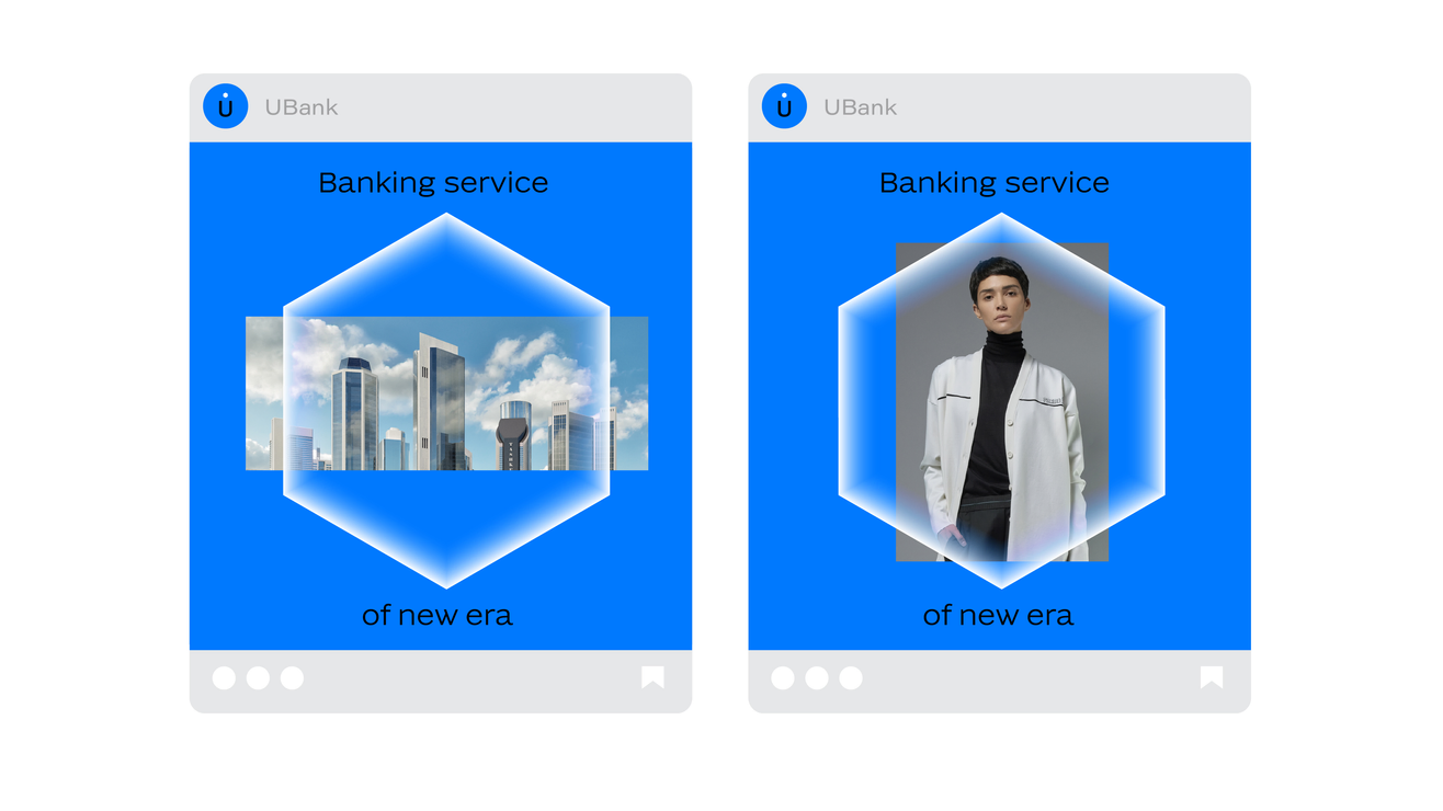
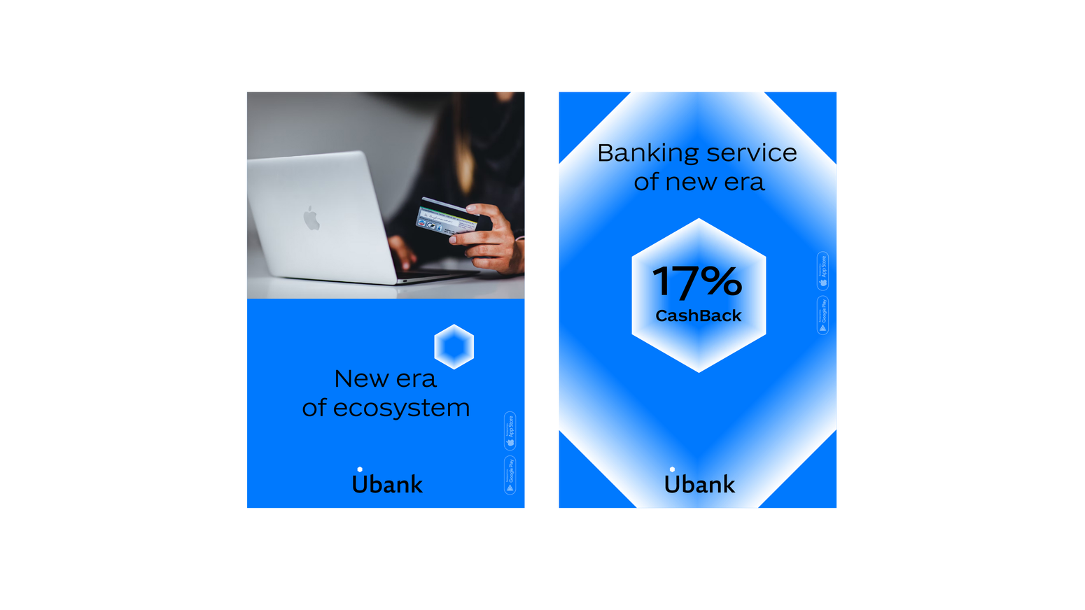
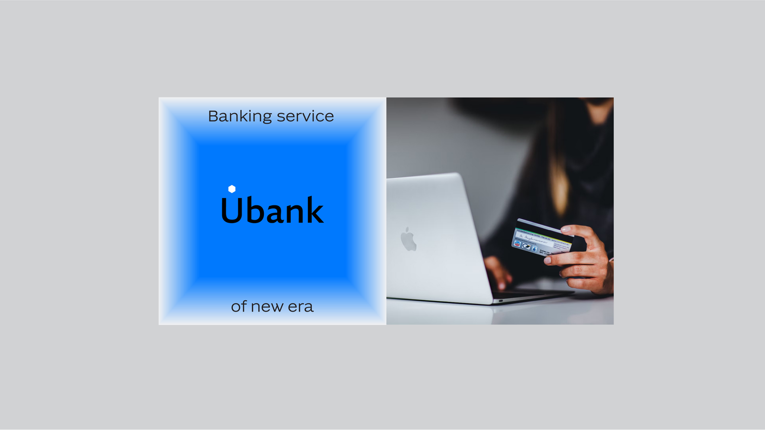
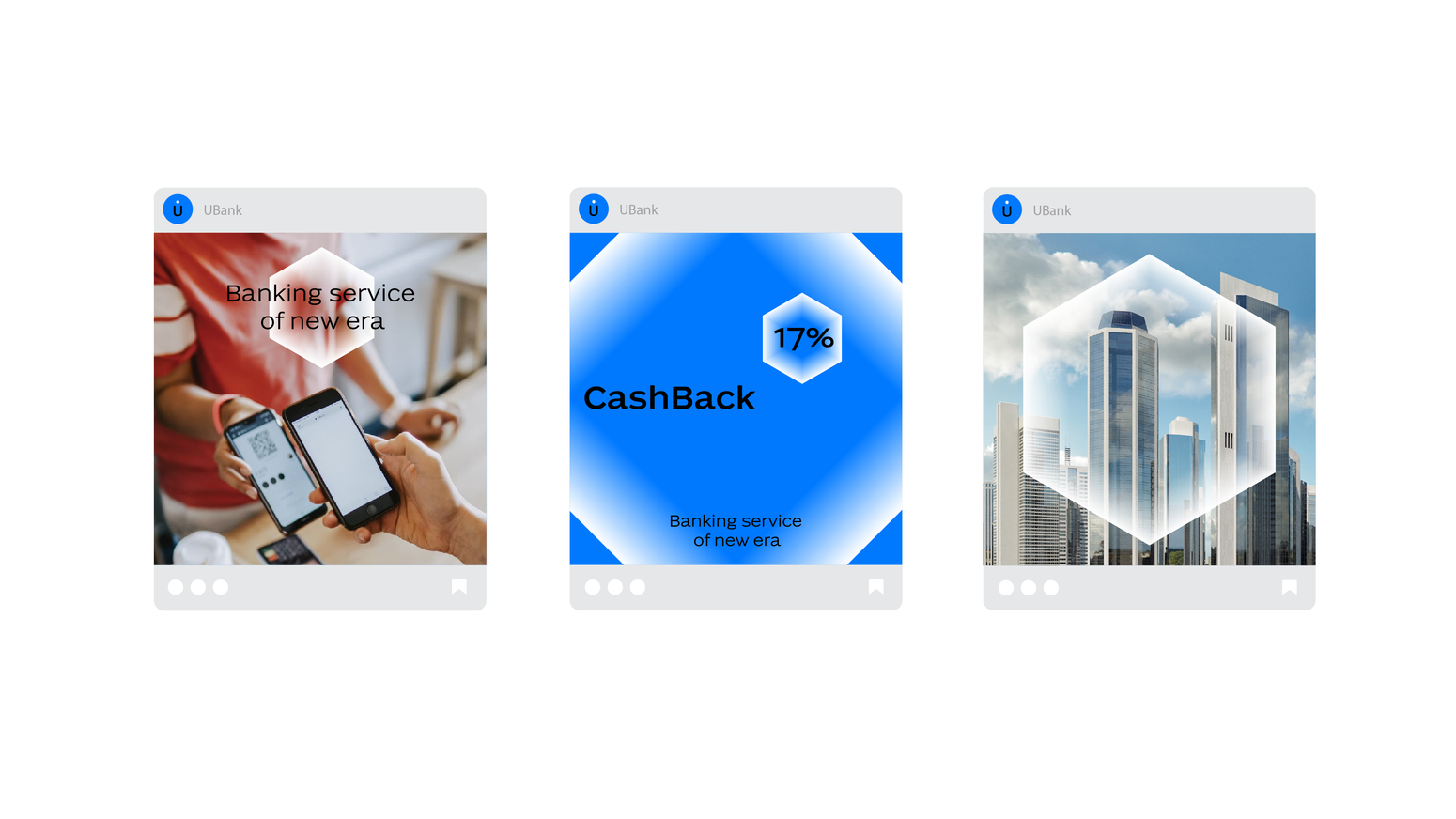
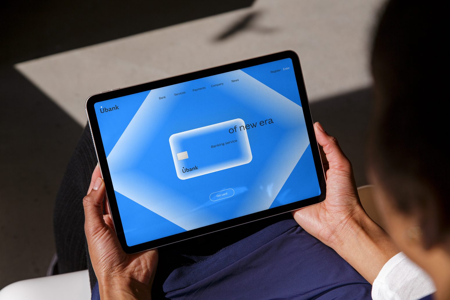
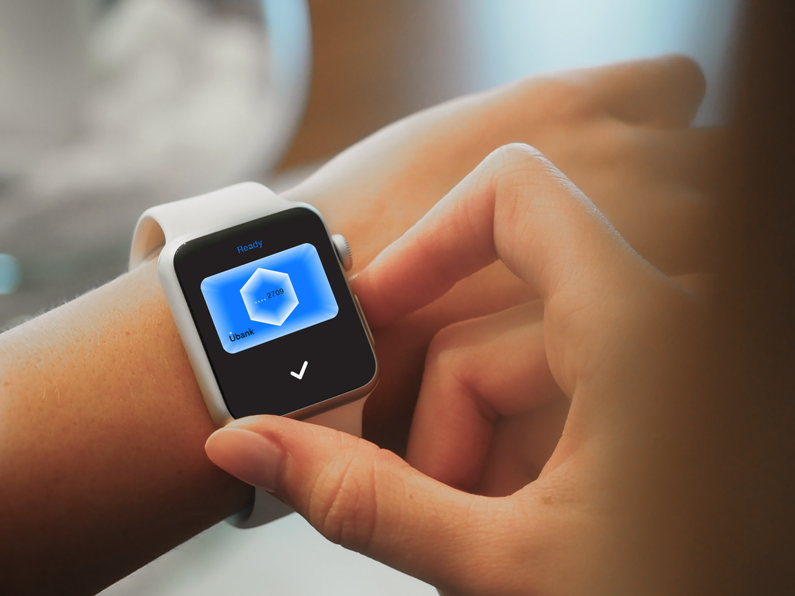
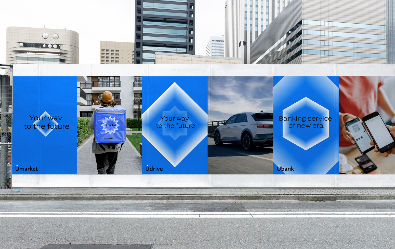
uworld
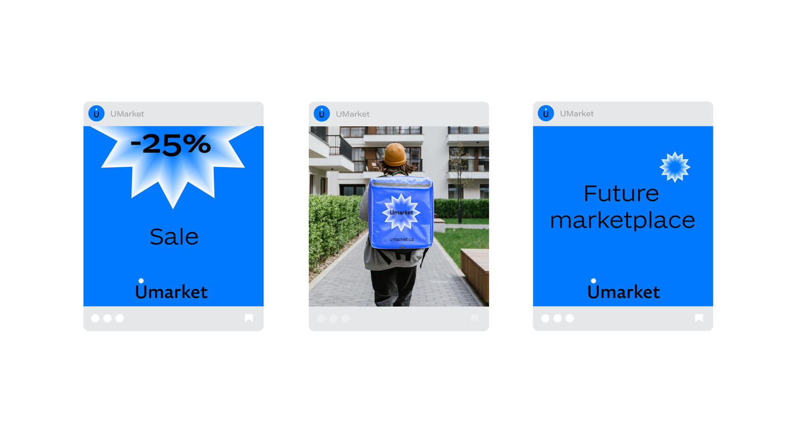
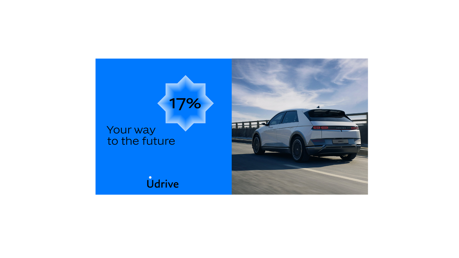
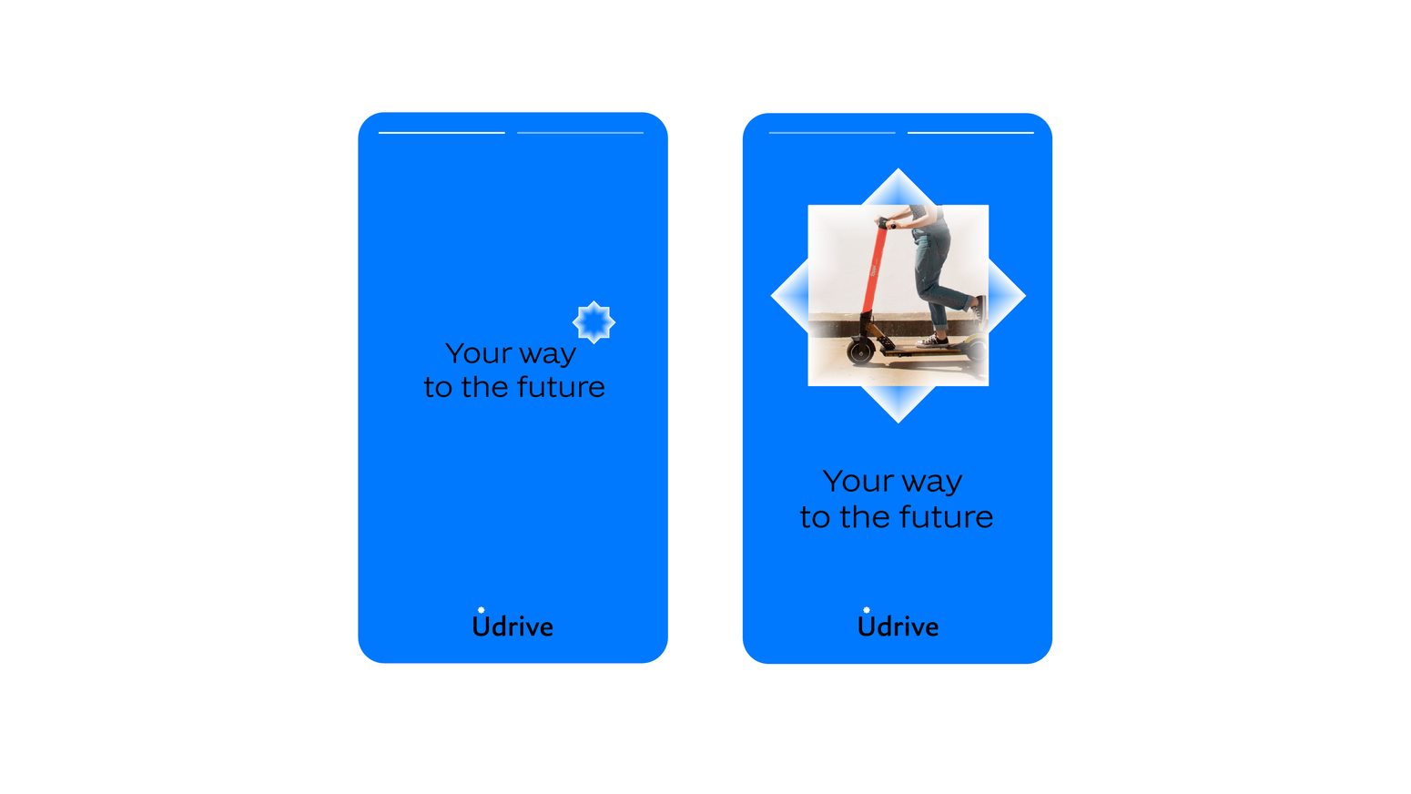
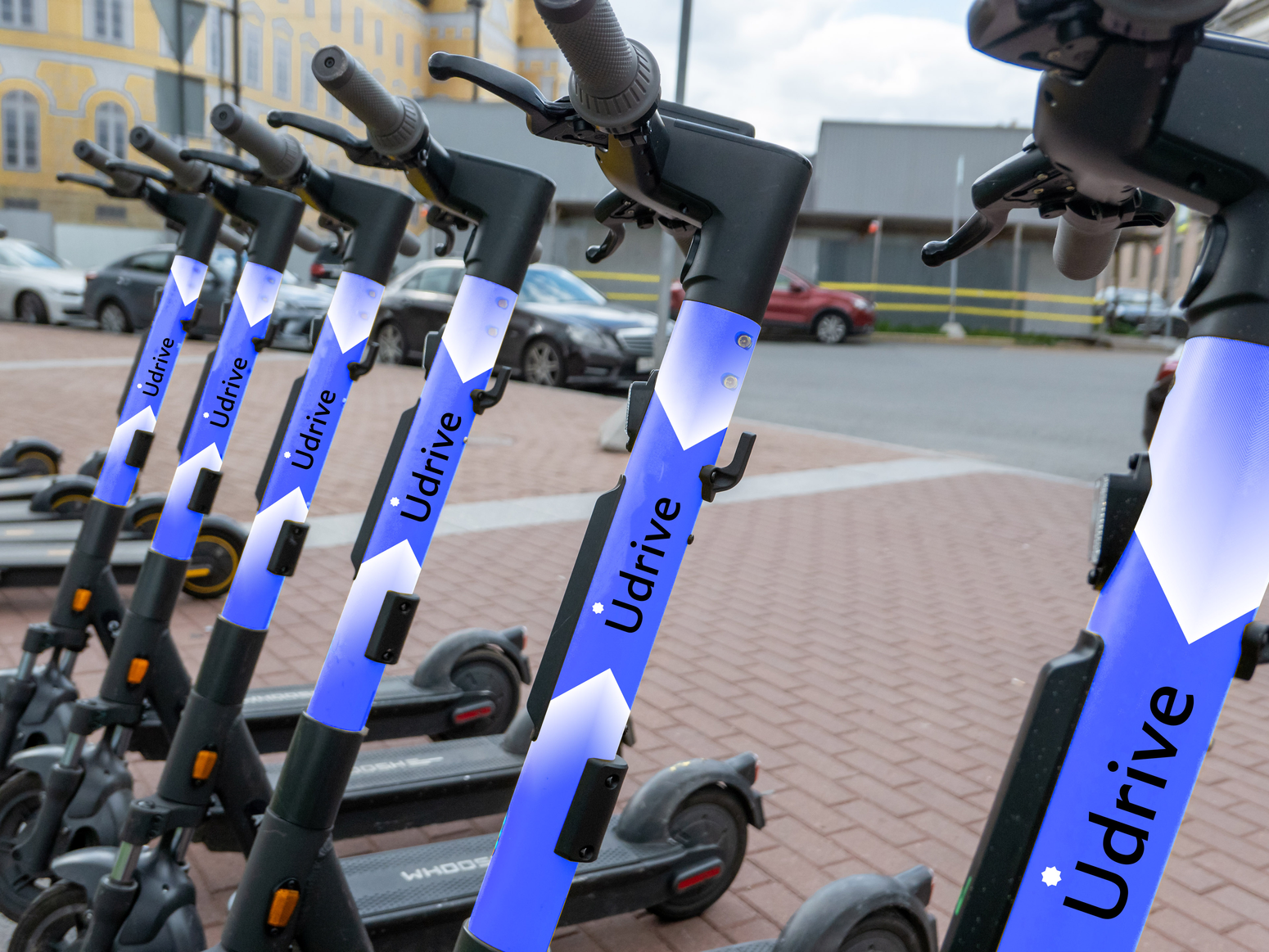
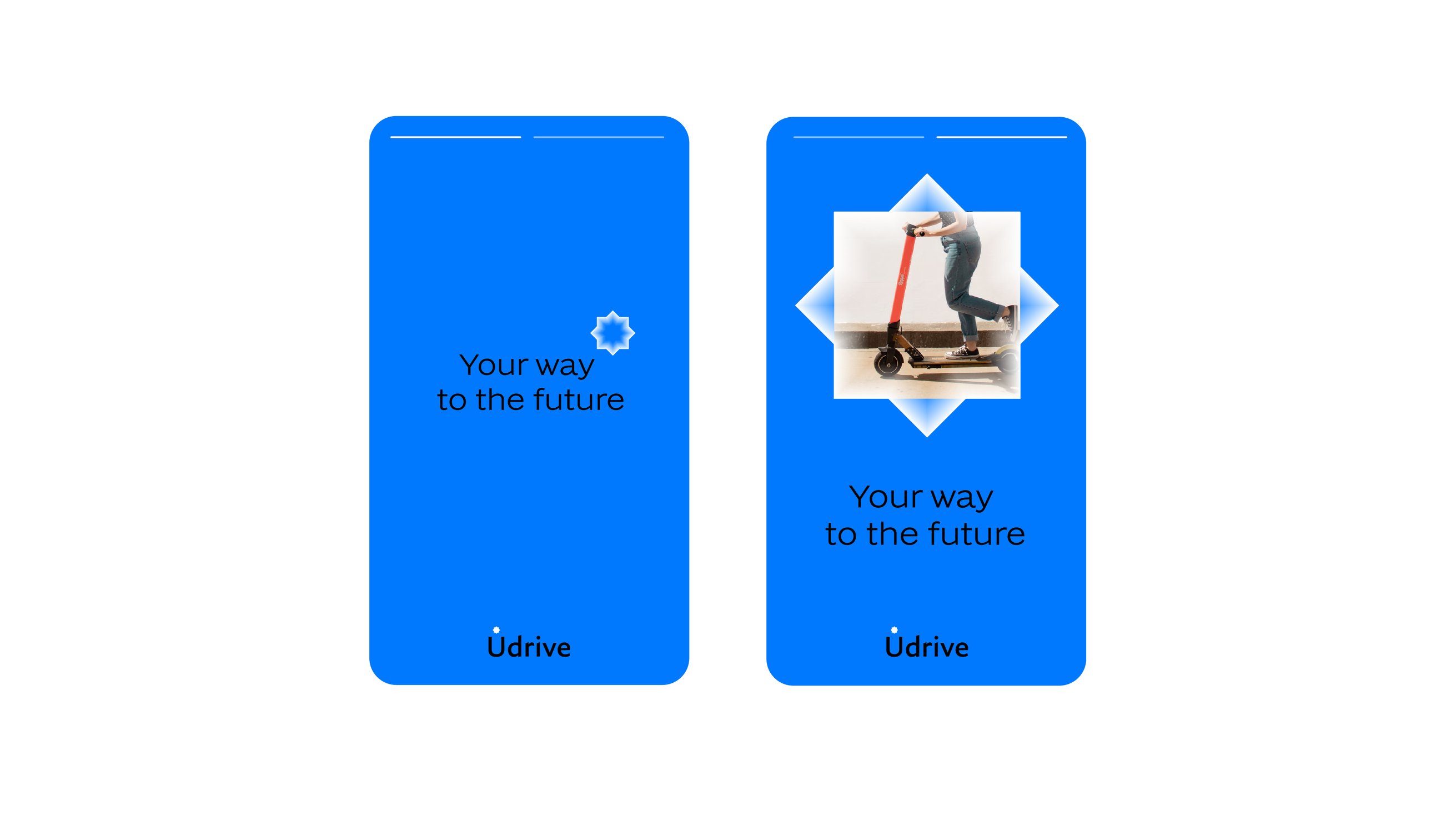
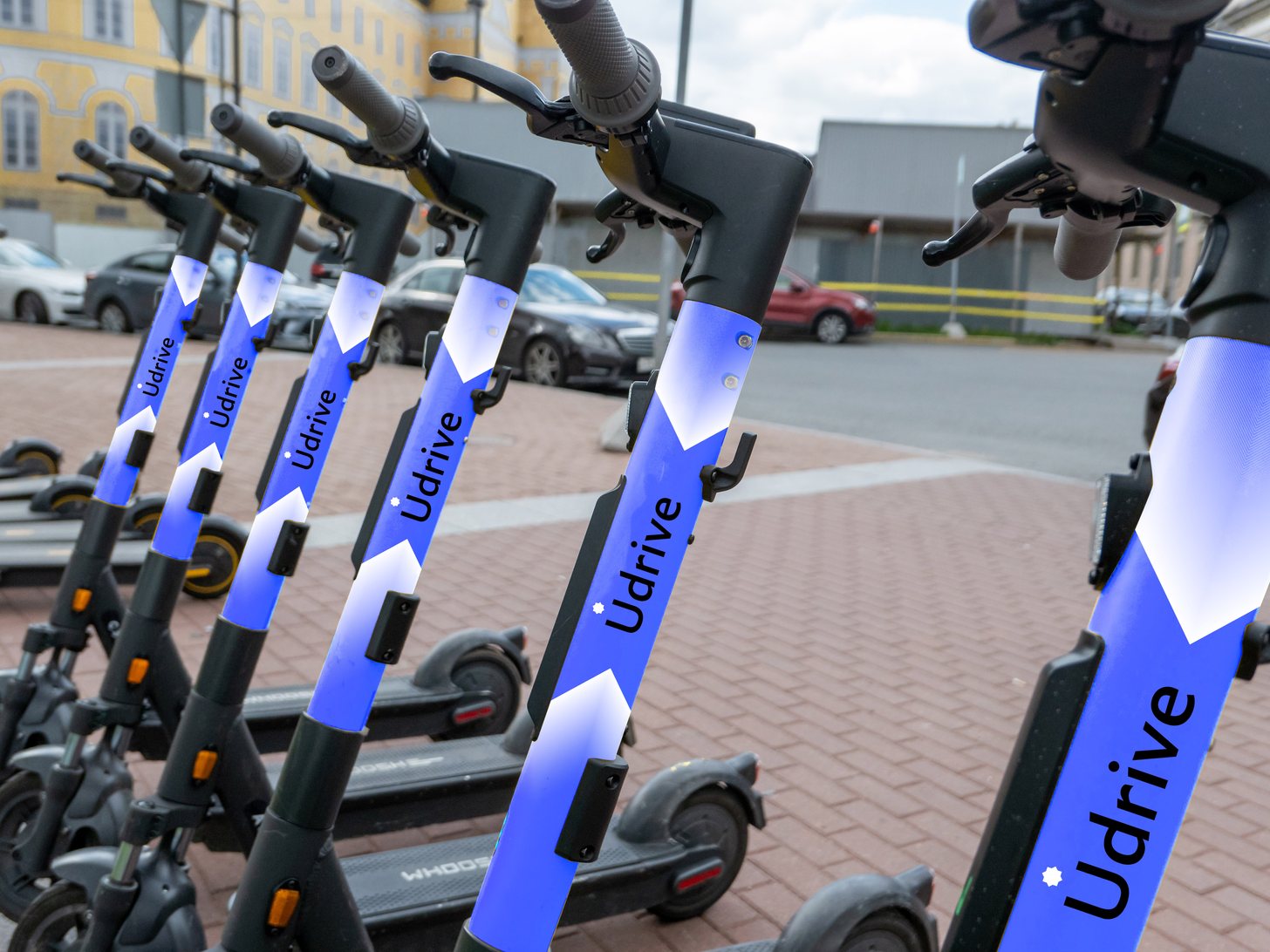
Develop a visual identity for ecosystem brand of services for convenient life. U is a new unique company in Uzbekistan, the first technological ecosystem in the country. Unique advantage: innovation and manufacturability - there are no analogues like this in the country companies.
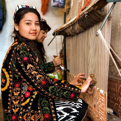
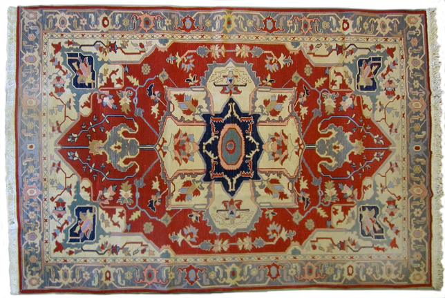
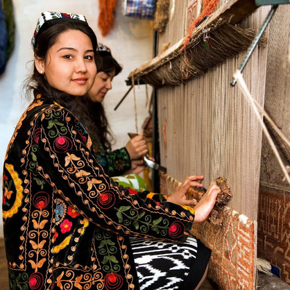
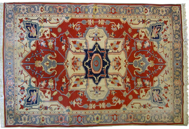
The main idea of the identity is unification historical roots and a new future that creates a brand. The basis is taken from traditional images of Uzbek carpets that open up completely new in a fascinating way
TARGET
solution
concept. the first technological ecosystem in Uzbekistan
2022
tech ecosystem
/
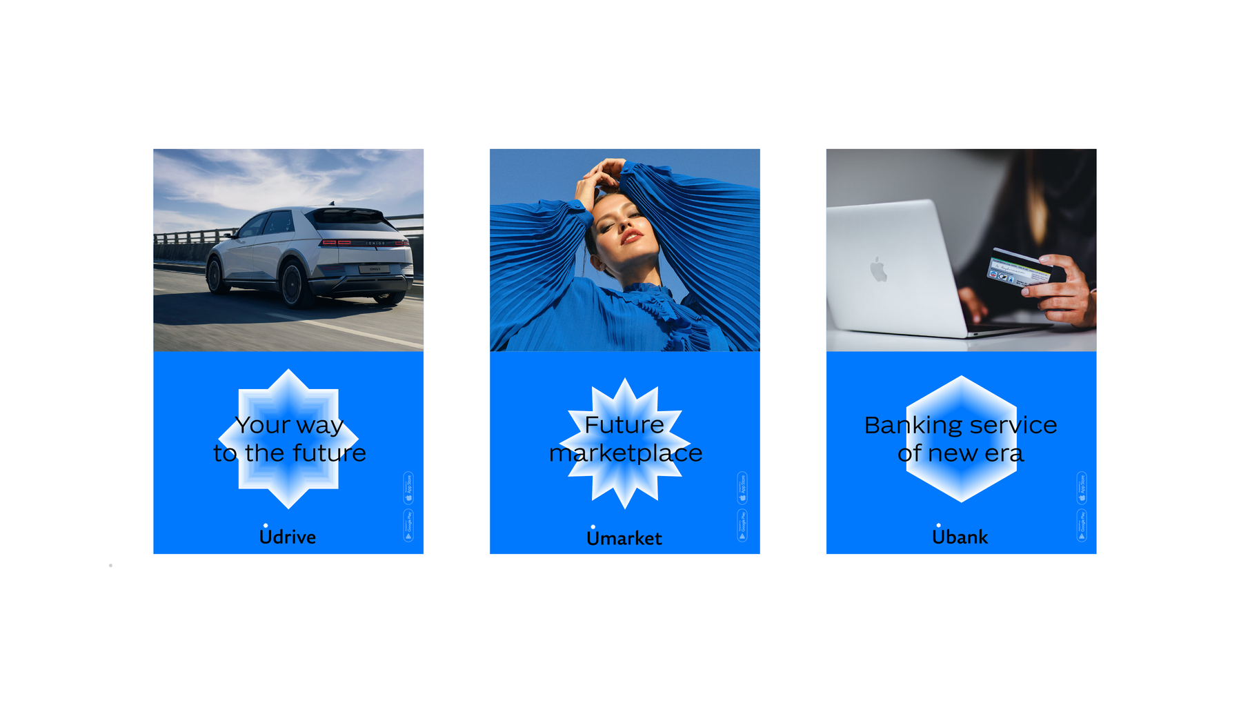
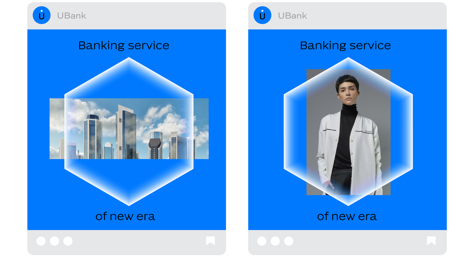
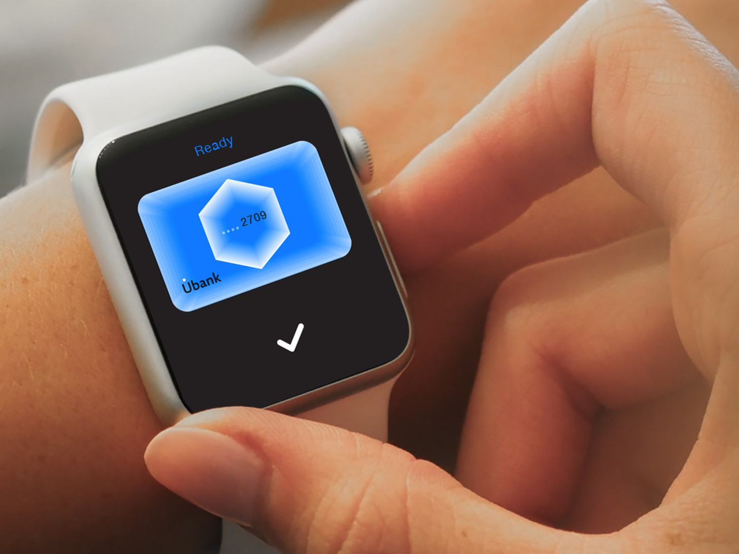
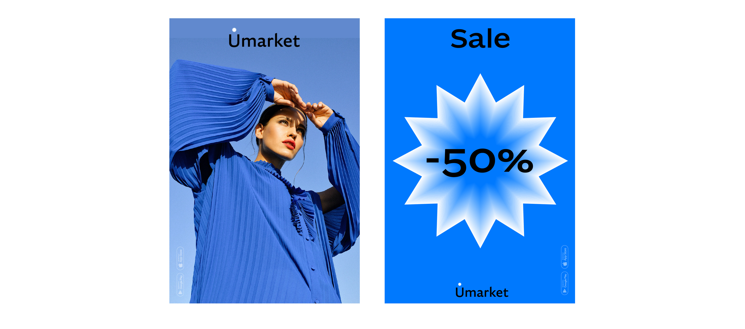
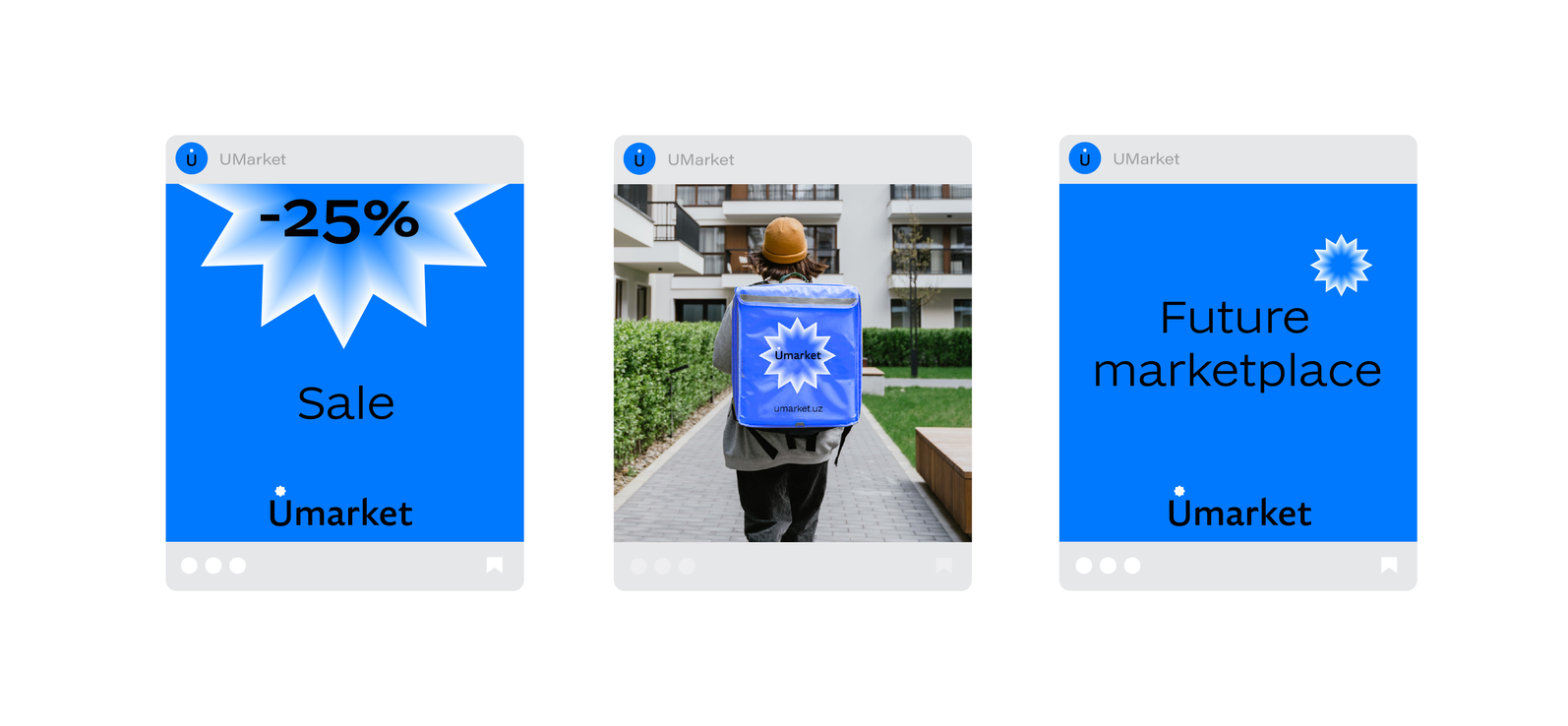
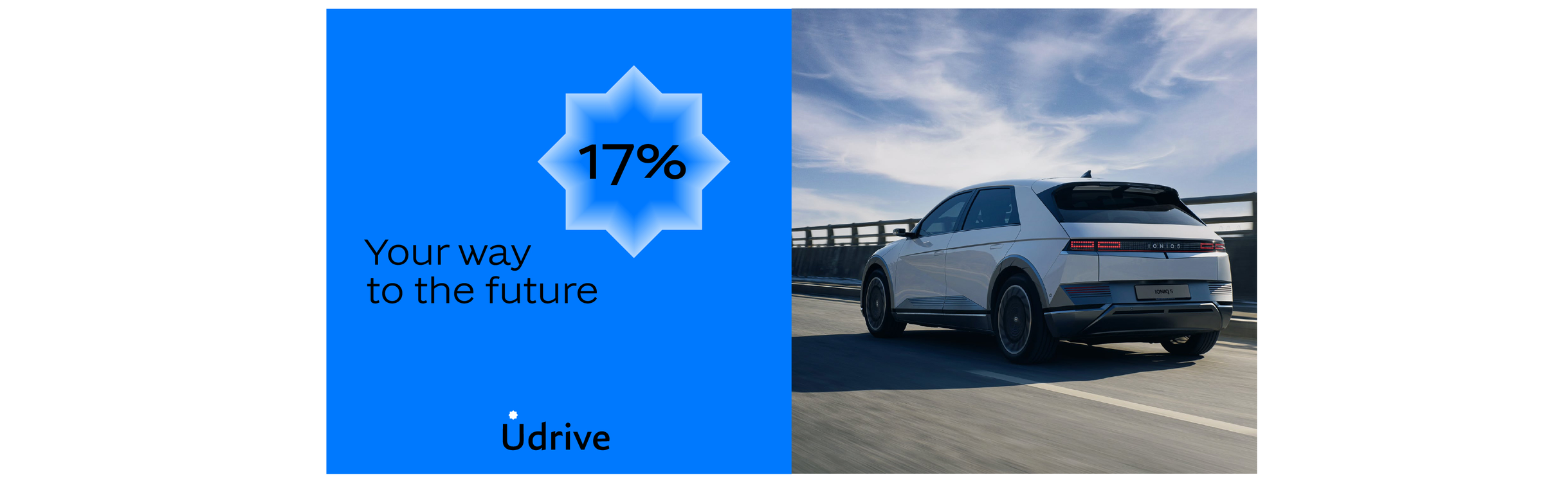
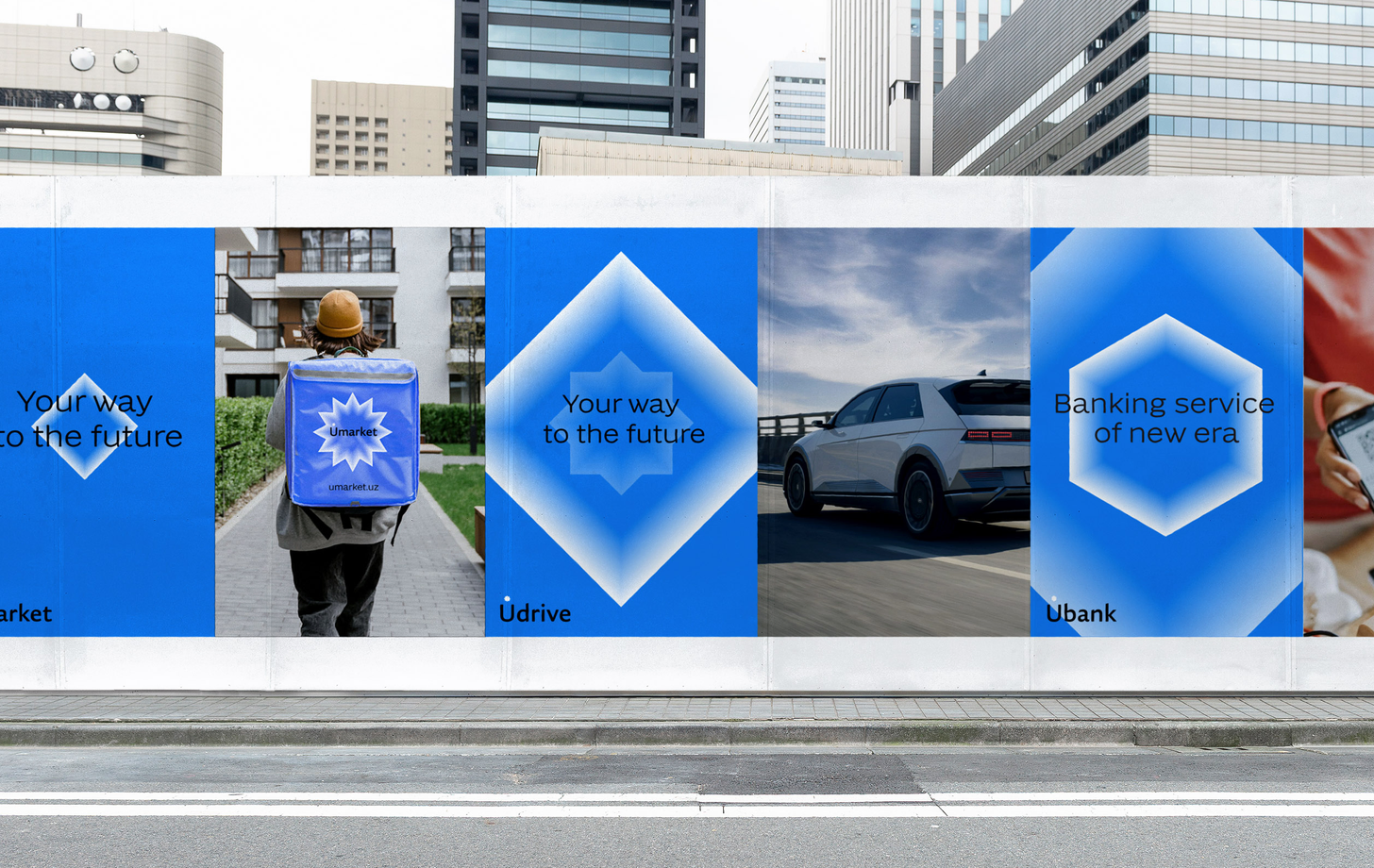
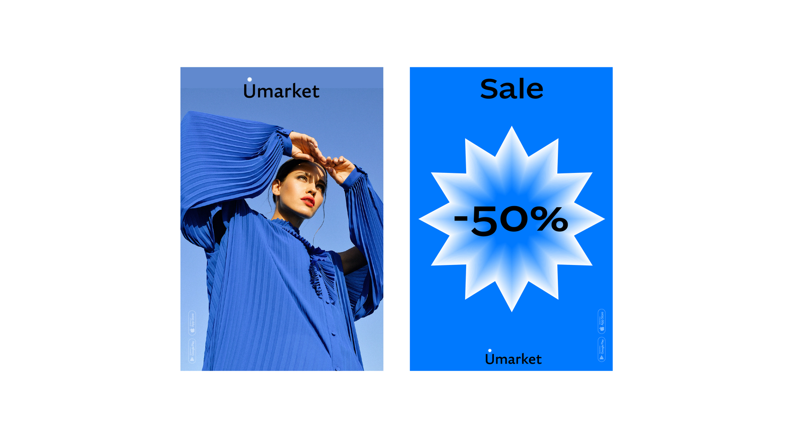
a distinctive shape
was chosen for each sub-brand of the company
bbdo moscow
agency
Flow
FRAGMENTS OF PROJECTS AND SEPARATE IMAGES